React Bootstrap Grid
Last Updated :
11 Jan, 2024
React Bootstrap Grid is like the maestro of web page layouts in React Bootstrap. It’s your go-to buddy for crafting designs that look good and adapt seamlessly across devices. From straightforward single-column setups to intricate multi-column arrangements, this tool’s got the flexibility and power to make it happen.
There are two main approaches to implement React Bootstrap Grid:
Using Grid component:
The Grid component is the main component for creating a grid layout.
- The grid is divided into 12 columns by default.
- Columns must add up to 12 for each row.
- Breakpoints are used to adjust layouts for different screen sizes (xs, sm, md, lg, xl).
- Offsets can be used to create spacing between columns.
- Ordering can be used to rearrange column positions on different screen sizes.
It takes a number of props that can be used to control the layout of the grid. Here are some of the most important props:
- container: Determines whether the grid should have a fixed width or a fluid width. A fixed-width grid will always have the same width, regardless of the screen size. A fluid-width grid will adjust its width to fit the available space on the screen.
- columns: Specifies the number of columns in the grid. The number of columns can be any number from 1 to 12.
- gutter: Specifies the width of the gutter between the columns. The gutter is measured in pixels.
- className: Used to add custom CSS classes to the grid.
Using the Row and Col components:
The Row and Col components are used to create rows and columns within the grid. The Row component defines a new row in the grid, and the Col component defines a column within that row.
The Col component takes a number of props that can be used to control the layout of the column. Here are some of the most important props:
- xs, sm, md, lg, xl: Props like xs and sm specify column spans for different screen sizes (e.g., phones and tablets).
- offset-xs, offset-sm, offset-md, offset-lg, offset-xl: These props determine the column offset on various screen sizes, like offset-xs for extra-small screens (phones) and offset-sm for small screens (tablets), and so forth.
Fluid Container:
Use <Container fluid /> for width: 100% across all viewport and device sizes.
Example: Below is the code example of the Fluid Container:
Javascript
import Container from "react-bootstrap/Container";
import Row from "react-bootstrap/Row";
import Col from "react-bootstrap/Col";
function ExampleContainer() {
return (
<Container fluid>
<Row>
<Col className="bg-secondary">A fluid container</Col>
</Row>
</Container>
);
}
export default ExampleContainer;
|
Output:

Auto-layout columns:
If column widths are not explicitly defined, the Col component will display columns of equal width.
Example: Below is the code example of the Auto-layout columns:
Javascript
import Container
from 'react-bootstrap/Container';
import Row from 'react-bootstrap/Row';
import Col from 'react-bootstrap/Col';
function Example1() {
return (
<Container>
<Row>
<Col className='bg-success'>
1 of 2
</Col>
<Col className='bg-warning'>
2 of 2
</Col>
</Row>
<Row>
<Col className='bg-warning'>
1 of 3
</Col>
<Col className='bg-success'>
2 of 3
</Col>
<Col className='bg-warning'>
3 of 3
</Col>
</Row>
</Container>
);
}
export default Example1;
|
Step to Run Application: Run the application using the following command from the root directory of the project:
npm start
Output:

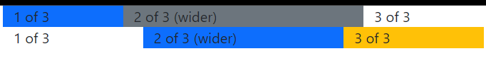
Setting one column width:
Flexbox grid columns with auto-layout enable you to define the width of a single column, leading to automatic resizing of adjacent columns. This can be achieved using predefined grid classes, grid mixins, or inline widths. Importantly, the width of the center column influences the resizing of the surrounding columns.
Example: Below is the code example of the Setting one column width:
Javascript
function Example2() {
return (
<Container>
<Row>
<Col className='bg-primary'>
1 of 3
</Col>
<Col xs={6}
className='bg-secondary'>
2 of 3 (wider)
</Col>
<Col>3 of 3</Col>
</Row>
<Row>
<Col className=''>
1 of 3
</Col>
<Col xs={5}
className='bg-primary'>
2 of 3 (wider)
</Col>
<Col
className='bg-warning'>
3 of 3
</Col>
</Row>
</Container>
);
}
export default Example2;
|
Step to Run Application: Run the application using the following command from the root directory of the project:
npm start
Output:
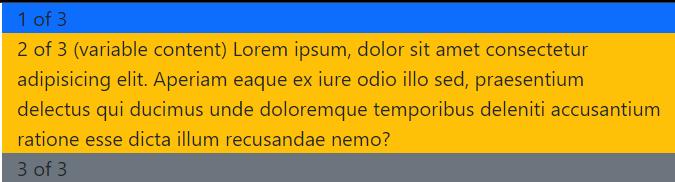
Variable width content:
You can set the column value to auto to size columns based on the natural width of their content.
Example: Below is the code example of the Variable width content:
Javascript
import Container
from 'react-bootstrap/Container';
import Row from 'react-bootstrap/Row';
import Col from 'react-bootstrap/Col';
function Example3() {
return (
<Container>
<Row className="justify-content-md-center">
<Col xs lg="2"
className='bg-primary'>
1 of 3
</Col>
<Col md="auto"
className='bg-warning'>
2 of 3 (variable content) Lorem ipsum,
dolor sit amet consectetur adipisicing
elit. Aperiam eaque ex iure odio illo
sed, praesentium delectus qui ducimus
unde doloremque temporibus deleniti
accusantium ratione esse dicta illum
recusandae nemo?
</Col>
<Col xs lg="2"
className='bg-secondary'>
3 of 3
</Col>
</Row>
</Container>
);
}
export default Example3;
|
Step to Run Application: Run the application using the following command from the root directory of the project:
npm start
Output:
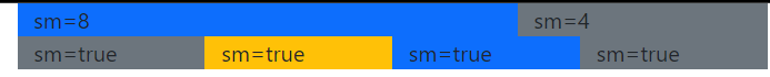
Responsive grids:
Using the Col component, you can designate column widths for six breakpoint sizes (xs, sm, md, lg, xl, and xxl). At each breakpoint, you have the option to define the number of columns to span. Alternatively, you can utilize the prop `<Col lg={true} />` for automatic layout widths.
- Multiple breakpoints can be added to create different grids depending on the screen size.
- The Col breakpoint props have the form prop form: {span: number, order: number, offset: number} for specifying offsets and ordering effects.
- Order property can be used to control the visual order of the content.
Example: Below is the code example of the Responsive grids:
Javascript
function Example5() {
return (
<Container>
<Row>
<Col sm={8}
className='bg-primary'>
sm=8
</Col>
<Col sm={4}
className='bg-secondary'>
sm=4
</Col>
</Row>
<Row>
<Col sm
className='bg-secondary'>
sm=true
</Col>
<Col sm
className='bg-warning'>
sm=true
</Col>
<Col sm
className='bg-primary'>
sm=true
</Col>
<Col sm
className='bg-secondary'>
sm=true
</Col>
</Row>
</Container>
);
}
export default Example5;
|
Step to Run Application: Run the application using the following command from the root directory of the project:
npm start
Output:
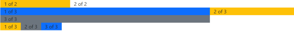
Setting column widths in Row:
The Row component allows you to define column widths for six breakpoint sizes (xs, sm, md, lg, xl, and xxl). At each breakpoint, you can specify the number of columns that will be placed adjacent to each other. Additionally, you have the option to set the columns to their natural widths by using the “auto” value. It’s important to note that Row column widths will take precedence over Col widths set at lower breakpoints when viewed on larger screens. For example, the size specified by `<Col xs={6} />` will be overridden by `<Row md={4} />` on medium and larger screens.
Example: Below is the code example of the setting column widths in row:
Javascript
import Container
from 'react-bootstrap/Container';
import Row from 'react-bootstrap/Row';
import Col from 'react-bootstrap/Col';
function Example4() {
return (
<Container>
<Row xs={2} md={4} lg={6}>
<Col className='bg-warning'>
1 of 2
</Col>
<Col>
2 of 2
</Col>
</Row>
<Row xs={1} md={2}>
<Col className='bg-primary'>
1 of 3
</Col>
<Col className='bg-warning'>
2 of 3
</Col>
<Col className='bg-secondary'>
3 of 3
</Col>
</Row>
<Row xs="auto">
<Col className='bg-warning'>
1 of 3
</Col>
<Col className='bg-secondary'>
2 of 3
</Col>
<Col className='bg-primary'>
3 of 3
</Col>
</Row>
</Container>
);
}
export default Example4;
|
Step to Run Application: Run the application using the following command from the root directory of the project:
npm start
Output:
Share your thoughts in the comments
Please Login to comment...