React-Bootstrap Select
Last Updated :
06 Nov, 2023
In this article, we will learn about the React-Bootstrap Select known as Form.Select, Form.Select is a component that helps to create dropdown menus in React apps that look good. The advantage of Bootstrap’s styling is that crafting menus that excel in both functionality and aesthetics is our goal. Form. Select empowers you to create diverse and visually appealing dropdown menus.
Syntax:
<Form.Select
    <option value="value">
        {/*option name*/}
    </option>
</Form.Select>
We can use the following properties inside the Form.Select component:
Properties:
- disabled: When this is set to “true,” it means the dropdown is grayed out, and you can’t pick anything from it.
- name: It’s like giving a name to your dropdown so that when you submit a form, the computer knows which dropdown you’re talking about.
- onChange: When you change your selection in the dropdown, this is the computer’s way of telling you that something changed.
- value: This is the currently selected option in the dropdown menu. It’s like telling the computer which choice you picked.
- id: It’s like giving your dropdown a unique name so the computer can identify it easily.
- bsPrefix: This allows you to change the default Bootstrap style for your dropdown.
- multiple: If this is set to “true,” it means you can choose more than one option in the dropdown at the same time.
- size: This lets you change the size of the dropdown. You can make it small (‘sm’) or large (‘lg’) if you want.
- custom: If this is set to “true,” it means you can use your own special styles to make the dropdown look unique using CSS classes.
Example 1: Let’s see In this example how we can do the basic implementation of Form.Select components using react-bootstrap.
Javascript
import React, { useState } from 'react';
import Form from 'react-bootstrap/Form';
import './App.css';
function RangeExample() {
const [selectedFruit, setSelectedFruit] = useState('Select any fruit');
const handleSelectChange = (e) => {
setSelectedFruit(e.target.value);
};
return (
<div className="outer">
<div>
<Form.Select value={selectedFruit} onChange={handleSelectChange}>
<option>Select any fruit</option>
<option value="mango">Mango</option>
<option value="banana">Banana</option>
<option value="cherry">Cherry</option>
<option value="grapes">Grapes</option>
<option value="apple">Apple</option>
</Form.Select>
</div>
</div>
);
}
export default RangeExample;
|
CSS
.outer {
display: flex;
align-items: center;
justify-content: center;
background-color: #152128f0;
height: 100vh;
width: 100vw;
color: rgb(191, 210, 210);
}
.custom-slider {
width: 70%;
margin: 0 auto;
}
|
Output:
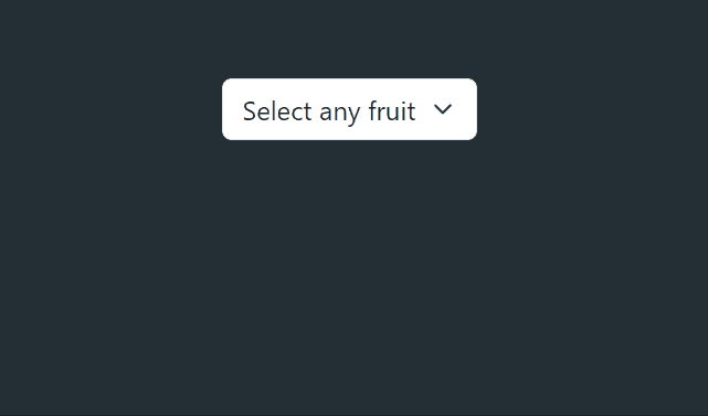
Output
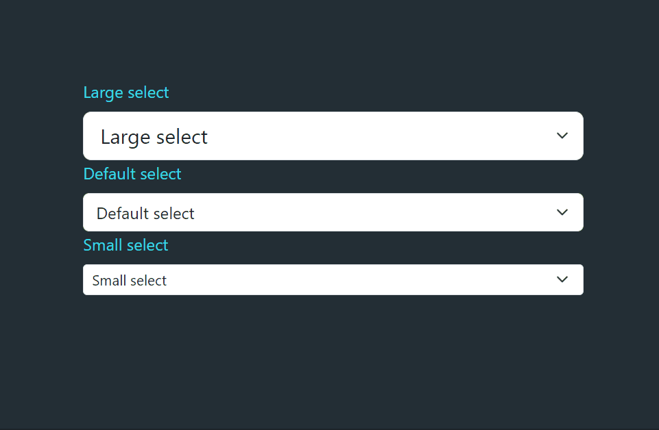
Example 2: Lets see In this example how we can control the size of Form.Select component using react-bootstrap.
Javascript
import React, { useState } from 'react';
import Form from 'react-bootstrap/Form';
import './App.css';
function RangeExample() {
return (
<div className="outer">
<div className='App'>
<Form.Group>
<Form.Label>Large select</Form.Label>
<Form.Select size="lg">
<option>Large select</option>
<option>Large select</option>
<option>Large select</option>
</Form.Select>
</Form.Group>
<Form.Group>
<Form.Label>Default select</Form.Label>
<Form.Select>
<option>Default select</option>
<option>Default select</option>
<option>Default select</option>
</Form.Select>
</Form.Group>
<Form.Group>
<Form.Label>Small select</Form.Label>
<Form.Select size="sm">
<option>Small select</option>
<option>Small select</option>
<option>Small select</option>
</Form.Select>
</Form.Group>
</div>
</div>
);
}
export default RangeExample;
|
CSS
.outer {
display: flex;
align-items: center;
justify-content: center;
background-color: #152128f0;
height: 100vh;
width: 100vw;
color: rgb(191, 210, 210);
}
.App {
width: 38vw;
color: rgb(57, 217, 231);
}
|
Output:
Output
Share your thoughts in the comments
Please Login to comment...