How to customize the labels for previous and next buttons in React Bootstrap pagination?
Last Updated :
22 Nov, 2023
In this article, we will learn how to customize the labels for previous and next buttons in React Bootstrap pagination. The Pagination component in React-Bootstrap provides a convenient way to create pagination controls for a list of items, such as a list of pages or data entries. By default, it shows “Previous” and “Next” labels on the respective buttons, but we can also customize them according to our requirements.
Syntax of Pagination:
<Pagination>
      <Pagination.Prev>...</Pagination.Prev>
      <Pagination.Item>...</Pagination.Item>
      <Pagination.Next>...</Pagination.Next>
</Pagination>
Approach:
In React-Bootstrap, by default the previous and next buttons in Pagination are represented with in Pagination.previous and Pagination.next element. To customize them we can use various attributes like aria-hidden, disabled, and custom styling.
Steps to create the application:
Step 1: Create the react app using the following CRA command.
npx create-react-app appdemo
Step 2: Now, navigate to your current project i.e. appdemo using the following command.
cd appdemo
Step 3: Install the required modules i.e. react-bootstrap and bootstrap using the following command.
npm install react-bootstrap bootstrap
Step 4: Import the necessary components from react-bootstrap as per requirement. To demonstrate customization of labels in Pagination I am importing Bootstrap CSS and Pagination components from react-bootstrap.
import Pagination from 'react-bootstrap/Pagination';
import 'bootstrap/dist/css/bootstrap.min.css';
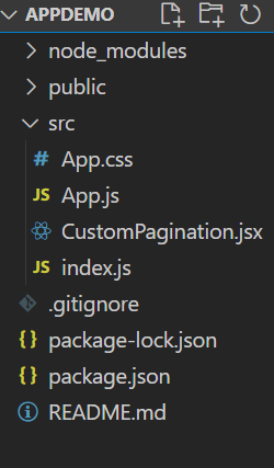
Project Structure:
The updated dependencies in package.json file will look like:
"dependencies": {
    "@testing-library/jest-dom": "^5.17.0",
    "@testing-library/react": "^13.4.0",
    "@testing-library/user-event": "^13.5.0",
    "bootstrap": "^5.3.2",
    "react": "^18.2.0",
    "react-bootstrap": "^2.8.0",
    "react-dom": "^18.2.0",
    "react-scripts": "5.0.1",
    "web-vitals": "^2.1.4"
}
Example 1: In this example, let us see how we can customize labels of Previous and Next buttons in React-Bootstrap pagination.
Javascript
import React from 'react';
import Pagination from 'react-bootstrap/Pagination';
function PaginationDemo() {
return (
<Pagination>
<Pagination.Prev>
<span aria-hidden="true">«</span>
</Pagination.Prev>
<Pagination.Next>
<span aria-hidden="true">»</span>
</Pagination.Next>
</Pagination>
);
}
function CustomPagination() {
return (
<div>
<h2>Pagination</h2>
<p>Your content displays here</p>
<PaginationDemo />
</div>
);
}
export default CustomPagination;
|
Javascript
import React from 'react';
import CustomPagination from './CustomPagination';
import 'bootstrap/dist/css/bootstrap.min.css';
import "./App.css";
const App = () => {
return (
<div className='component'>
<CustomPagination />
</div>
);
};
export default App;
|
CSS
.component {
display: flex;
flex-direction: column;
justify-content: center;
align-items: center;
height: 100vh;
}
|
Output:
.gif)
Example 2: Implementation of above approach.
Javascript
import React from 'react';
import Pagination from 'react-bootstrap/Pagination';
function PaginationDemo() {
return (
<Pagination>
<Pagination.Prev disabled
className="custom-prev-btn"
style={{ cursor: 'not-allowed' }}>
<span aria-hidden="true">Previous</span>
</Pagination.Prev>
<Pagination.Next className="custom-next-btn">
<span aria-hidden="true">Next</span>
</Pagination.Next>
</Pagination>
);
}
function CustomPagination() {
return (
<div>
<h2>Pagination</h2>
<p>Your content displays here</p>
<PaginationDemo />
</div>
);
}
export default CustomPagination;
|
Javascript
import React from 'react';
import CustomPagination from './CustomPagination';
import 'bootstrap/dist/css/bootstrap.min.css';
import "./App.css";
const App = () => {
return (
<div className='component'>
<CustomPagination />
</div>
);
};
export default App;
|
CSS
.component {
display: flex;
flex-direction: column;
justify-content: center;
align-items: center;
height: 100vh;
}
|
Output:
.gif)
Share your thoughts in the comments
Please Login to comment...