How to make rounded corner for navbar using react-bootstrap?
Last Updated :
06 Nov, 2023
In single-page applications, Navigation Bars are the most important components of web applications to provide national access to different sections and features of the applications. We can customize the navigation bar by adjusting the colors, width, and we can also make the rounded corners for the navbar using react-bootstrap. So this article will help us to learn to make rounded corners for the navbar using react-bootstrap.
Prerequisites:
We are making the navbar using the below approaches:
Steps to create the project:
Step 1: Create a React application using the following command:
npx create-react-app rounded-corner
Step 2: After creating your project folder(i.e. rounded-corner), move to it by using the following command:
cd rounded-corner
Step 3: Now install react-bootstrap in your working directory i.e. import-comp by executing the below command in the VScode terminal:
npm install react-bootstrap bootstrap
Step 4: Now we need to Add Bootstrap CSS to the index.js or App.js file:
import 'bootstrap/dist/css/bootstrap.min.css';
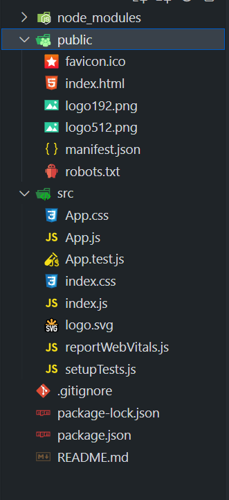
Project Structure:
Approach 1: Using rounded-pill Class
In the Approach, we have used the “rounded-pill” class to create rounded corners for the navbar. This class is applied to the Navbar component within the className prop, and it is a part of Bootstrap’s utility classes. When applied, it rounds the corners of the navbar, giving it a sleek and modern appearance. The “rounded-pill” class is a great choice for creating a navigation bar with a subtle, pill-shaped edge, making it visually appealing and user-friendly.
Example: Below is an example of the above-discussed approach.
Javascript
import React from 'react';
import {
Navbar, Nav,
Container, Image
} from 'react-bootstrap';
function App() {
const geeksForGeeksLogo =
return (
<div>
<center>
<h1 style={{ color: 'green' }}>GeeksforGeeks</h1>
<h5>
Approach 1: Using rounded-pill class
</h5>
</center>
<Navbar bg="dark" variant="dark"
className="rounded-pill m-1">
<Container>
<Navbar.Brand href="#">
<Image src={geeksForGeeksLogo} width="30"
height="30" className="d-inline-block align-top"
alt="GeeksforGeeks Logo" />
GeeksforGeeks
</Navbar.Brand>
<Nav className="ml-auto">
<Nav.Link href="#">Articles</Nav.Link>
<Nav.Link href="#">Courses</Nav.Link>
<Nav.Link href="#">Tutorials</Nav.Link>
<Nav.Link href="#">Videos</Nav.Link>
</Nav>
</Container>
</Navbar>
</div>
);
}
export default App;
|
Output:
.jpg)
Output
Approach 2: Using Style Prop
In this approach, we have used the “style” prop, the navbarStyle object is defined to include a border-radius property set to ’30px,’ which controls the rounding of the navbar’s corners. By applying this style object to the Navbar component using the style prop, you can easily customize the visual appearance of the navbar. In this case, a value of ’30px’ for borderRadius creates rounded corners.
Example: Below is an example of the above-discussed approach.
Javascript
import React from 'react';
import {
Navbar, Nav,
Container, Image
} from 'react-bootstrap';
function App() {
const geeksForGeeksLogo =
const navbarStyle = {
borderRadius: '30px',
margin: "10px"
};
return (
<div className="text-center">
<h1 style={{ color: 'green' }}>GeeksforGeeks</h1>
<h5>Approach 2: Using Style Prop</h5>
<Navbar bg="dark" variant="dark" style={navbarStyle}>
<Container>
<Navbar.Brand href="#">
<Image src={geeksForGeeksLogo} width="40"
height="40" className="d-inline-block align-top"
alt="GeeksforGeeks Logo" />
GeeksforGeeks
</Navbar.Brand>
<Nav className="ml-auto">
<Nav.Link href="#">Programming</Nav.Link>
<Nav.Link href="#">Articles</Nav.Link>
<Nav.Link href="#">Courses</Nav.Link>
<Nav.Link href="#">Tutorials</Nav.Link>
</Nav>
</Container>
</Navbar>
</div>
);
}
export default App;
|
Output:

Output
Share your thoughts in the comments
Please Login to comment...