React Bootstrap Overlay Component
Last Updated :
30 Jan, 2024
React Bootstrap provides various components for placing stunning overlays, tooltips, popovers, and other elements. The overlay is mostly used to arrange tooltips and popovers and adjust their display. It serves as a wrapper for toggle and transition functions. Common use cases for our Overlay components are aided by the OverlayTrigger Component. It uses the style parameter and ref to assist it orient itself for our overlay component. We can utilise the react-bootstrap OverlayTrigger Component in React by using the following method.
How to Create an Overlay?
Overlay and target are the two things that we must have to make an overlay. The element to be positioned is specified by the overlay, and the element related to the overlay is specified by the target. To make the overlay more precise, we may add arrows or other various choices to the injected properties, but these are optional.
Step 1: Import Overlay component
import Overlay from 'react-bootstrap/Overlay
Step 2: Import the OverlayTrigger component
import OverlayTrigger from 'react-bootstrap/OverlayTrigger'
Step 3: Import Tooltip component
import Tooltip from 'react-bootstrap/Tooltip'
Step 4: Import the Popover and its sub-components
import Popover from 'react-bootstrap/Popover'
import PopoverBody from 'react-bootstrap/PopoverBody'
import PopoverHeader from 'react-bootstrap/PopoverHeader'
Project Structure:
Example: Implementation to show react bootstrap overlay component.
Javascript
import { useState, useRef } from 'react';
import 'bootstrap/dist/css/bootstrap.min.css';
import { Button, Overlay } from 'react-bootstrap';
function App() {
const [show, setShow] = useState(false);
const target = useRef(null);
return (
<div>
<div style={{
textAlign: 'center', marginTop: '50px'
}}>
<h1 style={{
color: 'green'
}}>
GeeksforGeeks
</h1>
</div>
<div style={{
textAlign: 'center', marginTop: '50px',
position: 'relative'
}}>
<Button variant="danger"
ref={target} onClick={
() => setShow(!show)}>
Click me to see
</Button>
<Overlay target={target.current}
show={show} placement="right">
{({ ...props }) => (
<div
{...props}
style={{
position: 'absolute',
backgroundColor: 'rgba(255, 100, 100, 0.85)',
padding: '10px',
color: 'white',
borderRadius: '8px',
textAlign: 'center',
width: '100px',
top: '50%',
transform: 'translateY(-50%)',
...props.style,
}}>
<h6>React Overlay</h6>
</div>
)}
</Overlay>
</div>
</div>
);
}
export default App;
|
Output:

OverlayTrigger Component
The OverlayTrigger component in React-Bootstrap simplifies the implementation of overlays by managing their visibility based on user interactions. It provides an easy way to trigger overlays, such as tooltips or popovers, using various events like hover or click, enhancing user experience with minimal code.
Example: Implementation to show the OverlayTrigger Component.
Javascript
import React from 'react';
import 'bootstrap/dist/css/bootstrap.min.css';
import {
OverlayTrigger, Tooltip, Button
} from 'react-bootstrap';
function App() {
const renderTooltip = (props) => (
<Tooltip id="button-tooltip" {...props}>
Simple tooltip
</Tooltip>
);
return (
<div style={{
textAlign: 'center', marginTop: '50px'
}}>
<h1>GeeksforGeeks</h1>
<OverlayTrigger
placement="right"
delay={{ show: 250, hide: 400 }}
overlay={renderTooltip}>
<Button variant="success">
Hover me to see
</Button>
</OverlayTrigger>
</div>
);
}
export default App;
|
Output

How to Customize trigger behavior
To achieve more advanced interactions, the `<OverlayTrigger>` component allows a function child that provides event handlers corresponding to the specified `trigger` prop and the injected reference. This flexible approach enables the option to programmatically control the overlay’s visibility by dividing or manually applying props to any element. The example showcases how to position the overlay relative to an element other than the one triggering its visibility, offering enhanced control over trigger behavior.
Example: Implementation to show how to customize trigger behaviour.
Javascript
import React from 'react';
import 'bootstrap/dist/css/bootstrap.min.css';
import {
Tooltip, OverlayTrigger,
Button, Image
} from 'react-bootstrap';
function TriggerRendererProp() {
return (
<div style={{
textAlign: 'center', marginTop: '50px'
}}>
<h1 style={{ color: 'green' }}>
GeeksforGeeks
</h1>
<OverlayTrigger
placement="bottom"
overlay={
<Tooltip id="button-tooltip-2">
Check out this avatar
</Tooltip>}>
{({ ref, ...triggerHandler }) => (
<Button
variant="light"
{...triggerHandler}
className="d-inline-flex align-items-center">
<Image
ref={ref}
<span className="ms-1">
Hover to see
</span>
</Button>
)}
</OverlayTrigger>
</div>
);
}
export default TriggerRendererProp;
|
Output:

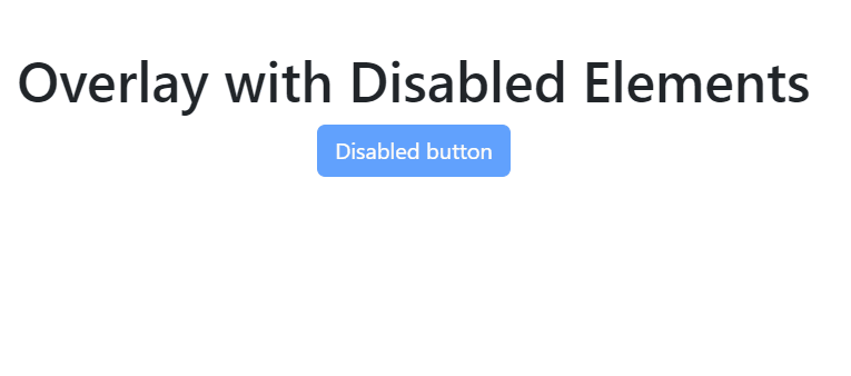
Overlay with Disabled Elements
Tooltips or popovers can also be displayed over items that are disabled. All operations, including hovering and clicking, are prevented when a component has a disabled property specified. Nonetheless, we are still able to provide a tooltip to the user.
Example: Implementation to show overaly with disabled elements .
Javascript
import Button from 'react-bootstrap/Button';
import OverlayTrigger from 'react-bootstrap/OverlayTrigger';
import Tooltip from 'react-bootstrap/Tooltip';
function OverlayDisabled() {
return (
<OverlayTrigger overlay={<Tooltip id="tooltip-disabled">Tooltip!</Tooltip>}>
<span className="d-inline-block">
<Button disabled style={{ pointerEvents: 'none' }}>
Disabled button
</Button>
</span>
</OverlayTrigger>
);
}
export default OverlayDisabled;
|
Output:
Share your thoughts in the comments
Please Login to comment...