React Bootstrap Form Check and Radios
Last Updated :
18 Jan, 2024
React-Bootstrap is a front-end framework mainly customized for React. It provides various components to build responsive and visually appealing user interfaces for react applications. Form Check and Radio components are used in handling form inputs.
Check and Radio buttons are both elements for making selections. The main difference between the two is that radio buttons are used to select one item from a list of several predefined items and checkboxes allow the user to choose items from a fixed number of alternatives.
Syntax:
import Form from 'react-bootstrap/Form';

 <Form>
          <Form.Check  type="checkbox" />
          <Form.Check  type="radio" />
</Form>
Form.Check Props:
- type: It specifies the type of the input, It can be either “checkbox“, “switch” or “radio“.
- name: It is a name of the input. This is particularly important when using radio buttons to group them together.
- label: It is a label text associated with the input.
- id: It is used to uniquely identify a element.
- value: It is used to set value of the input.
- checked: It indicates whether the input should be checked.
- disabled: It is used to disable the input field.
- inline: the input will be displayed inline with other elements.
- onChange: It is a callback function, fired when you choose checkbox or radio data.
Creating React Application And Installing Module:
Step 1: Create a React application using the following command.
npx create-react-app gfg
Step 2: After creating your project folder i.e. gfg, move to it using the following command.
cd gfg
Step 3: After creating the react application, Install the required modules using the following command.
npm install react-bootstrap bootstrap
Step 4: Add the below line in src/index.js file.
import 'bootstrap/dist/css/bootstrap.css';
Project Structure:
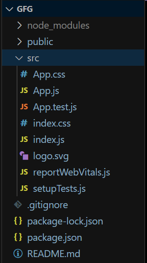
Project Structure
The updated dependencies in package.json file will look like:
"dependencies": {
    "@testing-library/jest-dom": "^5.17.0",
    "@testing-library/react": "^13.4.0",
    "@testing-library/user-event": "^13.5.0",
    "bootstrap": "^5.3.2",
    "react": "^18.2.0",
    "react-bootstrap": "^2.9.2",
    "react-dom": "^18.2.0",
    "react-scripts": "5.0.1",
    "web-vitals": "^2.1.4"
}
Example 1: In this example we will see Default Check Box and Radios.
Javascript
import { Form } from 'react-bootstrap';
import './App.css';
function App() {
return (
<div className='m-3'>
<h3>GeeksForGeeks | Default Form Check and Radios Example</h3>
{}
<div className='m-2'>
<h4>Check Box</h4>
<Form>
<label>Choose Items: </label>
<Form.Check
type="checkbox"
label="Cake" />
<Form.Check
type="checkbox"
label="Chocalate" />
<Form.Check
type="checkbox"
label="Ice Cream" />
</Form>
</div>
{}
<div className='m-2'>
<h4>Radios</h4>
<Form>
<label>Choose Gender: </label>
<Form.Check
type="radio"
label="Male"
name="Gender" />
<Form.Check
type="radio"
label="Female"
name="Gender" />
</Form>
</div>
</div>
);
}
export default App;
|
Output:
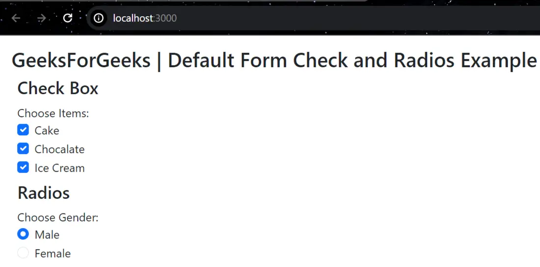
Default-Form-Check-and-Radios
Example 2: In this example we will see Inline Check Box and Radios.
Javascript
import { Form } from 'react-bootstrap';
import './App.css';
function App() {
return (
<div className='m-3'>
<h3>GeeksForGeeks | Inline Form Check and Radios Example</h3>
{}
<div className='m-2'>
<h4>Check Box</h4>
<Form>
<label>Choose Items: </label>
<Form.Check
inline
type="checkbox"
label="Item 1" />
<Form.Check
inline
type="checkbox"
label="Item 2" />
<Form.Check
inline
type="checkbox"
label="Item 3" />
</Form>
</div>
{}
<div className='m-2'>
<h4>Radios</h4>
<Form>
<label>Choose Items: </label>
<Form.Check
inline
type="radio"
label="Item 1"
name="Items" />
<Form.Check
inline
type="radio"
label="Item 2"
name="Items" />
</Form>
</div>
</div>
);
}
export default App;
|
Output:
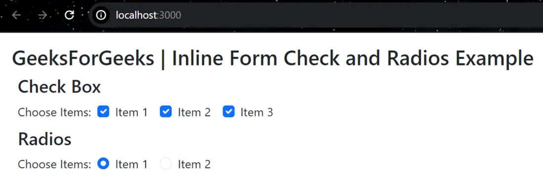
Inline-Form-Check-and-Radios
Example 3: In this example we will see Enabled and Disabled Check Box and Radios.
Javascript
import { Form } from 'react-bootstrap';
import './App.css';
function App() {
return (
<div className='m-3'>
<h3>GeeksForGeeks | Enabled and Disabled Form Check and Radios Example</h3>
{}
<div className='m-2'>
<h4>Check Box</h4>
<Form>
<label>Choose Items: </label>
<Form.Check
enabled
type="checkbox"
label="Item 1" />
<Form.Check
disabled
type="checkbox"
label="Item 2" />
</Form>
</div>
{}
<div className='m-2'>
<h4>Radios</h4>
<Form>
<label>Choose Items: </label>
<Form.Check
enabled
type="radio"
label="Item 1"
name="Items" />
<Form.Check
disabled
type="radio"
label="Item 2"
name="Items" />
</Form>
</div>
</div>
);
}
export default App;
|
Output:
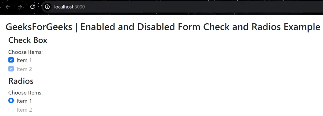
Enabled-and-Disabled-Form-Check-and-Radios
Share your thoughts in the comments
Please Login to comment...