How to make columns stack vertically on smaller screens in React Bootstrap?
Last Updated :
03 Nov, 2023
In the article, we used different components like rows, columns, etc. to display and deliver the information to the user. However, on smaller screen devices, there is an issue with the representation of these components. So, to handle the columns on the smaller screens, we can use grid classes and FlexBox classes provided by React Bootstrap.
Prerequisite:
Steps to create React App and install required modules:
Step 1: Create a React application using the following command:
npx create-react-app vertical-col
Step 2: After creating your project folder(i.e. vertical-col), move to it by using the following command:
cd vertical-col
Step 3: Now install react-bootstrap in your working directory i.e. vertical-col by executing the below command in the VScode terminal:
npm install react-bootstrap bootstrap
Step 4: Now we need to Add Bootstrap CSS to the index.js file:
import 'bootstrap/dist/css/bootstrap.min.css';
Approach 1: Using Bootstrap Grid Classes
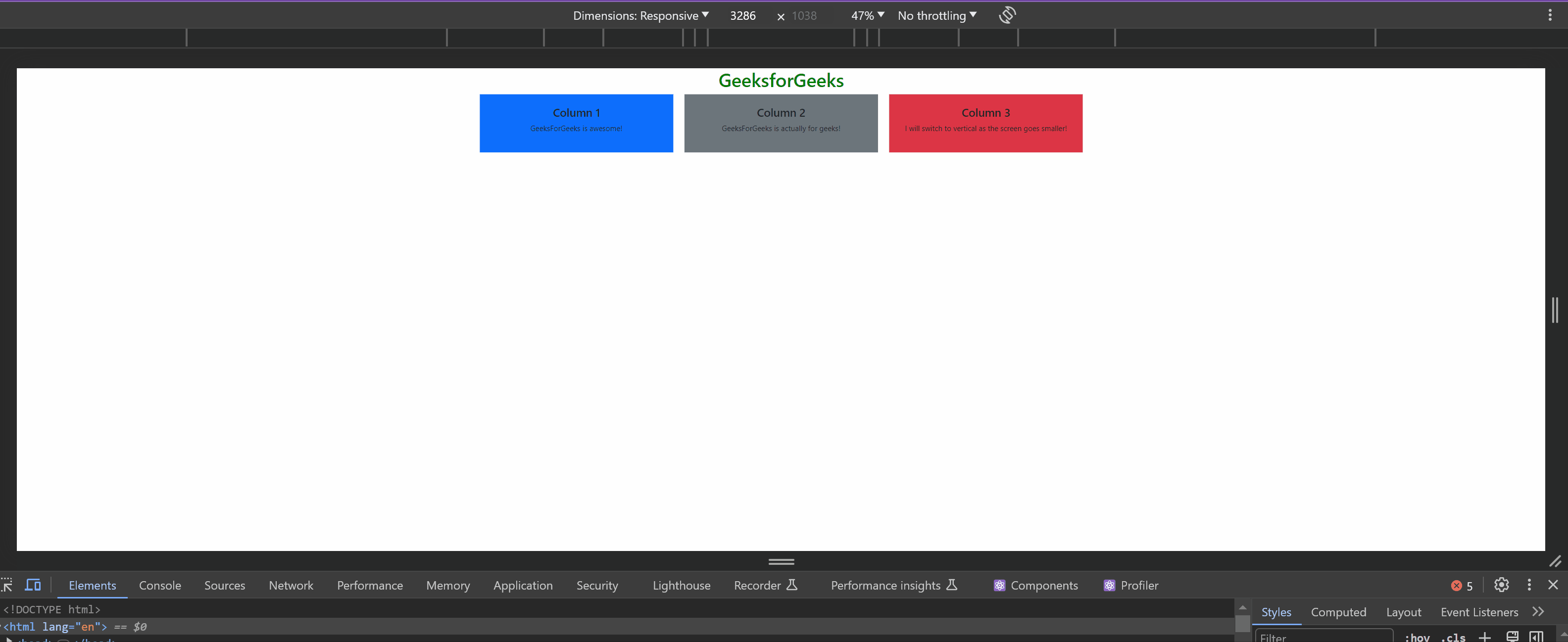
In this approach, we have created three columns with different content. Then we used React Bootstrap’s grid classes and responsive breakpoints like ‘xs’,’md’, and ‘lg’. This is mainly used to control the representation of data on various small-screen devices. On smaller screen-sized devices, we can see in the output that all the columns are aligned in a vertical stack manner. This makes the content user-friendly even on smaller screen-sized devices.
Example 1: This example implements the above-mentioned approach.
Javascript
import React from "react";
import { Container, Row, Col } from "react-bootstrap";
const App = () => {
return (
<Container>
<h1 className="text-center"
style={{ color: "green" }}>
GeeksforGeeks
</h1>
<Row>
<Col xs={12} md={6} lg={4}>
<div className="bg-primary text-center p-4">
<h4> Column 1 </h4>
<p> GeeksForGeeks is awesome!</p>
</div>
</Col>
<Col xs={12} md={6} lg={4}>
<div className="bg-secondary text-center p-4">
<h4> Column 2 </h4>
<p>GeeksForGeeks is actually for geeks!</p>
</div>
</Col>
<Col xs={12} md={12} lg={4}>
<div className="bg-danger text-center p-4">
<h4> Column 3 </h4>
<p> I will switch to vertical as the screen goes smaller!</p>
</div>
</Col>
</Row>
</Container>
);
};
export default App;
|
Output:
Approach 2: Using Flexbox Classes with React Bootstrap
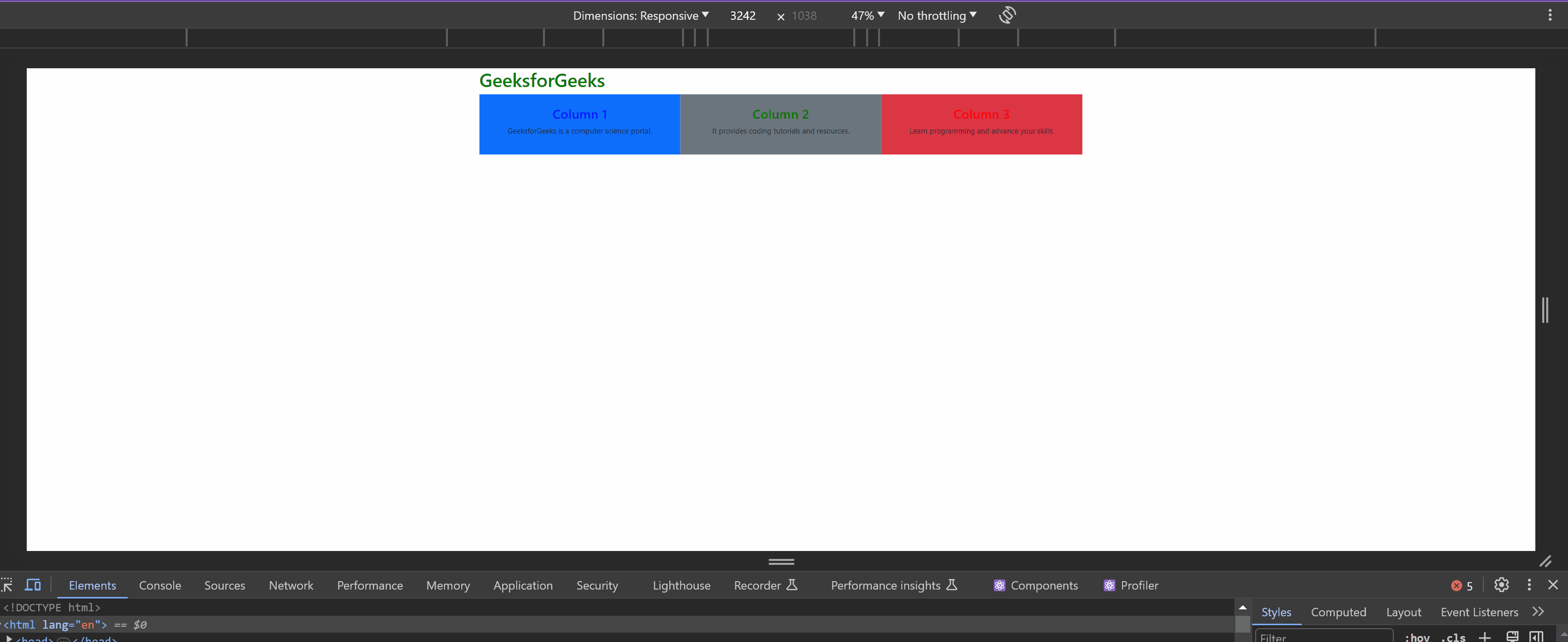
Here we will create a responsive-friendly layout using the Flexbox classes of React Bootstrap. These classes include d-flex, flex-grow-1, and the column classes (col-md-6, col-lg-4), used to create the responsive layout. Using all these classes, we can easily adjust the width and stack the columns vertically on smaller screen-sized devices. The columns are displayed horizontally on the larger screen-sized devices.
Example: This example implements the above-mentioned approach.
Javascript
import React from "react";
import { Container } from "react-bootstrap";
const App = () => {
return (
<Container>
<h1 style={{ color: "green"}}>
GeeksforGeeks
</h1>
<div className="d-flex flex-wrap">
<div className="flex-grow-1 col-md-6 col-lg-4 bg-primary p-4 text-center">
<h3 style={{ color: "blue"}}> Column 1 </h3>
<p> GeeksforGeeks is a computer science portal.</p>
</div>
<div className="flex-grow-1 col-md-6 col-lg-4 bg-secondary p-4 text-center">
<h3 style={{ color: "green", }}> Column 2 </h3>
<p> It provides coding tutorials and resources. </p>
</div>
<div className="flex-grow-1 col-md-6 col-lg-4 bg-danger p-4 text-center">
<h3 style={{ color: "red", }}> Column 3 </h3>
<p> Learn programming and advance your skills.</p>
</div>
</div>
</Container>
);
};
export default App;
|
Output:
Share your thoughts in the comments
Please Login to comment...