React Bootstrap Layout
Last Updated :
18 Jan, 2024
React Bootstrap Layout is a layout utility provided by the React Bootstrap library. They follow a stack style, where elements are arranged vertically or horizontally, creating an organized structure. These layouts are useful for building component-based designs.
In React Bootstrap there are mainly 3 components.
Creating React Application and installing dependencies:
Step 1: Run the following command to create a react app:
npx create-react-app bootstraplayout
Step 2: Migrate to that directory using:
cd bootstraplayout
Step 3 : Install the required dependencies.
npm i react-bootstrap bootstrap
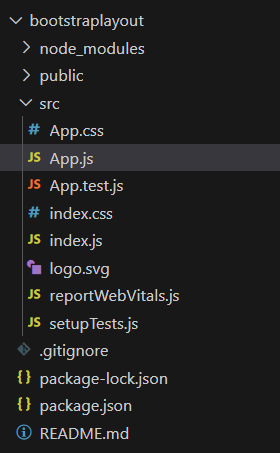
Project Structure:
The updated dependencies in package.json file will look like:
"dependencies": {
    "@testing-library/jest-dom": "^5.17.0",
    "@testing-library/react": "^13.4.0",
    "@testing-library/user-event": "^13.5.0",
    "bootstrap": "^5.3.2",
    "react": "^18.2.0",
    "react-bootstrap": "^2.9.2",
    "react-dom": "^18.2.0",
    "react-scripts": "5.0.1",
    "web-vitals": "^2.1.4"
}
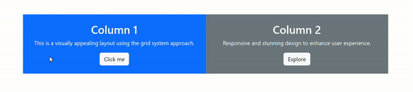
Example 1: Grid System:
It divides the layout into a 12-column grid, allowing developers to allocate different column widths for various screen sizes. To use the grid system, simply import the Container, Row, and Col components from ‘react-bootstrap’ and structure your layout accordingly.
Javascript
import React from 'react';
import { Container, Row, Col, Button } from 'react-bootstrap';
import 'bootstrap/dist/css/bootstrap.min.css';
import './App.css';
function App() {
return (
<Container className="text-center my-5">
<Row>
<Col md={6} className="bg-primary text-white p-4">
<h2>Column 1</h2>
<p>This is a visually appealing layout using the grid system approach.</p>
<Button variant="light">Click me</Button>
</Col>
<Col md={6} className="bg-secondary text-white p-4">
<h2>Column 2</h2>
<p>Responsive and stunning design to enhance user experience.</p>
<Button variant="light">Explore</Button>
</Col>
</Row>
</Container>
);
}
export default App;
|
Output:
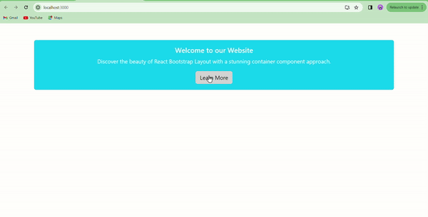
Example 2: Container Component:
The Container component provides a wrapper for your layout, ensuring a consistent and responsive width. Import the Container component and wrap your content inside it. This ensures that your content is displayed within a well-defined space, adapting to different devices seamlessly.
Javascript
import React from 'react';
import { Container, Card, Button } from 'react-bootstrap';
import 'bootstrap/dist/css/bootstrap.min.css';
import './App.css';
function App() {
return (
<Container className="text-center my-5">
<Card bg="info" text="white">
<Card.Body>
<Card.Title>Welcome to our Website</Card.Title>
<Card.Text>
Discover the beauty of React Bootstrap Layout with a stunning container component approach.
</Card.Text>
<Button variant="light">Learn More</Button>
</Card.Body>
</Card>
</Container>
);
}
export default App;
|
Output:
Example 3: Flexbox Utilities:
Flexbox utilities offer a powerful way to control the alignment and distribution of elements within a layout. By applying utility classes such as d-flex and justify-content-between, you can easily customize the positioning of elements.
Javascript
import React from 'react';
import { Container } from 'react-bootstrap';
import 'bootstrap/dist/css/bootstrap.min.css';
import './App.css';
function App() {
return (
<Container className="d-flex justify-content-around align-items-center flex-wrap my-5">
<div className="bg-success text-white p-3 m-2">Element 1</div>
<div className="bg-warning text-dark p-3 m-2">Element 2</div>
<div className="bg-danger text-white p-3 m-2">Element 3</div>
<div className="bg-info text-white p-3 m-2">Element 4</div>
</Container>
);
}
export default App;
|
Step 4 :Run the above code using following:
npm start
Output: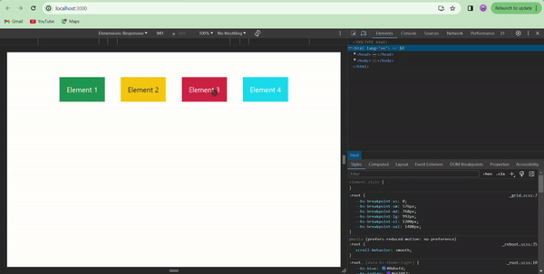
Share your thoughts in the comments
Please Login to comment...