How to Create a Responsive CSS Grid Layout ?
Last Updated :
13 Mar, 2024
A grid layout is said to be responsive when fixed-sized grid items will shift position according to the viewport size. Responsiveness gives more professional look to the website. It is necessary to out perform your website design. we are going to learn how can we create a responsive CSS grid layout.
These are the following approaches:
Using “auto-fill” property
This approach utilizes CSS Grid to create a responsive grid layout. The grid-template-columns property, with repeat(auto-fill, minmax(200px, 1fr)), dynamically adjusts the number of columns based on available space, ensuring each column maintains a minimum width of 200 pixels while stretching to fill any remaining space equally. grid-gap: 10px; sets the gap between grid items. Styling is applied to the grid items using .grid > div { … }, specifying properties like font size, padding, text color, and background color. This approach provides a flexible grid structure that adapts to various screen sizes, making it suitable for responsive web design. The HTML structure includes a container with the class grid and multiple div elements representing grid items. Overall, this approach offers an efficient and straightforward method for creating responsive grid layouts in web development.
Example: This example shows the responsive CSS grid layout.
HTML
                    <!DOCTYPE html>
<html>

<head>
    <title> Responsive grid with auto-fill</title>
    <style>
        .grid {
            display: grid;
            grid-template-columns: repeat(auto-fill,
              minmax(200px, 1fr));
            grid-gap: 10px
        }

        .grid>div {
            font-size: 20px;
            padding: 1rem;
            color: yellow;
            text-align: center;
            background: red;
        }
    </style>
</head>

<body>
    <div class="grid">
        <div> Div 1</div>
        <div>Div 2</div>
        <div>Div 3</div>
        <div>Div 4</div>
        <div>Div 5</div>
        <div>Div 6</div>
        <div>Div 7</div>
        <div>Div 8</div>
    </div>


</body>

</html>
Output:
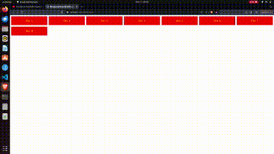
Output gif
Using both “auto-fill” and “auto-fit”
This approach provides flexibility in creating responsive grid layouts, allowing developers to choose between filling the space with fixed-width columns (auto-fill) or adjusting column widths to fit the container (auto-fit).The .auto-fill and .auto-fit classes are used to control the behavior of the grid columns. .auto-fill creates as many columns as possible with a minimum width of 200 pixels, while .auto-fit ensures that the columns fit snugly within the container, expanding or contracting as needed.
Example: This example shows the responsive CSS grid layout.
HTML
                    <!DOCTYPE html>
<html>

<head>
    <title> Responsive grid
      with auto-fill</title>
    <style>
        .grid {
            display: grid;
            margin: 8px;
            grid-gap: 10px
        }

        .grid>div {
            font-size: 20px;
            padding: 1rem;
            color: yellow;
            text-align: center;
            background: red;
        }

        .auto-fit {
            grid-template-columns: repeat(auto-fit,
                    minmax(200px, 1fr));
        }

        .auto-fill {
            grid-template-columns: repeat(auto-fill,
                    minmax(200px, 1fr));
        }
    </style>
</head>

<body>

    <div class="grid auto-fill">
        <div>Div 1</div>
        <div>Div 2</div>

    </div>

    <div class="grid auto-fit">
        <div>Div 1</div>
        <div>Div 2</div>

    </div>


</body>

</html>
Output:
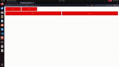
Output gif
This approach uses media query to create a responsive webpage layout. The .wrapper class defines the overall grid container with specified grid areas for header, sidebar, content, and footer. Media queries are used to adjust the layout based on screen width: for small screens, the layout is single-column with the header, sidebar, content, and footer stacked vertically; for medium screens, it transitions to a two-column layout with the sidebar and content beside each other and the header and footer spanning both columns. Each grid area is styled accordingly using .box class, with specific colors and padding. The HTML structure contains div elements with corresponding classes to populate the grid areas. This approach offers flexibility and responsiveness to different screen sizes while maintaining a structured layout.
Example: This example shows the responsive CSS grid layout by using media query.
HTML
                    <!DOCTYPE html>
<html>

<head>
    <title>Title of the document</title>
    <style>
        body {
            margin: 40px;
        }

        .sidebar {
            grid-area: sidebar;
        }

        .content {
            grid-area: content;
        }

        .header {
            grid-area: header;
        }

        .footer {
            grid-area: footer;
        }

        .wrapper {
            background-color: #eeeeee;
            color: #444;
            padding: 10px;
            margin: auto;
            display: grid;
            grid-gap: 1em;
            grid-template-areas:
                "header" "sidebar" "content" "footer";
        }

        @media only screen and (min-width: 500px) {
            .wrapper {
                grid-template-columns: 20% auto;
                grid-template-areas:
                    "header   header" "sidebar  content" "footer   footer";
            }
        }

        @media only screen and (min-width: 600px) {
            .wrapper {
                grid-gap: 20px;
                grid-template-columns: 120px auto;
                grid-template-areas:
                    "header  header" "sidebar content" "footer  footer";
                max-width: 600px;
            }
        }

        .box {
            background-color: #444;
            color: #ffffff;
            border-radius: 5px;
            padding: 10px;
            font-size: 20px;
        }

        .header,
        .footer {
            background-color: blue;
        }

        .sidebar {
            background-color: #ccc;
            color: #444;
        }

        .content {
            background: rgb(16, 160, 179);
        }
    </style>
</head>

<body>
    <div class="wrapper">
        <div class="box header">Header</div>
        <div class="box sidebar">Sidebar</div>
        <div class="box content">
            Content

        </div>
        <div class="box footer">Footer</div>
    </div>
</body>

</html>
Output:
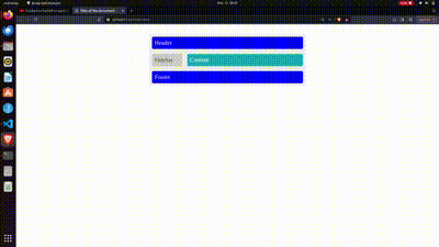
Output gif
Share your thoughts in the comments
Please Login to comment...