Angular MDBootstrap Grid System Layout
Last Updated :
07 Mar, 2022
MDBootstrap is a Material Design and bootstrap-based Angular UI library that is used to make good looking webpages with its seamless and easy-to-use component. In this article, we will know how to use Tooltips Component in Angular MDBootstap. Grid System Layout is a great tool for creating layouts that are optimized for mobile devices. Bootstrap’s grid system uses a series of containers, rows, and columns to layout and align content. we can define column size as ‘xs’, ‘sm’, ‘md’, ‘xl’ , and ‘xxl’. Basically, grid system layout built with flexbox which makes it fully responsive. It’s a powerful tool with a lot of features.
Syntax:
<div class="container">
  <div class="row">
    <div>
      GeeksforGeeks
    </div>
  </div>
</div>
Approach:
npm install
or
npm install -y
- After creating your project folder i.e. appname, move to it using the following command:
cd appname
- Start the server using the following command:
ng serve
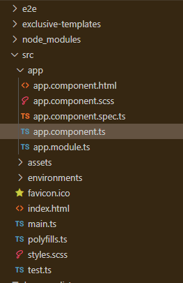
Project Structure: After complete installation, it will look like the following:
Example 1: This is the basic example that illustrates how to use the Grid System Layout.
app.component.html
<div id='gfg'>
<h2>GeeksforGeeks</h2>
<h4>Angular MDBootstrap Grid System Component</h4>
<br />
<div class="container">
<div class="row">
<div class="col-sm bg-danger rounded m-3">
GeeksforGeeks
</div>
<div class="col-sm bg-warning rounded m-3">
GeeksforGeeks
</div>
<div class="col-sm bg-success rounded m-3">
GeeksforGeeks
</div>
</div>
</div></div>
|
app.component.ts
import { Component } from '@angular/core';
@Component({
selector: 'app-root',
templateUrl: './app.component.html',
styleUrls: ['./app.component.css']
})
export class AppComponent { }
|
app.module.ts
import { BrowserModule } from '@angular/platform-browser';
import { NgModule } from '@angular/core';
import { BrowserAnimationsModule } from
'@angular/platform-browser/animations';
import { AppComponent } from './app.component';
import { MDBBootstrapModule } from 'angular-bootstrap-md';
import { FormsModule } from '@angular/forms';
@NgModule({
declarations: [
AppComponent
],
imports: [
BrowserModule,
BrowserAnimationsModule,
MDBBootstrapModule.forRoot(),
FormsModule,
],
providers: [],
bootstrap: [AppComponent]
})
export class AppModule { }
|
Output:

Example 2: In this example, we will know how to add rows of different width.
app.component.html
<div id='gfg'>
<h2>GeeksforGeeks</h2>
<h4>Angular MDBootstrap Grid System Component</h4>
<br />
<div class="container">
<div class="row">
<div class="col-sm bg-danger rounded m-3">
One of the 2
</div>
<div class="col-sm bg-warning rounded m-3">
One of the 2
</div>
</div>
<div class="row">
<div class="col-sm bg-success rounded m-3">
One of the 3
</div>
<div class="col-sm bg-secondary rounded m-3">
One of the 3
</div>
<div class="col-sm bg-info rounded m-3">
One of the 3
</div>
</div>
<div class="row">
<div class="col-sm bg-light rounded m-3">
One of the 4
</div>
<div class="col-sm bg-dark text-light rounded m-3">
One of the 4
</div>
<div class="col-sm bg-primary rounded m-3">
One of the 4
</div>
<div class="col-sm bg-warning rounded m-3">
One of the 4
</div>
</div>
</div>
</div>
|
app.component.ts
import { Component } from '@angular/core';
@Component({
selector: 'app-root',
templateUrl: './app.component.html',
styleUrls: ['./app.component.css']
})
export class AppComponent { }
|
app.module.ts
import { BrowserModule } from '@angular/platform-browser';
import { NgModule } from '@angular/core';
import { BrowserAnimationsModule } from
'@angular/platform-browser/animations';
import { AppComponent } from './app.component';
import { MDBBootstrapModule } from 'angular-bootstrap-md';
import { FormsModule } from '@angular/forms';
@NgModule({
declarations: [
AppComponent
],
imports: [
BrowserModule,
BrowserAnimationsModule,
MDBBootstrapModule.forRoot(),
FormsModule,
],
providers: [],
bootstrap: [AppComponent]
})
export class AppModule { }
|
Output:

Reference: https://mdbootstrap.com/docs/angular/layout/grid-usage/
Like Article
Suggest improvement
Share your thoughts in the comments
Please Login to comment...