How To Show Mean Value in Boxplots with ggplot2?
Last Updated :
10 Oct, 2021
In this article, we will discuss how to show mean value in Boxplot with ggplot2 using R programming language.
Firstly, we will create a basic boxplot using the geom_boxplot() function of the ggplot2 package and then do the needful, so that the difference is apparent.
Syntax:
ggplot() + geom_boxplot()
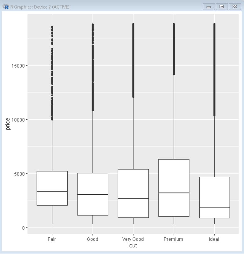
Example: Basic boxplot
R
library(tidyverse)
library(ggplot2)
ggplot(diamonds, aes(x=cut, y=price)) +
geom_boxplot()
|
Output:
In order to show mean values in boxplot using ggplot2, we use the stat_summary() function to compute new summary statistics and add them to the plot. We use stat_summary() function with ggplot() function.
Syntax:
stat_summary(mapping = NULL, data = NULL, geom = “pointrange”, position = “identity”, color=”value”, shape=”value”,…)
Example: Adding mean value to boxplot
R
library(ggplot2)
library(tidyverse)
ggplot(diamonds, aes(x=cut, y=price)) +
geom_boxplot() +
stat_summary(fun.y="mean")
|
Output:
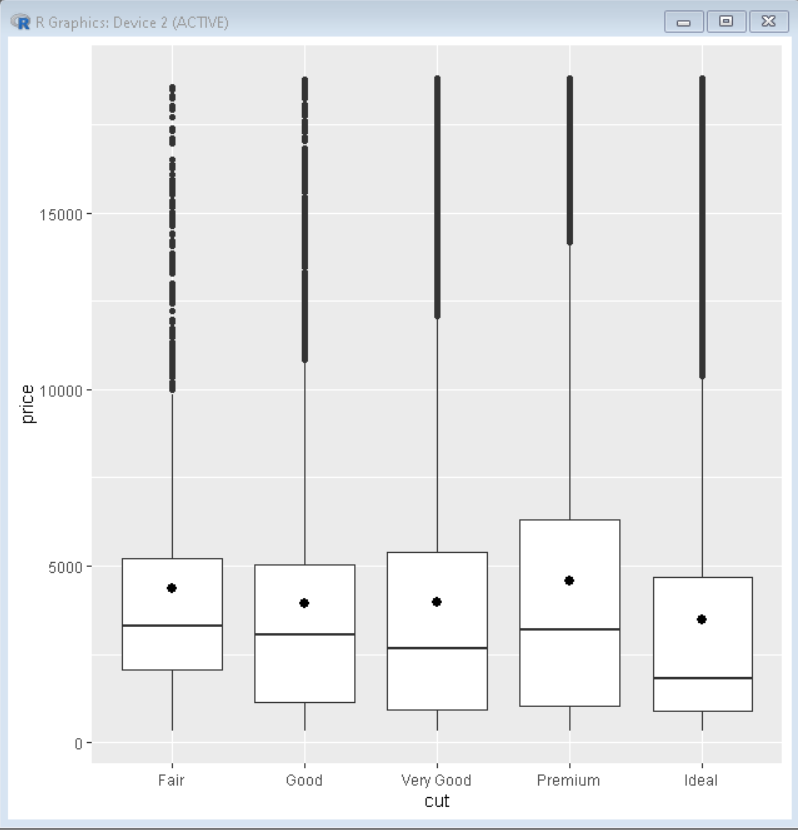
In the output produced above, the point in the center of the boxplot shows the variation of the mean of the y-axis for each category of data on the x-axis.
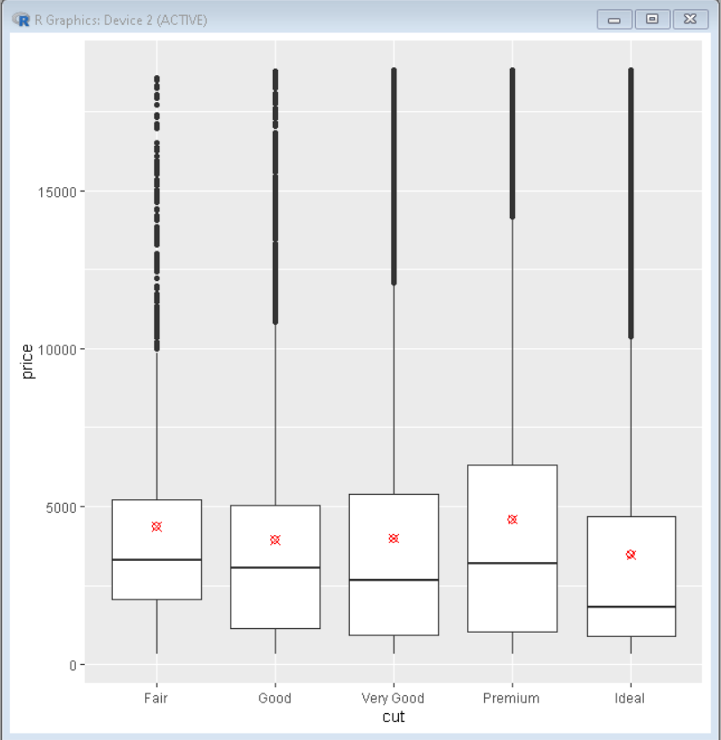
We can also change the color and shape of the mean mark using the color and shape parameter of the stat_summary() function. This helps us visualize the data better by distinguishing the mark from other symbols.
Example: Customizing added mean values
R
library(tidyverse)
library(ggplot2)
ggplot(diamonds, aes(x=cut, y=price)) +
geom_boxplot() +
stat_summary(fun.y="mean",color="red", shape=13)
|
Output:
Like Article
Suggest improvement
Share your thoughts in the comments
Please Login to comment...