React Chakra UI Media and icons
Last Updated :
02 Apr, 2024
React Chakra UI Media and Icons component is tailored for managing media content and displaying icons and images. Chakra UI provides a set of commonly used interface icons you can use in your websites or apps. It helps the user provide a better user experience by identifying functionalities by looking at the media and icons images for hovering and helps the process work faster by just looking at them.
ReactJS Chakra UI provides multiple ways of using media icons as mentioned below.
Prerequisites:
By using the Chakra UI icon library
Approach:
We created the basic app having All Icons from the Chakra UI Icons library and placed it on the component for our understanding. We have also shown how to use a third-party icon library and use them in different components by importing them. The user can also create custom icons using the createIcon() function and Icon component. We have used a few selected icons to learn their usage for implementation, the developer can include other icons as per the need.
Steps to Create the React Application And Installing Module:
Step 1: Create a React application using the following command:
npx create-react-app my-icon-app
Step 2: After creating your project folder(i.e. my-icon-app), move to it by using the following command:
cd my-icon-app
Step 3: After creating the React application, Install the required package using the following command:
npm i @chakra-ui/react @emotion/react@^11 @emotion/styled@^11 framer-motion@^6
npm i @chakra-ui/icons
Project Structure:
The updated dependencies in the package.json file.
"dependencies": {
    "@chakra-ui/react": "^2.8.2",
   "@chakra-ui/icons": "^2.1.1",
    "@emotion/react": "^11.11.1",
    "@emotion/styled": "^11.11.0",
    "@testing-library/jest-dom": "^5.17.0",
    "@testing-library/react": "^13.4.0",
    "@testing-library/user-event": "^13.5.0",
    "framer-motion": "^6.5.1",
    "react": "^18.2.0",
    "react-dom": "^18.2.0",
    "react-scripts": "5.0.1",
    "web-vitals": "^2.1.4"
}
Example: Write down the code in respective files. The user can use any number of icons and their respective component names, we have used some of them for a basic understanding.
JavaScript:
Javascript
import { ChakraProvider, Text,
Flex, Box} from "@chakra-ui/react";
import { PhoneIcon,
AddIcon,
CalendarIcon,
AtSignIcon,
ChatIcon,
AttachmentIcon,
CheckIcon,CloseIcon,
EditIcon,ExternalLinkIcon,
RepeatIcon,SearchIcon
} from '@chakra-ui/icons'
import "./App.css";
function App() {
return (
<ChakraProvider>
<Text
color="#2F8D46"
fontSize="2rem"
textAlign="center"
fontWeight="600"
my="1rem"
>
GeeksforGeeks - ReactJS Concepts
</Text>
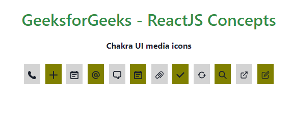
<h3><b>Chakra UI media icons</b></h3>
<br/>
<Flex direction="row" justifyContent="space-around">
<a href="#">
<Box width="100%" bg="lightgrey" p={2}>
<PhoneIcon />
</Box>
</a>
<a href="#">
<Box width="100%" bg="olive" p={2}>
<AddIcon/></Box>
</a>
<a href="#">
<Box width="100%" bg="lightgrey" p={2}>
<CalendarIcon />
</Box>
</a>
<a href="#">
<Box width="100%" bg="olive" p={2}>
<AtSignIcon/>
</Box>
</a>
<a href="#">
<Box width="100%" bg="lightgrey" p={2}>
<ChatIcon />
</Box>
</a>
<a href="#">
<Box width="100%" bg="olive" p={2}>
<CalendarIcon />
</Box>
</a>
<a href="#">
<Box width="100%" bg="lightgrey" p={2}>
<AttachmentIcon/></Box>
</a>
<a href="#">
<Box width="100%" bg="olive" p={2}>
<CheckIcon /></Box>
</a>
<a href="#">
<Box width="100%" bg="lightgrey" p={2}>
<RepeatIcon /></Box>
</a>
<a href="#">
<Box width="100%" bg="olive" p={2}>
<SearchIcon/></Box>
</a>
<a href="#">
<Box width="100%" bg="lightgrey" p={2}>
<ExternalLinkIcon /></Box>
</a>
<a href="#">
<Box width="100%" bg="olive" p={2}><EditIcon /></Box>
</a>
</Flex>
</ChakraProvider>
);
}
export default App;
Output:
By using a third-party icon library
Example 2: The following code demonstrates the usage of third party icons. Import the Icon component from @chakra-ui/react
npm install react-icons --save
Write the codes in the respective files. In the “ThirdPartyIcon.js” file, we are importing only some of the thrid party icons like Flat color Icons,Bootstrap icons,Ant Design Icons, Box Icons, Game Icons, Material Design Icons. The developer can choose to include any other third party icons and use them as per the need.
Javascript
import { ChakraProvider, Text,
         Flex, Box} from "@chakra-ui/react";
import IconApp from "./ThirdPartyIcon";

import "./App.css";

function App() {
    return (
        <ChakraProvider>
            <Text
                color="#2F8D46"
                fontSize="2rem"
                textAlign="center"
                fontWeight="600"
                my="1rem"
            >
                GeeksforGeeks - ReactJS Concepts
            </Text>
            <h3><b>Chakra UI Third Party icons</b></h3>
            <br/>
            <IconApp />

        </ChakraProvider>
    );
}
export default App;
// Filename - ThirdPartyIcon.js

 import { Icon, Flex,Box } from "@chakra-ui/react";

import { FcCallTransfer,FcBarChart } from 'react-icons/fc';
import { Bs8CircleFill, BsAlarmFill } from "react-icons/bs";
import { AiFillBank,AiFillAlert } from "react-icons/ai";
import { BiAddToQueue,BiAlarm } from "react-icons/bi";
import { Gi3DStairs,Gi3DGlasses } from "react-icons/gi";
import { Md10K,Md123 } from "react-icons/md";


function IconApp() {
    return (

        <Flex direction="row" justifyContent="space-around">

                <a href="#">
                    <Box width="100%"
                    bg="lightgrey"
                    p={2}><FcBarChart /></Box>
                </a>
                <a href="#">
                    <Box width="100%" bg="olive"
                    p={2}><FcCallTransfer/>
                    </Box>
                </a>
                <a href="#">
                    <Box width="100%" bg="lightgrey"
                         p={2}><Bs8CircleFill />
                    </Box>
                </a>
                <a href="#">
                    <Box width="100%" bg="olive"
                         p={2}><BsAlarmFill/>
                     </Box>
                </a>
                <a href="#">
                    <Box width="100%" bg="lightgrey"
                         p={2}><AiFillBank />
                    </Box>
                </a>
                <a href="#">
                    <Box width="100%" bg="olive"
                         p={2}><AiFillAlert />
                    </Box>
                </a>
                <a href="#">
                    <Box width="100%" bg="lightgrey"
                         p={2}><BiAddToQueue/>
                    </Box>
                </a>
                <a href="#">
                    <Box width="100%" bg="olive"
                        p={2}><BiAlarm />
                     </Box>
                </a>
                <a href="#">
                    <Box width="100%" bg="lightgrey"
                         p={2}><Gi3DGlasses />
                    </Box>
                </a>
                <a href="#">
                    <Box width="100%" bg="olive" p={2}>
                         <Gi3DStairs/>
                     </Box>
                </a>
                <a href="#">
                    <Box width="100%" bg="lightgrey"
                         p={2}><Md10K />
                     </Box>
                </a>
                <a href="#">
                    <Box width="100%" bg="olive"
                         p={2}><Md123 />
                    </Box>
                </a>
            </Flex>
    );
}
export default IconApp;
Output:

By using your own created icons.
Example 3: The following code demonstrates to create your own custom icons. This also use the Icon component and createIcon() function for creating own custom icons as desired.
Javascript
import {
         ChakraProvider, Text,
         Flex, Box
       } from "@chakra-ui/react";

import MyIcon from "./CustomIcons";
import CircleIcon from "./CircleIcon";

import "./App.css";

function App() {
    return (
        <ChakraProvider>
            <Text
                color="#2F8D46"
                fontSize="2rem"
                textAlign="center"
                fontWeight="600"
                my="1rem"
            >
                GeeksforGeeks - ReactJS Concepts
            </Text>
            <h3><b>Chakra UI Create Custom icons</b></h3>
            <br/>
            <CircleIcon />
            <MyIcon />
        </ChakraProvider>
    );
}
export default App;
// Filename - CircleIcon.js

import { Icon } from "@chakra-ui/react";

const CircleIcon = () => (
    <Icon viewBox='0 0 200 200'
       boxSize={10}  color='green.500'>
      <path
        fill='currentColor'
        d='M 100, 100 m -75, 0 a 75,75
         0 1,0 150,0 a 75,75 0 1,0 -150,0'
      />

    </Icon>
)

  export default CircleIcon;
// Filename - CustomsIcons.js

import { Icon, createIcon }
from "@chakra-ui/react";


 const MyIcon = createIcon({
    displayName: 'myIcon',
    viewBox: '0 0 200 200',
    d: 'M 100, 100 m -75, 0 a
     75,75 0 1,0 150,0 a 75,75 0 1,0 -150,0',
  })

  export default MyIcon;
Output:

Share your thoughts in the comments
Please Login to comment...