React Chakra UI Data Display Tag
Last Updated :
15 Feb, 2024
React Chakra UI Data Display Tag is a powerful and versatile component designed to simplify the presentation of data within React applications and mainly used for items that need to be labeled, categorized, or organized using keywords that describe them. With its intuitive design and customization options, this tag seamlessly integrates into Chakra UI, a popular React component library, enabling developers to display data efficiently and effectively.
Prerequisites:
Approach:
We will build different types of Data Display Tag using Chakra UI with React. We will be using components like Tag, TagLabel, TagLeftIcon, TagRightIcon, TagCloseButton, and so on with different size and style properties and the following given example.
Steps to Create the Project:
Step 1: Create a React application using the following command:
npx create-react-app gfg
Step 2: After creating your project folder(i.e. my-app), move to it by using the following command:
cd gfg
Step 3: After creating the React application, Install the required package using the following command:
npm i @chakra-ui/react @emotion/react@^11 @emotion/styled@^11 framer-motion@^6
Step 4: After that we will install the Chakra UI Icon Library using the following command:
npm i @chakra-ui/icons
Project Structure:
Project Structure
The updated dependencies in package.json will look like this:
"dependencies": {
    "@chakra-ui/icons": "^2.1.1",
    "@chakra-ui/react": "^2.8.2",
    "@emotion/react": "^11.11.3",
    "@emotion/styled": "^11.11.0",
    "@testing-library/jest-dom": "^5.17.0",
    "@testing-library/react": "^13.4.0",
    "@testing-library/user-event": "^13.5.0",
    "framer-motion": "^11.0.3",
    "react": "^18.2.0",
    "react-dom": "^18.2.0",
    "react-scripts": "5.0.1",
    "web-vitals": "^2.1.4"
}
Example: Below is the basic example of the Chakra UI Data Display Tag:
Javascript
import React from 'react';
import { ChakraProvider, Box, Text, HStack, Avatar }
from '@chakra-ui/react';
import { AddIcon, SettingsIcon } from '@chakra-ui/icons';
import {
Tag,
TagLabel,
TagLeftIcon,
TagRightIcon,
TagCloseButton,
} from '@chakra-ui/react'
function App() {
return (
<ChakraProvider>
<Text
color="#2F8D46"
fontSize="2rem"
textAlign="center"
fontWeight="400"
my="1rem">
GeeksforGeeks - React JS Chakra UI concepts
</Text>
<Box w="40%" mx="auto">
<Text fontSize="xl"
fontWeight="bold" mb="2">
Simple Tag Sample
</Text>
<HStack spacing={4} mb="2rem">
{['sm', 'md', 'lg'].map((size) => (
<Tag size={size} key={size} variant='solid' colorScheme='teal'>
Teal
</Tag>
))}
</HStack>
<Text fontSize="xl"
fontWeight="bold" mb="2">
Tag With Left Icons
</Text>
<HStack spacing={4} mb="2rem">
{['sm', 'md', 'lg'].map((size) => (
<Tag size={size} key={size} variant='subtle'
colorScheme='cyan'>
<TagLeftIcon boxSize='12px' as={AddIcon} />
<TagLabel>Cyan</TagLabel>
</Tag>
))}
</HStack>
<Text fontSize="xl"
fontWeight="bold" mb="2">
Tag with Right Icons
</Text>
<HStack spacing={4} mb="2rem">
{['sm', 'md', 'lg'].map((size) => (
<Tag size={size} key={size} variant='outline'
colorScheme='blue'>
<TagLabel>Blue</TagLabel>
<TagRightIcon as={SettingsIcon} />
</Tag>
))}
</HStack>
<Text fontSize="xl"
fontWeight="bold" mb="2">
Tag with Close Button
</Text>
<HStack spacing={4} mb="2rem">
{['sm', 'md', 'lg'].map((size) => (
<Tag
size={size}
key={size}
borderRadius='full'
variant='solid'
colorScheme='green'
>
<TagLabel>Green</TagLabel>
<TagCloseButton />
</Tag>
))}
</HStack>
<Text fontSize="xl"
fontWeight="bold" mb="2">
Chakra UI Custom Tag Element
</Text>
<Tag size='lg' colorScheme='red' borderRadius='full'>
<Avatar
src=
size='xs'
name='GFG'
ml={-1}
mr={2}
/>
<TagLabel>GeeksForGeeks</TagLabel>
</Tag>
</Box>
</ChakraProvider>
);
}
export default App;
|
Steps to run the application:
npm start
Output:
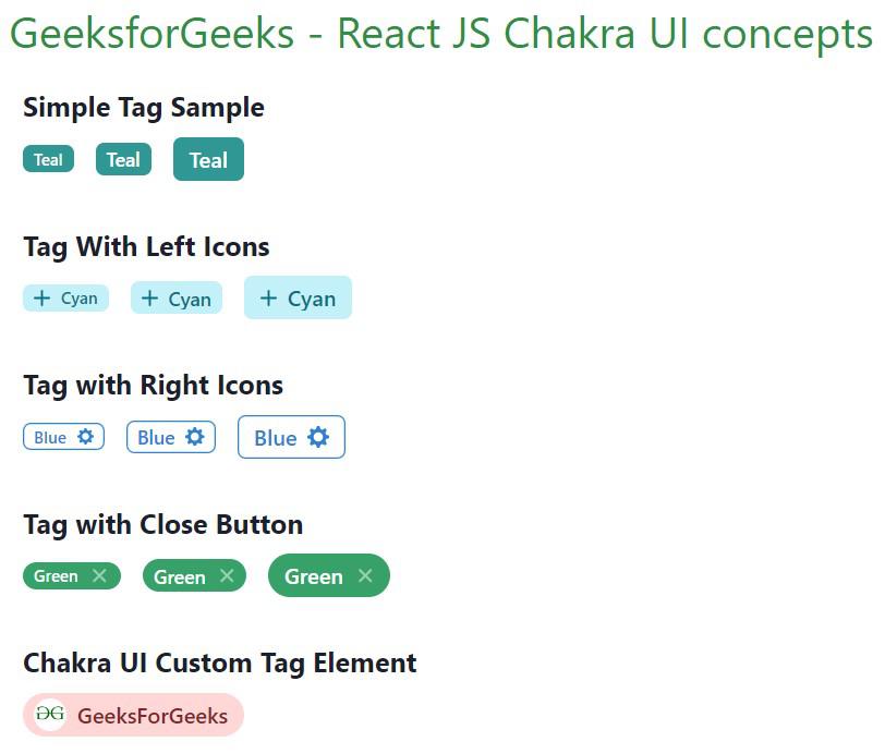
Chakra UI Data Display Tag
Share your thoughts in the comments
Please Login to comment...