Create an Animated Social Media Icons in React and Tailwind CSS
Last Updated :
04 Mar, 2024
Adding animated social media icons using React and Tailwind CSS improves user experience by enhancing functionality and visual appeal. The icons will have a smooth and appealing animation, making them visually engaging for users.
Output Preview:Let us have a look at how the final output will look like.
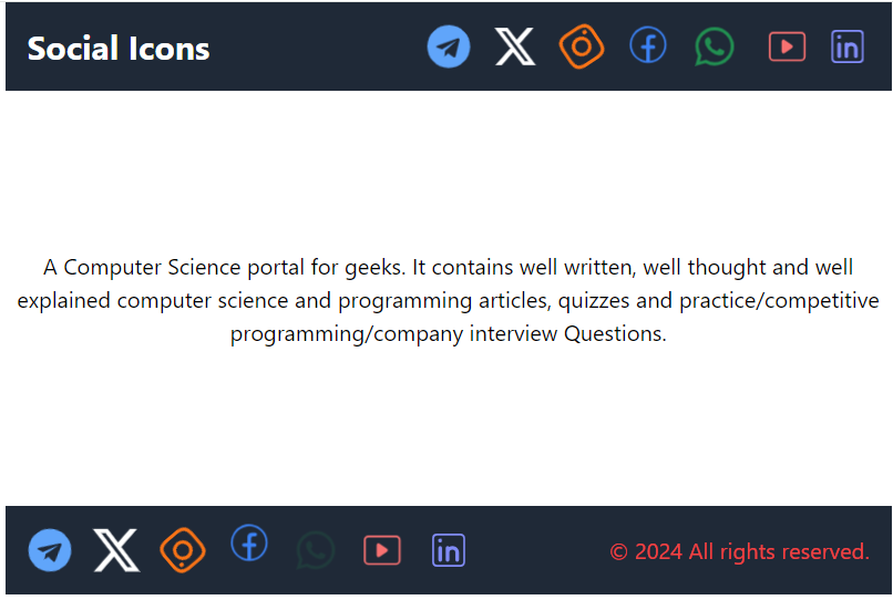
Preview
Approach to Create Animated Social Media Icons:
- Create separate React elements for each social media icon, enhancing code organization.
- Utilize the “react-icons” library to easily integrate a variety of social media icons into the component.
- Integrate Tailwind CSS for efficient styling and animations, using pre-defined classes for quick customization.
- Implement hover effects using CSS to enhance user interaction upon cursor hover.
- Ensure responsiveness across devices by utilizing Tailwind CSS for design and layout.
Steps to Create Animated Social Media Icons
Step 1: Create a new React JS project using the following command
npx create-react-app animated
cd animated
Step 2: Install Tailwind CSS
npm install tailwindcss
npx tailwindcss init -p
Step 3: Configure Tailwind CSS
Add Tailwind CSS to your src/index.css file:
@tailwind base;
@tailwind components;
@tailwind utilities;
Step 4: Modify tailwind.config.js file:
module.exports = {
  content: [
    "./src/**/*.{js,jsx,ts,tsx}",
  ],
  theme: {
    extend: {},
  },
  plugins: [],
}
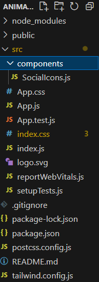
Folder Structure:
The updated dependencies in package.json file will look like:
"dependencies": {
    "@testing-library/jest-dom": "^5.17.0",
    "@testing-library/react": "^13.4.0",
    "@testing-library/user-event": "^13.5.0",
    "react": "^18.2.0",
    "react-dom": "^18.2.0",
    "react-icons": "^5.0.1",
    "react-scripts": "5.0.1",
    "tailwindcss": "^3.4.1",
    "web-vitals": "^2.1.4"
}
Example: Illustration of Animated Social Media Icons in React and Tailwind CSS
CSS
body {
margin: 0;
font-family: -apple-system, BlinkMacSystemFont,
'Segoe UI', 'Roboto', 'Oxygen',
'Ubuntu', 'Cantarell', 'Fira Sans',
'Droid Sans', 'Helvetica Neue',
sans-serif;
-webkit-font-smoothing: antialiased;
-moz-osx-font-smoothing: grayscale;
}
@tailwind base;
@tailwind components;
@tailwind utilities;
|
CSS
.icon {
font-size: 2rem;
transition: all 1.5s ease-out;
cursor: pointer;
}
.h-300 {
height: 300px;
}
.animation-stopped .icon {
animation-play-state: paused;
}
.animation-stopped .icon:hover {
animation-play-state: running;
}
.icon:hover {
transition: all 0.3s ease-in;
&.whatsapp {
filter: drop-shadow(0px 0px 10px green);
}
&.fb {
filter: drop-shadow(0px 0px 10px blue);
}
&.twitter {
filter: drop-shadow(0px 0px 10px white);
}
&.insta {
filter: drop-shadow(0px 0px 10px yellow);
}
&.telegram {
filter: drop-shadow(0px 0px 10px #3390ec);
}
&.youtube {
filter: drop-shadow(0px 0px 10px #ff0000);
}
&.linkedin {
filter: drop-shadow(0px 0px 10px #0077b5);
}
}
@media screen and (max-width:500px) {
header>div {
flex-wrap: wrap;
}
.icon {
font-size: 1.5rem;
}
footer>div {
flex-wrap: wrap;
}
}
.swing-animation {
animation: swingAnimation 1s ease-in-out infinite;
}
.pulse-animation {
animation: pulseAnimation 1s linear infinite;
}
.rotate-animation {
animation: rotateAnimation 1s linear infinite;
}
.bounce-animation {
animation: bounceAnimation 1s ease-in-out infinite;
}
.flash-animation {
animation: flashAnimation 1s linear infinite;
}
.shake-animation {
animation: shakeAnimation 1s ease-in-out infinite;
}
.flip-animation {
animation: flipAnimation 1s ease-in-out infinite;
}
@keyframes swingAnimation {
0% {
transform: rotate(0deg);
}
50% {
transform: rotate(15deg);
}
100% {
transform: rotate(0deg);
}
}
@keyframes pulseAnimation {
0% {
transform: scale(1);
}
50% {
transform: scale(1.2);
}
100% {
transform: scale(1);
}
}
@keyframes rotateAnimation {
from {
transform: rotate(0deg);
}
to {
transform: rotate(360deg);
}
}
@keyframes bounceAnimation {
0%,
100% {
transform: translateY(0);
}
50% {
transform: translateY(-20px);
}
}
@keyframes flashAnimation {
0%,
50%,
100% {
opacity: 1;
}
25%,
75% {
opacity: 0;
}
}
@keyframes shakeAnimation {
0%,
100% {
transform: translateX(0);
}
20%,
60% {
transform: translateX(-10px);
}
40%,
80% {
transform: translateX(10px);
}
}
@keyframes flipAnimation {
0% {
transform: rotateY(0);
}
50% {
transform: rotateY(180deg);
}
100% {
transform: rotateY(360deg);
}
}
|
Javascript
import "./App.css";
import SocialIcons from "./components/SocialIcons";
function App() {
return (
<>
<div className="container mx-auto">
<header className="bg-gray-800 text-white p-4">
<div className="container mx-auto flex
justify-between items-center">
<h1 className="text-2xl font-bold">
Social Icons
</h1>
<nav>
<SocialIcons />
</nav>
</div>
</header>
<main className="py-8 text-center h-300
flex items-center">
<h1>
A Computer Science portal for geeks.
It contains well written, well thought
and well explained computer science and
programming articles, quizzes and
practice/competitive programming/company
interview Questions.
</h1>
</main>
<footer className="bg-gray-800 text-white p-4">
<div className="container mx-auto flex
justify-between items-center
text-center">
<nav>
<ul className="flex space-x-4
animation-stopped">
<SocialIcons />
</ul>
</nav>
<p className="text-red-500">
© 2024 All rights reserved.
</p>
</div>
</footer>
</div>
</>
);
}
export default App;
|
Javascript
import React from "react";
import { FaInstagram, FaTelegram, FaWhatsapp } from "react-icons/fa";
import { CiFacebook } from "react-icons/ci";
import { FaXTwitter } from "react-icons/fa6";
import { CiYoutube } from "react-icons/ci";
import { CiLinkedin } from "react-icons/ci";
const SocialIcons = () => {
return (
<div className="flex space-x-4">
<FaTelegram
className="icon text-blue-400 telegram
swing-animation" />
<FaXTwitter
className="icon text-white twitter
pulse-animation" />
<FaInstagram
className="icon text-orange-500 insta
rotate-animation" />
<CiFacebook
className="icon text-blue-500 fb
bounce-animation" />
<FaWhatsapp
className="icon text-green-500 whatsapp
flash-animation" />
<CiYoutube
className="icon text-red-400 youtube
shake-animation" />
<CiLinkedin
className="icon text-indigo-400 linkedin
flip-animation" />
</div>
);
};
export default SocialIcons;
|
Steps to run the application:
Step 1: Type the following command in the terminal.
npm start
Step 2: Open the web browser and type the following URL
http://localhost:3000/
Output:
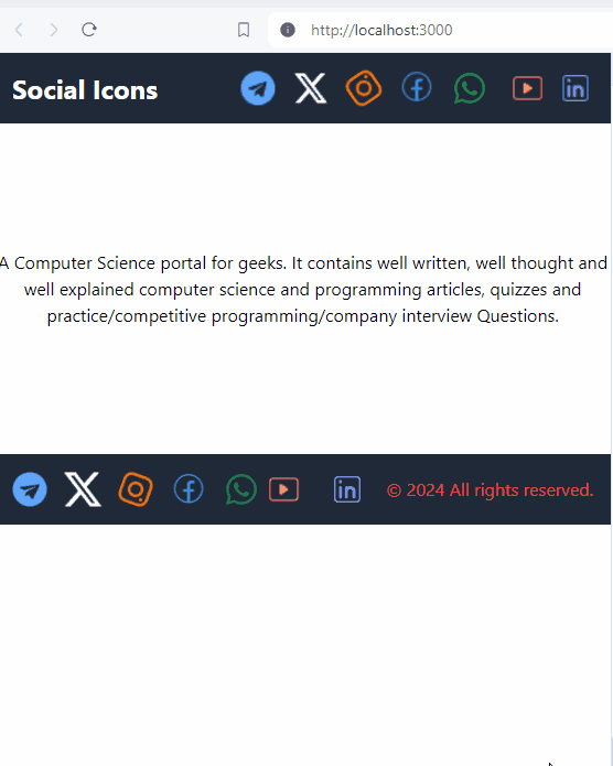
output
Share your thoughts in the comments
Please Login to comment...