It is Possible to Mix Chakra UI with Tailwind CSS ?
Last Updated :
27 Sep, 2023
Yes, it is possible to mix Chakra UI with Tailwind CSS. In this article, we are going to learn about mixing Chakra UI with Tailwind CSS. Chakra UI is a component-based open-source frontend framework for ReactJS. It is a simple, easy, and modular component library to build React Applications made by Segun Adebayo. Chakra UI is used by millions of users and can be easily configured and extended. Tailwind CSS is an inline CSS based library to build a modern website without creating separate files for styling. Therefore we use both of them together for web designing.
Mixing Chakra UI with Tailwind CSS allows combining the component library and theming capabilities of Chakra UI with the utility-first approach and responsive design features of Tailwind CSS to create visually appealing and highly functional user interfaces with a blend of both frameworks’ strengths. Here we are using two common approaches to perform mixing chakra UI with Tailwind CSS.
- Creating Chakra UI Card Component
- Creating Chakra UI Form Control Component
Creating Chakra UI Card Component
We have created a card component having a Heading, a Body Button, and a Form Control Component. Then we used the Tailwind CSS to style the component.
Prerequisite
Installation of Chakra UI and Tailwind CSS in Windows
Step 1: Create a React application using the following command:
npx create-react-app folder_name
Step 2: After creating your project folder i.e. folder_name, move to it using the following command:
cd folder_name
Step 3: After creating the ReactJS application, Install Chakra UI by writing the following command.
npm install @chakra-ui/react @emotion/react @emotion/styled framer-motion
Step 4: Add the <ChakraProvider> tag in the index.js file and wrap the App Component inside it.
Javascript
import React from "react";
import ReactDOM from "react-dom/client";
import "./index.css";
import App from "./App";
import reportWebVitals from "./reportWebVitals";
import { ChakraProvider } from "@chakra-ui/react";
const root = ReactDOM.createRoot(
document.getElementById("root"));
root.render(
<React.StrictMode>
<ChakraProvider>
<App />
</ChakraProvider>
</React.StrictMode>
);
reportWebVitals();
|
Step 5: Install TailwindCSS by writing the following command.
npm install -D tailwindcss
npx tailwindcss init
Step 6: Add the paths of your template file in tailwind.config.js
module.exports = {
    content: ["./src/**/*.{html,js,jsx}"],
    theme: {
        extend: {},
    },
    plugins: [],
}
Step 7: Add the tailwind directives to your index.css file
@tailwind base;
@tailwind components;
@tailwind utilities;
Step 8: Compile your index.css file to scan the template
npx tailwindcss -i ./src/index.css -o ./public/output.css
Step 9: Add your compiled CSS file to the <head> and start using Tailwind’s utility classes to style your content.
<link href="/public/output.css" rel="stylesheet">
Now TailwindCSS and ChakraUI is now installed and ready to be used in the project
Project Structure:
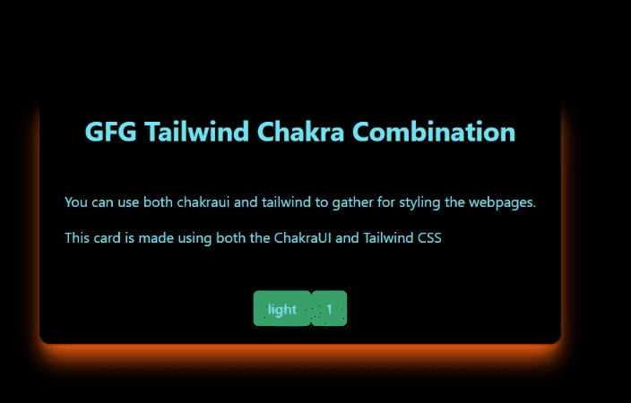
Example: Implement Chakra UI Card Component using Tailwind CSS to change the theme of the card and use various css transformations and change the card theme.
Create a CardExample.jsx and create a basic card layout by importing the Box, Card, CardHeading, CardFooter, and Cardbody.
- Box: A container to create a responsive layout easily.
- Card: Parent wrapper for the children.
- CardHeader: Header of the card.
- CardFooter: Footer of the card.
- CardBody: The body of the card.
- Heading: Renders the heading.
- Text: Renders a text.
- Button: Renders a button.
To implement the theme change of the card we use the useState react hook to store its value and then using the conditional operator we can change the color of the card and text-based the value of the hook.
To implement the CSS Transformations on the card create two useState hooks one for transformation text and the other for selecting a transformation then use switch case to store the transformation in text and a useEffect hook to render the change when the new transformation is selected.
Import CardExample in App.jsx
Javascript
import {
Box,
Button,
Card,
CardBody,
CardFooter,
CardHeader,
Heading,
Text,
} from "@chakra-ui/react";
import React, { useEffect, useState } from "react";
const CardExample = () => {
const [transformCount, setTransformCount] = useState(1);
const [transformText, setTransformText] = useState("");
useEffect(() => {
changeTransfrom();
}, [transformCount]);
const changeTransfrom = () => {
if (transformCount > 4) {
setTransformCount(1);
}
switch (transformCount) {
case 1:
setTransformText("hover:rotate-6");
break;
case 2:
setTransformText("hover:scale-105");
break;
case 3:
setTransformText("hover:skew-x-12");
break;
case 4:
setTransformText("hover:skew-y-12");
break;
default:
setTransformText("hover:translate-x-12");
}
};
const [darkTheme, setDarkTheme] = useState(true);
console.log(transformText);
return (
<Box
rounded={"xl"}
className={`p-auto shadow-xl ${transformText}
shadow-orange-600 bottom-20 duration-300 ease-in-out`}
>
<Card
rounded={"xl"}
align="center"
bg={darkTheme ? "black" : "white"}
className={`box `}
>
<CardHeader>
<Heading
size="xl"
className={darkTheme ?
` text-cyan-300 ` : `text-cyan-600`}
>
GFG Tailwind Chakra Combination
</Heading>
</CardHeader>
<CardBody>
<Text
className={darkTheme ?
` text-cyan-300 p-2` : `text-cyan-600 p-2`}
>
You can use both chakraui and tailwind to
gather for styling the webpages.
</Text>
<Text
className={darkTheme ?
` text-cyan-300 p-2` : `text-cyan-600 p-2`}
>
This card is made using both the ChakraUI and
Tailwind CSS
</Text>
</CardBody>
<CardFooter>
<Button
color={darkTheme ? "cyan.300" : "blue"}
colorScheme={darkTheme ? "green" : "teal"}
onClick={() => {
setDarkTheme(!darkTheme);
}}
>
{darkTheme ? "light" : "dark"}
</Button>
<Button
color={darkTheme ? "cyan.300" : "blue"}
colorScheme={darkTheme ? "green" : "teal"}
onClick={() => {
setTransformCount(transformCount + 1);
}}
>
{transformCount}
</Button>
</CardFooter>
</Card>
</Box>
);
};
export default CardExample;
|
Javascript
import CardExample from "./CardExample";
function App() {
return (
<div className="bg-black shadow-xl
text-white relative flex
flex-row justify-center
items-center h-screen w-full">
<CardExample />
</div>
);
}
export default App;
|
To run the project enter the following command in Terminal.
npm start
Note: then go to the http://localhost:3000
Output:
,
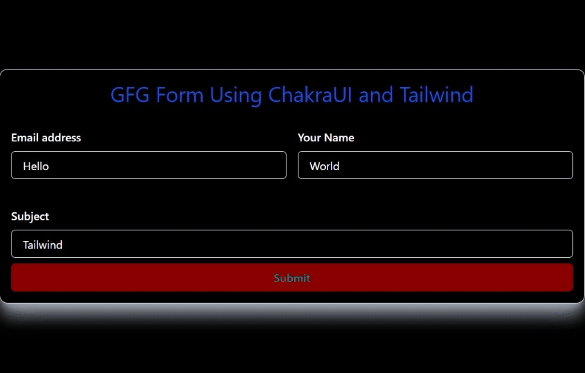
Creating Chakra UI Form Control Component
Implementing Chakra UI Form Control Component and Toast using Tailwind CSS to display the text in the toast. Create FormExample.jsx and create a form layout by importing Flex, FormControl, FormLabel, Input, useToast
- Flex: Just like Box but with display as flex.
- FormControl: Provides functionalities and context to its children.
- FormLabel: Just like HTML label used for form label.
- Input: Input component for user input.
- useToast: Create a toast component.
To implement this we use the useState react hooks to store the input values and then use them in the toast components to display the value in the toast
Example: Here we are using the above-explained approach.
import FormExample.jsx in the App.jsx
Javascript
import {
Box,
Button,
Flex,
FormControl,
FormLabel,
Input,
Text,
useToast,
} from "@chakra-ui/react";
import React from "react";
import { useState } from "react";
const FormExample = () => {
const toast = useToast();
const [email, setEmail] = useState("");
const [name, setName] = useState("");
const [subject, setSubject] = useState("");
return (
<Box className="col-span-3 w-full h-auto
shadow-gray-400 border
shadow-xl
rounded-xl lg:p-4">
<Box className="p-4">
<Text className="text-center text-3xl
text-semibold
text-blue-700">
GFG Form Using ChakraUI and Tailwind
</Text>
<Box className="grid md:grid-cols-2
gap-4 w-full py-6">
<Flex className="flex-col py-2">
<FormControl>
<FormLabel>
Email address
</FormLabel>
<Input
type="email"
onChange={(e) => {
setEmail(e.target.value);
}}
/>
</FormControl>
</Flex>
<Flex flexDirection={"column"}
className="py-2">
<FormControl>
<FormLabel>
Your Name
</FormLabel>
<Input
type="text"
onChange={(e) => {
setName(e.target.value);
}}
/>
</FormControl>
</Flex>
</Box>
<Flex flexDirection={"column"}
className="py-2">
<FormControl w="full">
<FormLabel>
Subject
</FormLabel>
<Input
type="text"
onChange={(e) => {
setSubject(e.target.value);
}}
/>
</FormControl>
</Flex>
<Button
loadingText="Submitting"
color="teal"
bg="darkred"
variant="solid"
className="p-2 w-full"
onClick={() =>
toast({
title: "GFG says",
description: `${email} ${name} ${subject}`,
status: "success",
position: "top",
duration: 9000,
isClosable: true,
})
}
>
Submit
</Button>
</Box>
</Box>
);
};
export default FormExample;
|
Javascript
import "./App.css";
import FormExample from "./FormExample";
function App() {
return (
<div className="bg-black shadow-xl
text-white relative flex
flex-row justify-center
items-center h-screen w-full">
<FormExample />
</div>
);
}
export default App;
|
To run the project enter the following command in Terminal.
npm start
Note: then go to the http://localhost:3000
Output:
Share your thoughts in the comments
Please Login to comment...