React Chakra UI Data Display Card
Last Updated :
19 Feb, 2024
React Chakra UI Data Display Cards or simply Cards are one of the most basic components of the web interface. It enables the presentation of information in a very organized manner. Chakra UI, the robust react UI library, makes it easy to create data display cards of different types served for different purposes.
Prerequisites:
Chakra UI has divided a card into four different components.
- Card: This is the base layer of every card.
- CardHeader: This is the wrapper where the card’s header is present.
- CardBody: This is the wrapper that contains the card’s main content.
- CardFooter: This is the wrapper located at the lowermost portion of a card.
Approach 1: Basic Card
This is the most basic way to create a card. There will be the CardBody Wrapped inside the Card. You just need to put some body content inside the CardBody.
Syntax:
<Card>
  <CardHeader>...</CardHeader>
  <CardBody>...</CardBody>
  <CardFooter>...</CardFooter>
</Card>
Approach 2: Card with Multiple Dividers
In case you want to display multiple content in a single card divided by dividers, then you can make the use of this approach.
Syntax:
<Card>
  <CardHeader></CardHeader>
  <CardBody>
    <Stack divider={<StackDivider />} spacing='4'>
      <Box>...</Box>
      <Box>...</Box>
      <Box>...</Box>
    </Stack>
  </CardBody>
</Card>
Approach 3: Card with Image
In case you want to attach image into the card, you can make the use of this approach.
Syntax:
<Card>
  <CardBody>
    <Image
      src=[specify source]
      alt=[provide alt]
      borderRadius='lg'
    />
  </CardBody>
</Card>
Approach 4: Horizontal Card
If you want to make a card that display the data horizontally, you can make the use of this approach.
Syntax:
<Card
     direction={{ base: 'column', sm: 'row' }}
     overflow='hidden'
     variant='outline'
>
<CardBody>{Body1}</CardBody>
<CardBody>{Body2}</CardBody>
</Card>
Element 1 and Element 2 will be displayed horizontally.
Approach 5: Card with different variants
Chakra UI provides mainly four card variants named as – elevated, outline, filled, unstyled. You can modify the variant prop to change the style of the card. The default variant is elevated.
Syntax:
<Card variant={`elevated` or  `outline` or `filled` `unstyled`}>
      <CardHeader>...</CardHeader>
      <CardBody>...</CardBody>
</Card>
Approach 6: Card of different sizes
This approach is used when you want to modify the size of card. Chakra UI provides 3 cards sizes. You can use the size props to change the size of the card.
Syntax:
<Card size={`sm` or `md` or `lg`}>
      <CardHeader>....</CardHeader>
      <CardBody>....</CardBody>
 </Card>
Steps to create a React App and Installing Module
Step 1: Create a react application by executing the following command in the terminal and enter into the application
npx create-react-app data-display-app
cd data-display-app
Step 2: Install the Chakra UI dependencies
npm i @chakra-ui/react
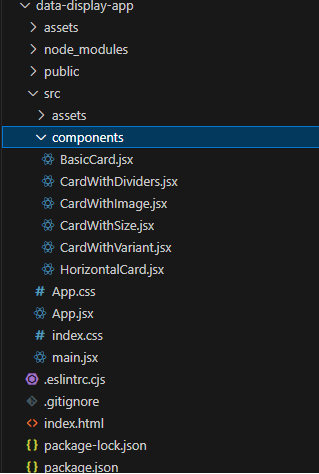
Project Structure:
The updated dependencies in the packaga.json file will look like:
"dependencies": {
    "@chakra-ui/react": "^2.8.2",
    "@testing-library/jest-dom": "^5.17.0",
    "@testing-library/react": "^13.4.0",
    "@testing-library/user-event": "^13.5.0",
    "react": "^18.2.0",
    "react-dom": "^18.2.0",
    "react-scripts": "5.0.1",
    "web-vitals": "^2.1.4"
}
Example: Below are the examples of different approaches of data display card. The modified App.js (improve UI), index.js (include ChakraProvider) and index.css (imported raleway font) files are also listed in the last three code.
Javascript
import {
Card, CardHeader,
CardBody, CardFooter, Box } from '@chakra-ui/react';
const CustomCard = () => {
return (
<Card size='lg' bg="#ed3238" borderWidth="1px"
borderRadius="lg" overflow="hidden"
boxShadow="lg" color='white'>
<CardHeader>
<Box
color="gray.200"
fontWeight="semibold"
letterSpacing="wide"
fontSize="xs"
textTransform="uppercase"
ml="2"
>
Category
</Box>
</CardHeader>
<CardBody>
<Box fontWeight="semibold" as="h4"
lineHeight="tight" isTruncated>
Basic Card
</Box>
<Box>
This is a Chakra UI basic card.
</Box>
</CardBody>
<CardFooter>
@GeeksforGeeks
</CardFooter>
</Card>
);
};
export default CustomCard;
|
Javascript
import {
Card, CardHeader, CardBody,
CardFooter, Text, Divider } from '@chakra-ui/react';
const CardWithDividers = () => {
return (
<Card bg='gray.900' color='white'>
<CardHeader fontSize='2xl' mb='1'>
Card With Dividers
</CardHeader>
<CardBody>
<Text>Card Content 1</Text>
<Divider />
<Text>Card Content 2</Text>
<Divider />
<Text>Card Content 3</Text>
<Divider/>
</CardBody>
<CardFooter>@GeeksForGeeks</CardFooter>
</Card>
);
};
export default CardWithDividers;
|
Javascript
import {
Card, CardBody, CardHeader,
StackDivider, Box, Divider, Stack,
Text, CardFooter, Button,
ButtonGroup, Image } from '@chakra-ui/react';
const CardWithImage = () => {
return (
<Card maxWidth='300px' borderRadius="lg"
overflow="hidden" boxShadow="lg" margin="auto">
<Image height={'100px'}
alt="Placeholder Image" />
<CardBody>
<Stack>
<Text fontWeight="bold" fontSize="md">
Card With Image
</Text>
<Text fontSize={'xs'}>
This is a Chakra UI card with Image
</Text>
</Stack>
</CardBody>
<CardFooter>
<ButtonGroup>
<Button size={'sm'} fontWeight={300}
colorScheme="blue">Blue Button</Button>
<Button size={'sm'} fontWeight={300}
colorScheme="green">Green Button</Button>
</ButtonGroup>
</CardFooter>
</Card>
);
};
export default CardWithImage;
|
Javascript
import {
Stack, Card, CardHeader, CardBody,
CardFooter, Heading, Text, Flex }
from '@chakra-ui/react';
const CardWithSize = () => {
return (
<Flex bg={'#ece3ff'} p='12px' borderRadius={'12px'}
maxW='md' direction={'column'}>
<Heading fontFamily={'raleway'} mb='4'>
Card with Different Sizes
</Heading>
<Flex direction={'column'} p='12px'
borderRadius={'12px'} maxW={''} gap={6}>
{[{size: 'sm', color: '#a0d91c'},
{size: 'md', color: '#d91c81'},
{size:'lg', color: '#581cd9'}].map((props) => (
<Card color={'white'} w='400px'
bg={props.color} key={props.size}
size={props.size} maxH="full">
{ }
<CardHeader>
<Heading size={'xs'}>
Card of Size {props.size}
</Heading>
</CardHeader>
<CardBody>
<Text>size = {props.size}</Text>
</CardBody>
<CardFooter>
@GeeksForGeeks
</CardFooter>
</Card>
))}
</Flex>
</Flex>
);
};
export default CardWithSize;
|
Javascript
import React from 'react';
import {
Stack, Card, CardHeader, CardBody, Heading,
Text, useColorModeValue, CardFooter
}
from '@chakra-ui/react';
const CardWithVariant = () => {
const cardColors = {
elevated: {
bg: useColorModeValue("blue.400", "blue.600"),
textColor: "white",
},
outline: {
bg: "transparent",
border: "1px solid",
borderColor: useColorModeValue("blue.400", "blue.600"),
textColor: useColorModeValue("blue.400", "blue.600"),
},
filled: {
bg: useColorModeValue("green.400", "green.600"),
textColor: "white",
},
unstyled: {
bg: "transparent",
border: '1px solid',
},
};
return (
<Stack spacing='4'>
{['elevated', 'outline', 'filled', 'unstyled'].map((variant) => (
<Card
key={variant}
variant={variant}
bg={cardColors[variant].bg}
border={cardColors[variant].border}
color={cardColors[variant].textColor}
borderWidth={cardColors[variant].borderWidth}
>
<CardHeader>
<Heading fontFamily={'raleway'} fontWeight={'300'}
size='md'>
Card with Variant: {variant}
</Heading>
</CardHeader>
<CardBody>
<Text>variant = {variant}</Text>
</CardBody>
<CardFooter>
@GeeksforGeeks
</CardFooter>
</Card>
))}
</Stack>
);
};
export default CardWithVariant;
|
Javascript
import React from 'react';
import {
Card, Stack, Image, Heading,
Text, Button, useColorModeValue }
from '@chakra-ui/react';
const HorizontalCard = () => {
const cardBorderColor = useColorModeValue("blue.400", "blue.600");
const cardBackgroundColor = useColorModeValue("white", "gray.800");
return (
<>
<div style={{
background:'#f3f0fa',
padding: '24px', margin: '10px', borderRadius: '16px'}}>
<Heading fontFamily={'raleway'}>
Horizontal Card
</Heading>
<Card
direction={{ base: 'column', sm: 'row' }}
overflow='hidden'
variant='outline'
borderWidth='1px'
borderColor={cardBorderColor}
borderRadius='lg'
bg={cardBackgroundColor}
boxShadow='lg'
marginY='4'
>
<Image
objectFit='cover'
maxW={{ base: '100%', sm: '200px' }}
alt='Caffe Latte'
/>
<Stack p='4' spacing='4' align='flex-start'
justify='center'>
<Heading fontFamily={'raleway'} size='md'
color={useColorModeValue("gray.800", "white")}>
Horizontal Card
</Heading>
<Text color={useColorModeValue("gray.600", "gray.400")}>
This is a horizontal card made with
Chakra UI, card component with an image.
</Text>
<Button fontWeight={300} variant='solid'
colorScheme='red'>
@GeeksforGeeks
</Button>
</Stack>
</Card>
</div>
</>
);
};
export default HorizontalCard;
|
Javascript
import logo from './logo.svg';
import './App.css';
import BasicCard from './components/BasicCard';
import CardWithDividers from './components/CardWithDividers';
import CardWithImage from './components/CardWithImage';
import CardWithSize from './components/CardWithSize';
import CardWithVariant from './components/CardWithVariant';
import HorizontalCard from './components/HorizontalCard';
import { Box, Text, Divider } from '@chakra-ui/react';
function App() {
return (
<div style={{ maxWidth: '1200px', margin: 'auto', marginTop: '20px' }}>
<div style={{ display: 'flex', gap: '12px' }}>
<div style={{ minWidth: '400px' }}>
<BasicCard />
</div>
<div style={{ minWidth: '400px' }}>
<CardWithDividers />
</div>
<div style={{ minWidth: '400px' }}>
<CardWithImage />
</div>
</div>
<div style={{ display: 'flex', gap: '12px' }}>
<div style={{ marginTop: '12px' }}>
<CardWithSize />
</div>
<div style={{ marginTop: '12px' }}>
<CardWithVariant />
</div>
</div>
<div>
<HorizontalCard />
</div>
</div>
);
}
export default App;
|
Javascript
import React from 'react';
import ReactDOM from 'react-dom/client';
import './index.css';
import App from './App';
import { ChakraProvider } from '@chakra-ui/react';
const root = ReactDOM.createRoot(document.getElementById('root'));
root.render(
<ChakraProvider>
<App />
</ChakraProvider>
);
|
CSS
* {
font-family: raleway;
}
|
Start the application by running the following command.
npm start
Output:
.gif)
Output
Share your thoughts in the comments
Please Login to comment...