Chakra UI Form Select
Last Updated :
05 Feb, 2024
Chakra UI is a modern UI building library that comprises of many predefined customizable components. One of those components are ‘Select’. Select component in Chakra UI allows an user to choose a value from a set of defined values. ‘RadioGroup’ does somewhat similar thing. However, In the case where there are more than five options, you can consider using ‘Select’ component.
Prerequisites
Below are the approaches of Chakra UI’s Form Select we are going to use.
Approach 1: Basic Select
The most basic way of implementing Chakra UI’s ‘Select’ is to wrap all the options inside a ‘Select’ component.
Syntax:
<Select placeholder='Select option'>
    <option value='option1'>Option 1</option>
    <option value='option2'>Option 2</option>
    <option value='option3'>Option 3</option>
</Select>
Approach 2: Select with Different Sizes
The basic ‘Select’ component also allows you to modify the size of the component into four different sizes.
- xs (24px)
- sm (32px)
- md (40px)
- lg (48px)
Syntax:
<Select placeholder='Select option' size='lg'>
  //map all the options
</Select>
Approach 3: Select with Different Apperence
The ‘Select’ component in Chakra UI’s gives us four variants to choose from. These variants are:
- outline
- unstyled
- flushed
- filled
Syntax:
<Select variant='outline' placeholder='Choose' >
//map all the options
</Select>
Approach 4: Select with Different Icons
You can also modify the icon in the Select component by providing icon component as ‘Select’ icon prop.
Syntax:
<Select icon={<MdArrowDropDown />} >
//map all the options
</Select>
Approach 5: Select with Different Styles
You can also change the style of ‘Select’ component by specifying different props into the Select component.
Syntax:
<Select bg='tomato' borderColor='tomato' color='white' />
//map all the options
</Select>
Steps to Create a React App and Install Module:
Step 1: Create a react app by using the command and enter the app directory created by running:
npx create-react-app chakra-select
cd chakra-select
Step 2: Install Chakra UI dependency by running the following command in the terminal:
npm install @chakra-ui/react react-icons
The updated dependencies should look like the one provided below. Open package.json and scan for dependencies field.
"dependencies": {
    "@chakra-ui/react": "^2.8.2",
    "@testing-library/jest-dom": "^5.17.0",
    "@testing-library/react": "^13.4.0",
    "@testing-library/user-event": "^13.5.0",
    "react": "^18.2.0",
    "react-dom": "^18.2.0",
    "react-icons": "^5.0.1",
    "react-scripts": "5.0.1",
    "web-vitals": "^2.1.4"
},
Step 3: Create a ‘components’ folder in the ‘src’ directory and further create 5 files for examples of 5 different approaches listed above.
Example: Below is the example to show the Chakra UI From Select.
- src/components/BasicSelect.js
- src/components/SelectWithDifferentSizes.js
- src/components/SelectWithDifferentAppearences.js
- src/components/SelectWithDifferentIcons.js
- src/components/SelectWithDifferentStyles.js
Javascript
import React, { useState } from 'react';
import { Select } from '@chakra-ui/react';
const BasicSelect = () => {
const [selectedOption, setSelectedOption] = useState('');
const handleSelectChange = (event) => {
const selectedValue = event.target.value;
setSelectedOption(selectedValue);
console.log('Selected option:', selectedValue);
};
return (
<Select
placeholder='Select option'
onChange={handleSelectChange}
value={selectedOption}
>
<option value='option1'>Option 1</option>
<option value='option2'>Option 2</option>
<option value='option3'>Option 3</option>
</Select>
);
};
export default BasicSelect;
|
Javascript
import React, { useState } from 'react';
import { Select } from '@chakra-ui/react';
const SelectWithDifferentSizes = () => {
const [selectedOption, setSelectedOption] = useState('');
const handleSelectChange = (event) => {
const selectedValue = event.target.value;
setSelectedOption(selectedValue);
console.log('Selected option:', selectedValue);
};
return (
<Select
placeholder='Select option'
onChange={handleSelectChange}
value={selectedOption}
size='lg'
>
<option value='option1'>Option 1</option>
<option value='option2'>Option 2</option>
<option value='option3'>Option 3</option>
</Select>
);
};
export default SelectWithDifferentSizes;
|
Javascript
import React, { useState } from 'react';
import { Select } from '@chakra-ui/react';
const SelectWithDifferentAppearances = () => {
const [selectedOption, setSelectedOption] = useState('');
const handleSelectChange = (event) => {
const selectedValue = event.target.value;
setSelectedOption(selectedValue);
console.log('Selected option:', selectedValue);
};
return (
<Select
placeholder='Select option'
onChange={handleSelectChange}
value={selectedOption}
variant='filled'
>
<option value='option1'>Option 1</option>
<option value='option2'>Option 2</option>
<option value='option3'>Option 3</option>
</Select>
);
};
export default SelectWithDifferentAppearances;
|
Javascript
import React, { useState } from 'react';
import { Select, Icon } from '@chakra-ui/react';
import { MdArrowDropDown } from 'react-icons/md';
const SelectWithDifferentIcons = () => {
const [selectedOption, setSelectedOption] = useState('');
const handleSelectChange = (event) => {
const selectedValue = event.target.value;
setSelectedOption(selectedValue);
console.log('Selected option:', selectedValue);
};
return (
<Select
placeholder='Select option'
onChange={handleSelectChange}
value={selectedOption}
icon={<Icon as={MdArrowDropDown} />}
>
<option value='option1'>Option 1</option>
<option value='option2'>Option 2</option>
<option value='option3'>Option 3</option>
</Select>
);
};
export default SelectWithDifferentIcons;
|
Javascript
import React, { useState } from 'react';
import { Select } from '@chakra-ui/react';
const SelectWithDifferentStyles = () => {
const [selectedOption, setSelectedOption] = useState('');
const handleSelectChange = (event) => {
const selectedValue = event.target.value;
setSelectedOption(selectedValue);
console.log('Selected option:', selectedValue);
};
return (
<Select
placeholder='Select option'
onChange={handleSelectChange}
value={selectedOption}
style={{
fontSize: '16px',
fontWeight: 'bold',
color: 'blue',
bg: 'lightgray',
}}
>
<option value='option1'>Option 1</option>
<option value='option2'>Option 2</option>
<option value='option3'>Option 3</option>
</Select>
);
};
export default SelectWithDifferentStyles;
|
Javascript
import "./App.css";
import BasicSelect
from "./components/BasicSelect";
import SelectWithDifferentAppearances
from "./components/SelectWithDifferentAppearences";
import SelectWithDifferentIcons
from "./components/SelectWithDifferentIcons";
import SelectWithDifferentSizes
from "./components/SelectWithDifferentSizes";
import SelectWithDifferentStyles
from "./components/SelectWithDifferentStyles";
function App() {
return (
<div className="base">
<div className="app"><BasicSelect /></div>
<div className="app"><SelectWithDifferentAppearances /></div>
<div className="app"><SelectWithDifferentIcons /></div>
<div className="app"><SelectWithDifferentSizes /></div>
<div className="app"><SelectWithDifferentStyles /></div>
</div>
);
}
export default App;
|
Javascript
import React from 'react';
import ReactDOM from 'react-dom/client';
import './index.css';
import App from './App';
import { ChakraProvider } from '@chakra-ui/react';
const root = ReactDOM.createRoot(document.getElementById('root'));
root.render(
<ChakraProvider>
<App />
</ChakraProvider>
);
|
CSS
.base {
margin: 20px;
}
.app {
max-width: 800px;
margin: auto;
padding: 20px;
border: 2px solid gray;
border-radius: 20px;
margin-top: 6px;
}
.btn {
border-radius: 10px;
padding: 6px 12px;
margin-top: 20px;
background-color: skyblue;
}
.btn:hover {
background-color: white;
color: black;
border: 1px solid black;
}
|
Output: Run the following command to start the app at localhost:
npm start
Navigate to http://localhost:3000/
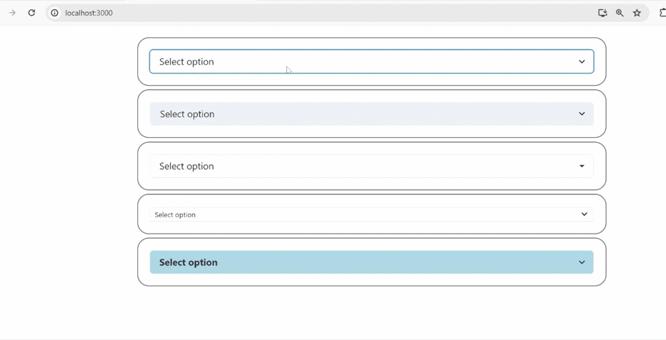
Output
Share your thoughts in the comments
Please Login to comment...