React Chakra UI Grid Layout
Last Updated :
19 Feb, 2024
React Chakra UI Grid Layout is an incredibly powerful and flexible component designed to streamline the creation of responsive and aesthetically pleasing grid-based designs within web applications. As an integral part of the Chakra UI library, this grid layout system offers developers a seamless integration with React, enabling them to build visually stunning and responsive user interfaces effortlessly.
Prerequisites:
Approach:
In this article, we’ll explore the various components provided by Chakra UI for building grid layouts. The key components include Grid, GridItem, and Box, each contributing to the overall flexibility and responsiveness of your application’s grid structure.
Steps to Create the Project:
Step 1: Create a React application using the following command:
npx create-react-app gfg
Step 2: After creating your project folder(i.e. my-app), move to it by using the following command:
cd gfg
Step 3: After creating the React application, Install the required package using the following command:
npm i @chakra-ui/react @emotion/react@^11 @emotion/styled@^11 framer-motion@^6
Project Structure:
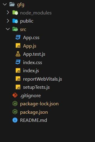
Project Structure
The updated dependencies in package.json file will look like this:
"dependencies": {
    "@chakra-ui/react": "^2.8.2",
    "@emotion/react": "^11.11.3",
    "@emotion/styled": "^11.11.0",
    "@testing-library/jest-dom": "^5.17.0",
    "@testing-library/react": "^13.4.0",
    "@testing-library/user-event": "^13.5.0",
    "framer-motion": "^11.0.3",
    "react": "^18.2.0",
    "react-dom": "^18.2.0",
    "react-scripts": "5.0.1",
    "web-vitals": "^2.1.4"
}
Example: Below is the basic example of the Chakra UI Grid Layout:
Javascript
import React from 'react';
import { ChakraProvider, Grid, GridItem, Text } from '@chakra-ui/react';
function App() {
return (
<ChakraProvider>
<Text
color="#2F8D46"
fontSize="2rem"
textAlign="center"
fontWeight="400"
my="1rem">
GeeksforGeeks - React JS Chakra UI concepts
</Text>
<Grid
templateAreas={`"header header"
"nav main"
"nav footer"`}
gridTemplateRows={'50px 1fr 30px'}
gridTemplateColumns={'150px 1fr'}
h='200px'
gap='1'
color='blackAlpha.700'
fontWeight='bold'
bg='gray.100'
p='4'
borderRadius='md'
>
<GridItem
pl='2'
bg='orange.400'
area={'header'}
borderRadius='md'
color='white'
fontSize='1.2rem'
display='flex'
m="1"
alignItems='center'
>
Header
</GridItem>
<GridItem
pl='2'
bg='pink.400'
area={'nav'}
borderRadius='md'
p='2'
m="1"
color='white'
fontSize='1.2rem'
>
Nav
</GridItem>
<GridItem
pl='2'
bg='green.400'
area={'main'}
borderRadius='md'
p='2'
m="1"
color='white'
fontSize='1.2rem'
>
Main
</GridItem>
<GridItem
pl='2'
bg='blue.400'
area={'footer'}
borderRadius='md'
color='white'
m="1"
fontSize="15px"
>
Footer
</GridItem>
</Grid>
</ChakraProvider>
);
}
export default App;
|
Steps to run the application:
npm start
Output:
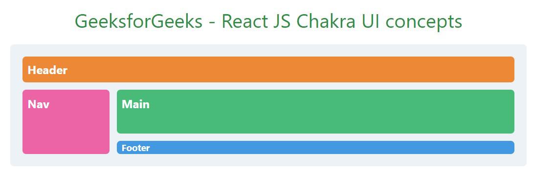
Chakra UI Grid Layout
Share your thoughts in the comments
Please Login to comment...