React Chakra UI Media and Icons Image
Last Updated :
15 Feb, 2024
React Chakra UI Media and Icons Image component is tailored for managing media content and displaying icons and images.
In this guide, we’ll delve into how to leverage Chakra UI to efficiently handle media assets and effectively incorporate icons and images into your React application, thereby enhancing both aesthetics and user experience.
Prerequisites:
Approach:
We will build different types of Media assets using Chakra UI with ReactJS. The Chakra UI Image and Icons component provides various functionalities such as resize the images, Images with border radius and also different types of Icons that we can directly implement in our React Application according to the requirements.
Steps to Create the Project:
Step 1: Create a React application using the following command:
npx create-react-app gfg
Step 2: After creating your project folder(i.e. my-app), move to it by using the following command:
cd gfg
Step 3: After creating the React application, Install the required package using the following command:
npm i @chakra-ui/react @emotion/react@^11 @emotion/styled@^11 framer-motion@^6
Step 4: After that we will install the Chakra UI Icon Library using the following command:
npm i @chakra-ui/icons
Project Structure:
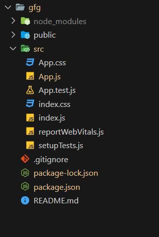
Project Structure
The updated dependencies in package.json will look like this:
"dependencies": {
    "@chakra-ui/icons": "^2.1.1",
    "@chakra-ui/react": "^2.8.2",
    "@emotion/react": "^11.11.3",
    "@emotion/styled": "^11.11.0",
    "@testing-library/jest-dom": "^5.17.0",
    "@testing-library/react": "^13.4.0",
    "@testing-library/user-event": "^13.5.0",
    "framer-motion": "^11.0.3",
    "react": "^18.2.0",
    "react-dom": "^18.2.0",
    "react-scripts": "5.0.1",
    "web-vitals": "^2.1.4"
}
Example: Below is the basic example of the Chakra UI Media and Icons Images:
Javascript
import React from 'react';
import { ChakraProvider, Box, Text, Avatar, Image, Stack, AvatarGroup }
from '@chakra-ui/react';
import { SettingsIcon, EmailIcon, PhoneIcon, InfoOutlineIcon }
from '@chakra-ui/icons';
function App() {
return (
<ChakraProvider>
<Text
color="#2F8D46"
fontSize="2rem"
textAlign="center"
fontWeight="400"
my="1rem"
mb="0.5rem">
GeeksforGeeks - React JS Chakra UI concepts
</Text>
<Box w="40%" mx="auto">
<Text fontSize="xl" fontWeight="bold"
mb="1rem">
Chakra UI Sample Image Use
</Text>
<Box boxSize='90px'>
<Image src=
alt='GeeksForGeeks' />
</Box>
<Text fontSize="xl" fontWeight="bold"
mb="1rem" mt="2rem">
Chakra UI Images with different sizes
</Text>
<Stack direction='row'>
<Image
boxSize='80px'
objectFit='cover'
src=
alt='GeeksForGeeks'
/>
<Image
boxSize='105px'
objectFit='cover'
src=
alt='GeeksForGeeks'
/>
<Image boxSize='130px' src=
alt='GeeksForGeeks' />
</Stack>
<Text fontSize="xl" fontWeight="bold"
mb="1rem" mt="2rem">
Chakra UI Image with border radius
</Text>
<Image
borderRadius='full'
boxSize='105px'
src=
alt='GeeksForGeeks'
/>
<Text fontSize="xl" fontWeight="bold"
mb="1rem" mt="2rem">
Chakra UI Icons with Avatar Example
</Text>
<AvatarGroup spacing='1rem'
display="flex" justifyContent="center"
align="center">
<Avatar bg='red.500'
icon={<EmailIcon fontSize='1.5rem' />} />
<Avatar bg='teal.500'
icon={<PhoneIcon fontSize='1.5rem' />} />
<Avatar bg='blue.500'
icon={<InfoOutlineIcon fontSize='1.5rem' />} />
<Avatar bg='green.500'
icon={<SettingsIcon fontSize='1.5rem' />} />
</AvatarGroup>
</Box>
</ChakraProvider>
);
}
export default App;
|
Steps to run the application:
npm start
Output:
.jpg)
Chakra UI Media and Icons Images
Share your thoughts in the comments
Please Login to comment...