Chakra UI Disclosure
Last Updated :
08 Feb, 2024
Chakra UI is a powerful component library for React that is designed and developed by Segun Adebayo to build front-end applications. The Chakra UI comes with simple yet easy-to-understand documentation that gives us guidelines on how to build a reusable component. In this article, we will learn about the useDisclosure hook in React and, why it is used, and learn its implementation with the help of examples.
Pre-requisites:
useDisclosure hook in React.
The Chakra UI useDisclosure is a hook that is commonly used to handle cases like open, close, and toggle click events for similar components like Modal, Drawer, Popovers, and Alert Dialog boxes. It also manages the boolean states of any event. It handles the showing and hiding of some content.
Features of useDisclosure hook:
1. Accessibility: Chakra UI puts a strong focus on accessibility. It ensures that the component is fully accessible to users who rely on assistive technologies, meeting the required accessibility standards.
2. Customization: With the Disclosure component, you have a wide range of customization options. Customization options include tweaking the trigger element, defining animation effects, and applying custom styling.
3. Controlled and Uncontrolled Modes: Chakra UI offers support for both controlled and uncontrolled modes with the Disclosure component. In the controlled mode, developers retain complete control over the open/closed state of the disclosure panels. On the other hand, in the uncontrolled mode, the component autonomously handles its state internally, providing a more hands-off approach.
Reason to choose useDisclosure hook
It gives good control to open-close behavior for modals, tooltips, etc. It is simple to use and access for creating acustom user interface with togglable panels to show and hide important content.
Importing useDisclosure hook:
To import the useDisclosure hook, write the following code at the top level of your component.
import { useDisclosure } from '@chakra-ui/react'
This method returns an object with the “isOpen” boolean field and the following callback functions
- onClose
- onOpen
- onToggle
- getDisclosureProps
- getButtonProps
Note: The user can use a combination of the values and methods returned by the useDisclosure hook for controlling various components affected by the hook.
Steps to Create React Application And Installing Module:
Step 1: Create a React application using the following command:
npx create-react-app chakra-disclosure-app
Step 2: After creating your project folder(i.e. my-app), move to it by using the following command:
cd chakra-disclosure-app
Step 3: After creating the React application, Install the required package using the following command:
npm i @chakra-ui/react @emotion/react@^11 @emotion/styled@^11 framer-motion@^6
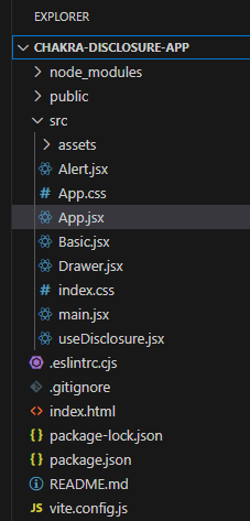
Project Structure:
The updated dependencies in package.json file will look like:
"dependencies": {
    "@chakra-ui/react": "^2.8.2",
    "@emotion/react": "^11.11.3",
    "@emotion/styled": "^11.11.0",
    "framer-motion": "^6.5.1",
    "react": "^18.2.0",
    "react-dom": "^18.2.0"
}
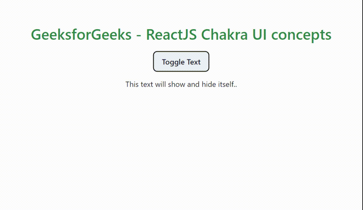
Example 1: Write down the code in respective files. This will demonstrate a button which will toggle the text when the user clicks the button. The getDisclosureProps() and getButtonProps() methods provides the handler and attributes for accessibility by various UI components for the required action.
Javascript
import { ChakraProvider, Text,Box} from "@chakra-ui/react";
import React,{ useState } from 'react';
import Basic from "./Basic";
import "./App.css";
function App() {
return (
<ChakraProvider>
<Text
color="#2F8D46"
fontSize="2rem"
textAlign="center"
fontWeight="600"
my="1rem"
>
GeeksforGeeks - ReactJS Chakra UI concepts
</Text>
<Basic />
</ChakraProvider>
);
}
export default App;
|
Javascript
import {
useDisclosure, Button, extendTheme,
Text
} from '@chakra-ui/react'
function Basic() {
const { getDisclosureProps, getButtonProps, } = useDisclosure()
const btnProps = getButtonProps()
const disclosProps = getDisclosureProps()
return (
<>
<Button {...btnProps}>Toggle Text</Button>
<Text {...disclosProps} mt={4}>
This text will show and hide itself..
</Text>
</>
)
}
export default Basic;
|
Step to run the application: Run the application using the following command:
npm run start
Output: Now go to http://localhost:3000 in your browser:
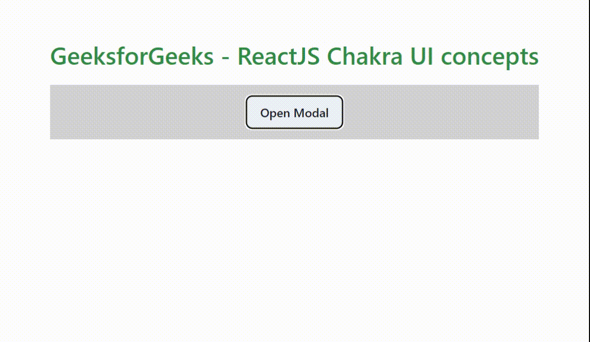
Example 2: The following code will demonstrate using a Modal Dialog using the fields returned by the hook. Similar steps are followed as mentioned in the above example 1. Just change the above “Basic.js” file code with the following and run the program.
Javascript
import {
useDisclosure, useModalContext,
Button, extendTheme,
Modal, ModalContent,
ModalHeader, ModalOverlay,
ModalFooter, Box,
ModalBody, ModalCloseButton,
} from '@chakra-ui/react'
function Basic() {
const { isOpen, onOpen, onClose,
} = useDisclosure()
return (
<>
<Box bg="lightgrey" w="100%" h="100%" p={4}>
<Button onClick={onOpen}>Open Modal</Button>
<Modal isOpen={isOpen} onClose={onClose}>
<ModalOverlay />
<ModalContent>
<ModalHeader>GeeksforGeeks</ModalHeader>
<ModalCloseButton />
<ModalBody>
It is a dialog box/popup window that is
displayed on top of the current page.
</ModalBody>
<ModalFooter>
<Button colorScheme='green' mr={3} onClick={onClose}>
Close
</Button>
</ModalFooter>
</ModalContent>
</Modal>
</Box>
</>
);
};
export default Basic;
|
Output:
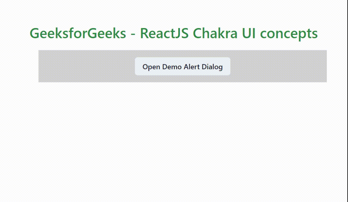
Example 3: The following code will demonstrate using a Alert Dialog box which seems to be a mandatory message for the user. The alert dialog uses the fields returned by the hook. AlertDialog requires that you provide the leastDestructiveRef prop. Change the “Basic.js” file code with the following.
Javascript
import { useRef } from 'react';
import {
useDisclosure,Button,extendTheme,
Text,AlertDialog,Box,
AlertDialogBody,
AlertDialogFooter,
AlertDialogHeader,
AlertDialogContent,
AlertDialogOverlay,
AlertDialogCloseButton,
} from '@chakra-ui/react'
function Basic() {
const { isOpen, onOpen, onClose} = useDisclosure()
const cancelRefer = useRef()
return (
<>
<Box ml='5' bg="lightgrey" w="100%" h="100%" p={4}>
<Button onClick={onOpen}>
Open Demo Alert Dialog
</Button>
<AlertDialog
isOpen={isOpen}
leastDestructiveRef={cancelRefer} onClose={onClose}
>
<AlertDialogOverlay>
<AlertDialogContent>
<AlertDialogHeader fontSize='md' fontWeight='bold'>
Chakra UI Alert Dialogs
</AlertDialogHeader>
<AlertDialogBody>
Hello, I am good , hope the same from you
</AlertDialogBody>
<AlertDialogFooter>
<Button ref={cancelRefer} onClick={onClose}>
Cancel
</Button>
<Button colorScheme='pink' onClick={onClose} ml={3}>
Delete
</Button>
</AlertDialogFooter>
</AlertDialogContent>
</AlertDialogOverlay>
</AlertDialog>
</Box>
</>
)
}
export default Basic;
|
Output:
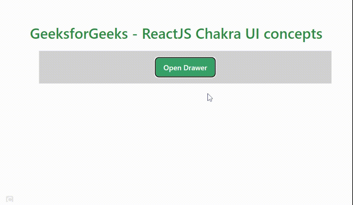
Example 4: The following code will demonstrate using a Drawer component showing a panel sliding from the edge of the screen. Just change the “Basic.js” file with the following code and run the program
Javascript
import { useRef } from 'react';
import {
useDisclosure, Button, extendTheme,
Text, Box, Input,
Drawer,
DrawerBody,
DrawerFooter,
DrawerHeader,
DrawerOverlay,
DrawerContent,
DrawerCloseButton
} from '@chakra-ui/react'
function Basic() {
const { isOpen, onOpen, onClose } = useDisclosure()
const btnRefer = useRef()
return (
<>
<Box ml='5' bg="lightgrey" w="100%" h="100%" p={4}>
<Button ref={btnRefer} colorScheme='green' onClick={onOpen}>
Open Drawer
</Button>
<Drawer isOpen={isOpen} placement='left'
onClose={onClose} finalFocusRef={btnRefer}
>
<DrawerOverlay />
<DrawerContent>
<DrawerCloseButton />
<DrawerHeader>My Account</DrawerHeader>
<DrawerBody>
<Input placeholder='Enter...' />
</DrawerBody>
<DrawerFooter>
<Button mr={3} onClick={onClose}>
Logout
</Button>
<Button colorScheme='lightblue'>Save</Button>
</DrawerFooter>
</DrawerContent>
</Drawer>
</Box>
</>
)
}
export default Basic;
|
Output:
Share your thoughts in the comments
Please Login to comment...