How to Align Social Media Icons Vertically on Left Side using HTML, CSS, & JavaScript ?
Last Updated :
11 Oct, 2023
In this article, we will learn how to make social media icons vertically on the left side using HTML, CSS, and JavaScript. We have used HTML to give basic structure for this project CSS to give styling and JavaScript for the functionality.
Prerequisites
Approach
- We are using HTML to give the basic structure to this project using tags like <h1>,<p>,<div>, and <img> for cards div and headings
- Then, give the styling to the app using CSS, and add properties like flex, position, and padding to beautify the project giving proper formatting, height, width, and color.
- Hover Effect while pointer moves towards cards and gives box-shadow
- We have used the font awesome icons to add social media icons using the CDN link.
- Using JavaScript to give functionality to the search bar while pressing the “Enter” key to the course items searched.
Example: Here we first design the structure of our project and given styling then we will code for the functionality.
HTML
<!DOCTYPE html>
<html lang="en">
<head>
<meta charset="UTF-8" />
<meta name="viewport"
content="width=device-width, initial-scale=1.0" />
<link rel="stylesheet"
href=
<link rel="stylesheet"
href="style.css">
<title>Social Media Items</title>
</head>
<body>
<div class="items">
<i class="fa fa-facebook-official"
style="font-size: 24px; color: blue">
</i>
</a>
<i class="fa fa-instagram"
style="font-size: 24px"
style="font-size: 24px">
</i>
</a>
<i class="fa fa-linkedin-square"
style="font-size: 24px; color: blue">
</i>
</a>
<i class="fa fa-youtube-play"
style="font-size: 24px; color: red">
</i>
</a>
<i class="fa fa-twitter-square"
style="font-size: 24px; color: blue">
</i>
</a>
</div>
<div class="content">
<h1>GeeksForGeeks</h1>
<h2>Hello, What Do You Want To
Learn?</h2>
<div class="search-bar">
<input type="text"
placeholder="Write Something..."
class="searchbar" />
</div>
<div class="outer-cards">
<div class="cards">
<div id="card1">
<img
src=
<h4>
How will you print
numbers from 1 to
100 without using a
loop?
</h4>
<p>
If we take a look at
this problem
carefully, we can
see that the
idea of "loop" is to
track some cou...
</p>
</div>
<div id="card2">
<img
src=
<h4>Explore Practice
Problems</h4>
<p>
Solve DSA Problems.
Filter based on
topic tags and
company tags. Get
curated problem
lists by GFG ex...
</p>
</div>
</div>
</div>
</div>
<script src="./script.js"></script>
</body>
</html>
|
CSS
body {
background-color: #3b3b3b;
}
.items {
display: flex;
flex-direction: column;
justify-content: center;
height: 500px;
position: fixed;
}
i {
margin-top: 8px;
}
.content h1,
h2 {
text-align: center;
}
.content h1 {
color: green;
}
.content h2 {
color: white;
}
.search-bar {
display: flex;
justify-content: center;
}
.search-bar input {
width: 50%;
margin-left: 40px;
height: 37px;
border: none;
border-radius: 9px;
}
.search-bar input::placeholder {
margin-left: 100px;
}
input:focus {
outline: none;
}
.outer-cards {
display: flex;
justify-content: center;
height: 500px;
}
.cards {
display: flex;
justify-content: center;
background-color: #262626;
border-radius: 20px;
flex-wrap: wrap;
height: 200px;
color: white;
padding: 20px 10px;
margin-left: 100px;
margin-top: 30px;
gap: 15px;
}
.cards #card1 {
width: 350px;
background-color: #1e1e1f;
border-radius: 7px;
color: white;
transition-duration: 0.2s;
}
#card1:hover {
box-shadow: 0px 0px 10px rgb(255, 255, 255);
}
#card2:hover {
box-shadow: 0px 0px 10px rgb(255, 255, 255);
}
.cards #card2 {
background-color: #1e1e1f;
color: white;
border-radius: 7px;
width: 350px;
transition-duration: 0.2s;
}
img {
border-radius: 7px;
width: 350px;
}
h4 {
margin-top: 2px;
padding: 3px 3px;
}
p {
margin-top: -15px;
padding: 3px 3px;
color: #a5a5a5;
}
@media screen and (max-width: 850px) {
.cards {
height: 90%;
width: 50%;
}
.search-bar input {
margin-left: 55px;
}
}
@media screen and (max-width: 710px) {
.cards {
height: 450px;
}
.cards #card1,
#card2 {
width: 200px;
}
.cards #card2 {
width: 200px;
}
img {
border-radius: 7px;
width: 200px;
}
.search-bar input {
margin-left: 90px;
}
}
@media screen and (max-width: 360px) {
.cards {
height: 500px;
}
.cards #card1,
#card2 {
width: 150px;
}
.cards #card2 {
width: 150px;
}
img {
border-radius: 7px;
width: 150px;
}
}
|
Javascript
let searchbar =
document.getElementsByClassName("search-bar")[0];
let cards =
document.getElementsByClassName("cards");
searchbar.addEventListener("keydown", (e) => {
if (e.keyCode === 13) {
console.log("clicked");
cards.innerHTML = "Course is Commint soon";
for (let i = 0; i < cards.length; i++) {
cards[i].innerHTML = "Course is Coming soon";
}
}
});
|
Output:
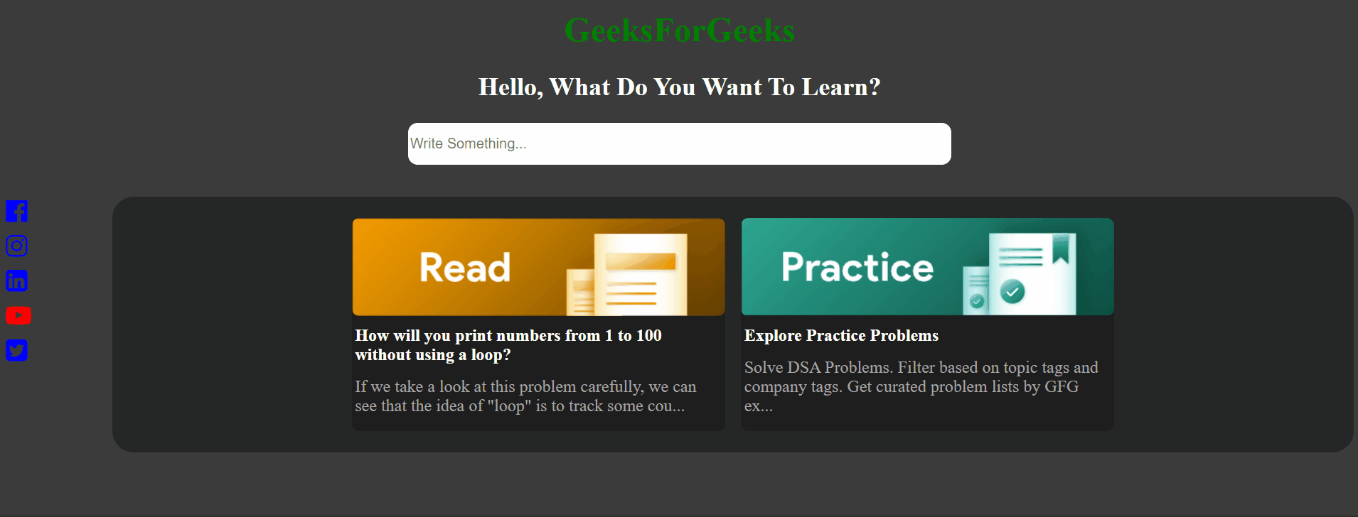
Output
Share your thoughts in the comments
Please Login to comment...