React Chakra UI Overlay
Last Updated :
19 Feb, 2024
Chakra UI, a comprehensive React component library, introduces the concept of Overlays serving as dynamic visual elements that are superimposed on the main content, providing additional context, functionality, or notifications. Although Chakra UI doesn’t have a standalone “Overlay” component, it offers various components that effectively implement overlay functionality, including drawers, popovers, alert dialogs, menus, and more.
In this article, we will explore the concept of overlays within the context of Chakra UI and how these components contribute to enhancing user interaction and experience.
Prerequisites:
We will discuss the following Overlay Components in Chakra UI
Alert Dialog Component
Chakra UI Overlay Alert Dialog component helps you bring user attention to critical actions or information. It creates a modal overlay, preventing interaction with the main interface until a decision is made. With its customizable design and accessibility features, Chakra UI Overlay Alert Dialog empowers you to deliver clear, impactful messages and guide users towards informed decisions within your application.
Drawer Component
Chakra UI Overlay Drawer is a dynamic and intuitive component designed to provide users with smooth access to additional content or functionality without disrupting the main interface. With a focus on simplicity and customization, this component empowers developers to create immersive navigation experiences, enhancing user engagement and satisfaction.
An overlay menu is a type of navigation or menu system in web design that is displayed as an overlay on top of the main content of a webpage. It contrasts with traditional menus that are embedded within the page layout. The overlay menu is considered a modern design trend offering a dynamic size of menus don’t similar to traditional menus and it can cover the whole page or we can set a custom margin around menu.
Modal Component
Chakra UI Overlay Modal is a component used to create modal dialogs in React applications. It is part of the Chakra UI library, offering a set of components for building consistent and accessible user interfaces. This component is used for creating interactive and visually appealing modal dialogs. In this article, we will see the practical demonstration of the Chakra UI Overlay Modal in terms of example and output.
Steps to Create the Project:
Step 1: Create a React application using the following command:
npx create-react-app gfg
Step 2: After creating your project folder(i.e. gfg), move to it by using the following command:
cd gfg
Step 3: After creating the React application, Install the required package using the following command:
npm i @chakra-ui/react @emotion/react@^11 @emotion/styled@^11 framer-motion@^6
Step 4: After that we will install the Chakra UI Icon Library using the following command:
npm i @chakra-ui/icons
Project Structure:
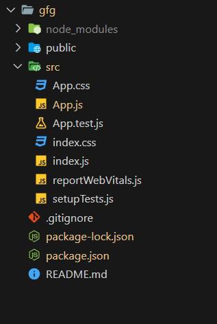
Project Structure
The updated dependencies in package.json will look like this:
"dependencies": {
    "@chakra-ui/icons": "^2.1.1",
    "@chakra-ui/react": "^2.8.2",
    "@emotion/react": "^11.11.3",
    "@emotion/styled": "^11.11.0",
    "@testing-library/jest-dom": "^5.17.0",
    "@testing-library/react": "^13.4.0",
    "@testing-library/user-event": "^13.5.0",
    "framer-motion": "^11.0.3",
    "react": "^18.2.0",
    "react-dom": "^18.2.0",
    "react-scripts": "5.0.1",
    "web-vitals": "^2.1.4"
}
Example 1: Below is the basic example of the Chakra UI Overlay Alert Dialog:
Javascript
import React from 'react';
import {
ChakraProvider,
CSSReset, Box, Container
}
from '@chakra-ui/react';
import DeleteButtonWithConfirmation from './AlertDialog';
function App() {
return (
<ChakraProvider>
<CSSReset />
<Container maxW="container.sm" mt={10}>
<Box>
<DeleteButtonWithConfirmation />
</Box>
</Container>
</ChakraProvider>
);
}
export default App;
|
Javascript
import React, { useState, useRef } from "react";
import {
Button,
AlertDialog,
AlertDialogBody,
AlertDialogFooter,
AlertDialogHeader,
AlertDialogContent,
AlertDialogOverlay,
} from "@chakra-ui/react";
const DeleteButtonWithConfirmation = () => {
const [isOpen, setIsOpen] = useState(false);
const cancelRef = useRef();
const handleDelete = () => {
};
const onOpen = () => setIsOpen(true);
const onClose = () => setIsOpen(false);
return (
<>
<Button colorScheme="red" onClick={onOpen}>
Delete
</Button>
<AlertDialog
isOpen={isOpen}
leastDestructiveRef={cancelRef}
onClose={onClose}
>
<AlertDialogOverlay>
<AlertDialogContent>
<AlertDialogHeader fontSize="lg" fontWeight="bold">
Delete Item
</AlertDialogHeader>
<AlertDialogBody>
Are you sure you want to delete this item? This
action cannot be undone.
</AlertDialogBody>
<AlertDialogFooter>
<Button ref={cancelRef} onClick={onClose}>
Cancel
</Button>
<Button
colorScheme="red"
onClick={handleDelete}
ml={3}
>
Delete
</Button>
</AlertDialogFooter>
</AlertDialogContent>
</AlertDialogOverlay>
</AlertDialog>
</>
);
};
export default DeleteButtonWithConfirmation;
|
Steps to run the application:
npm start
Output:

Chakra UI Overlay Alert Dialog
Example 2: Below is the basic example of the Chakra UI Overlay Menus:
Javascript
import React from "react";
import { ChakraProvider, CSSReset, Box, Container } from "@chakra-ui/react";
import { ChevronDownIcon } from "@chakra-ui/icons";
import { Button, Menu, MenuButton, MenuList, MenuItem } from "@chakra-ui/react";
function App() {
return (
<ChakraProvider>
<CSSReset />
<Container maxW="container.sm" mt={10}>
<Box>
<Menu>
<MenuButton as={Button}
rightIcon={<ChevronDownIcon />}>
Actions
</MenuButton>
<MenuList>
<MenuItem>Download</MenuItem>
<MenuItem>Create a Copy</MenuItem>
<MenuItem>Mark as Draft</MenuItem>
<MenuItem>Delete</MenuItem>
<MenuItem>Attend a Workshop</MenuItem>
</MenuList>
</Menu>
</Box>
</Container>
</ChakraProvider>
);
}
export default App;
|
Steps to run the application:
npm start
Output:
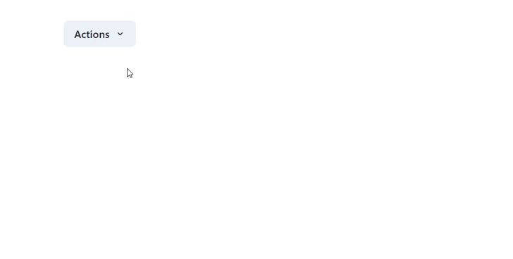
Chakra UI Overlay Menu
Share your thoughts in the comments
Please Login to comment...