React Chakra UI Other
Last Updated :
13 Feb, 2024
Chakra UI is a useful tool that allows users to design appealing and practical websites and applications in a quick and easy way. It provides a variety of ready-to-use components that can be personalized and adjusted to meet different project needs, thus streamlining web development and making it more enjoyable. In this article, we will learn the other Chakra UI pre-built components which also help in creating the projects faster.
Prerequisites:
Approach:
We create a box component and try to show the working of Portal component by using the Modal component. There is a close button also to close the portal and come back to its Modal. In the second code, we make use of the Show and Hide components to show and hide some text in the children box component. The third code demonstrates a simple transition from the bottom of the page using the Slide component.
Steps to Create React Application And Installing Module:
Step 1: Create a React application using the following command:
npx create-react-app chakra-other-app
Step 2: After creating your project folder(i.e. chakra-other-app), move to it by using the following command:
cd chakra-other-app
Step 3: After creating the React application, Install the required package using the following command:
npm i @chakra-ui/react @emotion/react@^11 @emotion/styled@^11 framer-motion@^6
Project structure:

The updated dependencies in the package.json file.
"dependencies": {
    "@chakra-ui/react": "^2.8.2",
    "@emotion/react": "^11.11.1",
    "@emotion/styled": "^11.11.0",
    "@testing-library/jest-dom": "^5.17.0",
    "@testing-library/react": "^13.4.0",
    "@testing-library/user-event": "^13.5.0",
    "framer-motion": "^6.5.1",
    "react": "^18.2.0",
    "react-dom": "^18.2.0",
    "react-scripts": "5.0.1",
    "web-vitals": "^2.1.4"
}
Other Components:
- Portal: It is a pre-built component outside the current DOM hierarchy that is used to transport any element to the end of
document.body and renders a tree into it. It can support nested portals.
import { Portal } from '@chakra-ui/react'
- Show and Hide: The Show component displays the children if the media query matches. The Hide component hides the children if the media query matches.
import { Show, Hide } from '@chakra-ui/react'
- Transitions: Chakra UI supports exporting components `Fade`, `ScaleFade`, `Slide`, `SlideFade`, and `Collapse` to provide simple transitions. Most transition components are created using
framer-motion.
import { Slide} from '@chakra-ui/react'
Example 1: Below is the example to show the Chakra UI Other.
- Utilize the
useDisclosure hook to manage open and close click events for the portal.
- Provide the option for the user to specify the rendering destination by passing the
containerRef prop.
- Set the value of
containerRef to either the ref of the ModalBody container or to a custom container based on the user’s requirement.
Javascript
import { useState } from 'react'
import { ChakraProvider, Box, Text }
from '@chakra-ui/react';
import ModalPortal from './Portal.jsx'
import './App.css'
function App() {
const [count, setCount] = useState(0)
return (
<>
<ChakraProvider>
<Box>
<Text
color="#2F8D46" fontSize="2rem"
textAlign="center" fontWeight="400"
my="1rem">
GeeksforGeeks - React JS Chakra UI concepts
</Text>
<ModalPortal />
</Box>
</ChakraProvider>
</>
)
}
export default App
|
Javascript
import { useRef } from 'react'
import {
Box,
Button, useDisclosure,
Portal, Modal, ModalContent,
ModalHeader, ModalOverlay,
ModalFooter,
ModalBody, ModalCloseButton,
} from "@chakra-ui/react";
const ModalPortal = () => {
const { isOpen, onOpen, onClose } = useDisclosure()
const ref = useRef()
return (
<Box bg="lightgrey" w="100%" h="100%" p={4}>
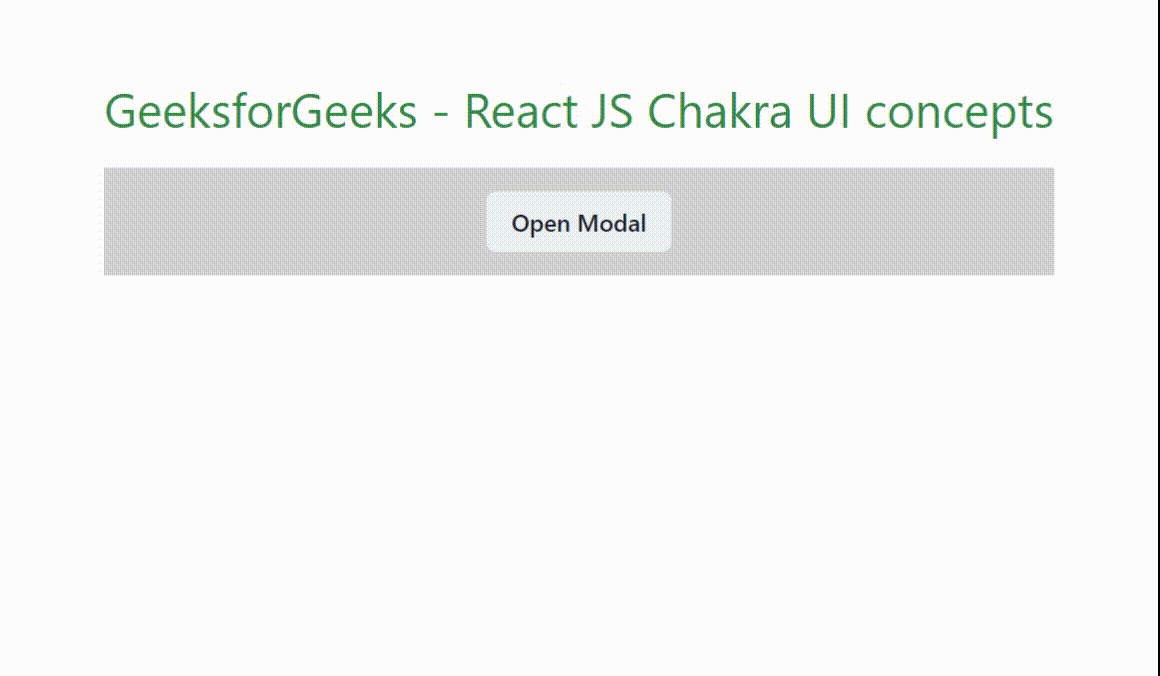
<Button onClick={onOpen}>Open Modal</Button>
<Modal isOpen={isOpen} onClose={onClose} >
<ModalOverlay />
<ModalContent>
<ModalHeader>GeeksforGeeks</ModalHeader>
<ModalCloseButton />
<ModalBody ref={ref}>
<Portal containerRef={ref}>
The text is coming out from a PORTAL.
</Portal>
</ModalBody>
<ModalFooter>
<Button colorScheme='green'
mr={3} onClick={onClose}>
Close
</Button>
</ModalFooter>
</ModalContent>
</Modal>
</Box>
);
};
export default ModalPortal;
|
Start your application using the following command.
npm run start
Output: Now go to http://localhost:3000 in your browser:
Example 2: The code showcases the functionality of displaying and hiding child components.
- It utilizes the
above and below props, which serve as keys for the theme’s breakpoints.
- The
above prop behaves akin to the CSS “min-width” property, determining when a certain breakpoint is surpassed.
- Conversely, the
below prop functions similarly to the CSS “max-width” property, indicating the maximum width threshold before hiding components.
As in the above example, the code for “App.js” will be same other than the import statement and App() function call.
Javascript
import { useState } from 'react'
import { ChakraProvider, Box, Text }
from '@chakra-ui/react';
import ShowHide from './ShowHide.jsx'
import './App.css'
function App() {
const [count, setCount] = useState(0)
return (
<>
<ChakraProvider>
<Box>
<Text
color="#2F8D46" fontSize="2rem"
textAlign="center" fontWeight="400"
my="1rem">
GeeksforGeeks - React JS Chakra UI concepts
</Text>
<ShowHide />
</Box>
</ChakraProvider>
</>
)
}
export default App
|
Javascript
import {
Flex, Box,
Show, Hide,
} from "@chakra-ui/react";
const ShowHide = () => {
return (
<Box bg="lightgrey" w="100%" h="100%" p={4}>
<Flex mt='3' justifyContent="center">
<Show above='sm'>
<Box bg="pink">
This text shows with minimum width
of "sm" value or greater.
</Box>
</Show>
<Hide below='md'>
<Box bg="lightgreen">
This text hides at the maximum width
of "md" value and smaller.
</Box>
</Hide>
</Flex>
</Box>
);
};
export default ShowHide;
|
Output:

Example 3: The code showcases the Slide component from Chakra UI, facilitating smooth transitions from the bottom of the page.
- A button click triggers the transition, providing a simple user interaction.
- Users can specify the direction of the slide according to their needs.
- The useDisclosure hook is employed to manage scenarios for opening and toggling the slide component.
Javascript
import { useState } from 'react'
import { ChakraProvider, Box, Text }
from '@chakra-ui/react';
import Transition from './Transitions.jsx'
import './App.css'
function App() {
const [count, setCount] = useState(0)
return (
<>
<ChakraProvider>
<Box>
<Text
color="#2F8D46" fontSize="2rem"
textAlign="center" fontWeight="400"
my="1rem">
GeeksforGeeks - React JS Chakra UI concepts
</Text>
<Transition />
</Box>
</ChakraProvider>
</>
)
}
export default App
|
Javascript
import {
Flex, Box, useDisclosure,
Button, Text, Slide,
} from "@chakra-ui/react";
const Transition = () => {
const { isOpen, onToggle } = useDisclosure()
return (
<Box bg="lightgrey" w="100%" h="100%" p={4}>
<Flex mt='3' justifyContent="center">
<Flex
direction="row"
alignItems="left"
w={{ base: "90%", md: "80%", lg: "60%" }}>
<Button onClick={onToggle}>Click it</Button>
<Slide direction='bottom' in={isOpen} style={{ zIndex: 10 }}>
<Box p='30px' color='white'
mt='4' bg='green'
rounded='md' shadow='md'
>
<Text>
React is one of the most popular, efficient,
and powerful open-source JavaScript library for
building dynamic and interactive user interfaces.
Whether you are a beginner or an experienced developer,
React Tutorial will significantly enhance your development
skills.
React JS is not a framework, it is just a library
developed by Facebook.
It is very helpful in efficient
development and maintenance of large-scale applications.
ReactJS has a vast ecosystem and community which makes the
development very easy and ensures performance optimization.
</Text>
</Box>
</Slide>
</Flex>
</Flex>
</Box>
);
};
export default Transition;
|
Output: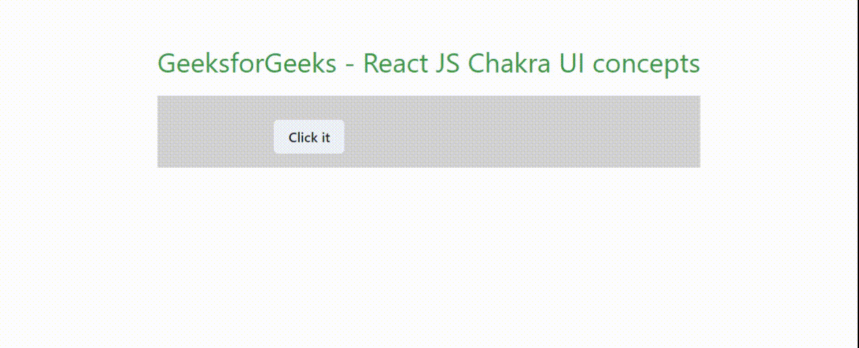
Share your thoughts in the comments
Please Login to comment...