Create a Responsive Navbar using ReactJS
Last Updated :
08 Apr, 2024
Responsive Navbar short for Navigation Bar in React JS provides a routing function for the web application that can change the layouts according to different screens. Navbar provides multiple-page navigation support for the ReactJS single-page application. Responsiveness helps in loading the Nav component for different screens and layouts.
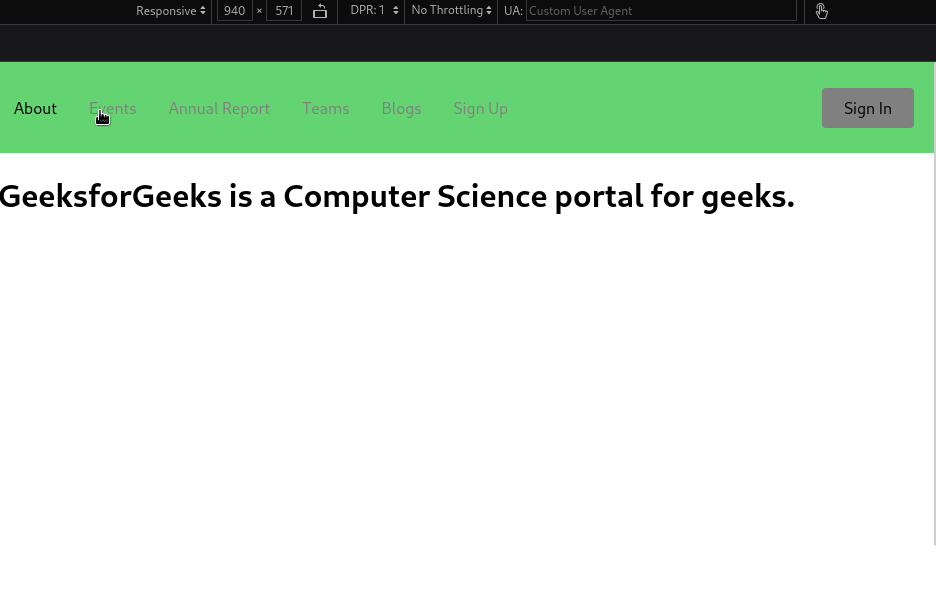
Preview of Final Output: Let us have a look at how the final application will look like:

Prerequisites to create Responsive Navbar:
Approach
To create a Responsive NavBar in React, we will
- use the react-router-dom for defining the routes.
- design the navbar using the styled-components library.
- define the pages using JSX
- link the pages to respective routes or we address with the help to Route component.
Steps to create Responsive Navbar
Step 1: Create a new React Project. Check this article for setting up the react project.
Step 2: Install the dependencies required in this project by typing the given command in the terminal:
npm i react-router-dom react-icons styled-components@5.3.10
Step 3: Now create the components folder in src then go to the components folder and create a new folder name Navbar. In Navbar folder create two files index,js and NavbarElements.js.
Step 4: Define the required page components in pages folder. In pages create files name about.js, annual.js, blogs.js, events.js, index.js, signup.js, team.js
Project Structure of Responsive Navbar
The file structure in the project will look like this:

Dependencies list after installing packages:
"dependencies": {
        "@testing-library/jest-dom": "^5.17.0",
        "@testing-library/react": "^13.4.0",
        "@testing-library/user-event": "^13.5.0",
        "react": "^18.2.0",
        "react-dom": "^18.2.0",
        "react-icons": "^4.11.0",
        "react-router-dom": "^6.16.0",
        "react-scripts": "5.0.1",
        "styled-components": "^5.3.10",
        "web-vitals": "^2.1.4"
}
Example: We will create a responsive navbar using react-router-dom with diiferent files as Home, About, blogs, and signup etc.
Javascript
// index.js

import React from "react";
import ReactDOM from "react-dom/client";
import "./index.css";
import App from "./App";

const root = ReactDOM.createRoot(
    document.getElementById("root")
);
root.render(
    <React.StrictMode>
        <App />
    </React.StrictMode>
);
// filename -App.js

import React from "react";
import "./App.css";
import Navbar from "./components/Navbar";
import {
    BrowserRouter as Router,
    Routes,
    Route,
} from "react-router-dom";
import Home from "./pages";
import About from "./pages/about";
import Events from "./pages/events";
import AnnualReport from "./pages/annual";
import Teams from "./pages/team";
import Blogs from "./pages/blogs";
import SignUp from "./pages/signup";

function App() {
    return (
        <Router>
            <Navbar />
            <Routes>
                <Route path="/" element={<Home />} />
                <Route path="/about" element={<About />} />
                <Route
                    path="/events"
                    element={<Events />}
                />
                <Route
                    path="/annual"
                    element={<AnnualReport />}
                />
                <Route path="/team" element={<Teams />} />
                <Route path="/blogs" element={<Blogs />} />
                <Route
                    path="/sign-up"
                    element={<SignUp />}
                />
            </Routes>
        </Router>
    );
}

export default App;
// components/Navbar/index.js

import React from "react";
import {
    Nav,
    NavLink,
    Bars,
    NavMenu,
    NavBtn,
    NavBtnLink,
} from "./NavbarElements";

const Navbar = () => {
    return (
        <>
            <Nav>
                <Bars />

                <NavMenu>
                    <NavLink to="/about" >
                        About
                    </NavLink>
                    <NavLink to="/events" activeStyle>
                        Events
                    </NavLink>
                    <NavLink to="/annual" activeStyle>
                        Annual Report
                    </NavLink>
                    <NavLink to="/team" activeStyle>
                        Teams
                    </NavLink>
                    <NavLink to="/blogs" activeStyle>
                        Blogs
                    </NavLink>
                    <NavLink to="/sign-up" activeStyle>
                        Sign Up
                    </NavLink>
                    {/* Second Nav */}
                    {/* <NavBtnLink to='/sign-in'>Sign In</NavBtnLink> */}
                </NavMenu>
                <NavBtn>
                    <NavBtnLink to="/signin">
                        Sign In
                    </NavBtnLink>
                </NavBtn>
            </Nav>
        </>
    );
};

export default Navbar;
// components/Navbar/navbarElements.js

import { FaBars } from "react-icons/fa";
import { NavLink as Link } from "react-router-dom";
import styled from "styled-components";

export const Nav = styled.nav`
    background: #63d471;
    height: 85px;
    display: flex;
    justify-content: space-between;
    padding: 0.2rem calc((100vw - 1000px) / 2);
    z-index: 12;
    /* Third Nav */
    /* justify-content: flex-start; */
`;

export const NavLink = styled(Link)`
    color: #808080;
    display: flex;
    align-items: center;
    text-decoration: none;
    padding: 0 1rem;
    height: 100%;
    cursor: pointer;
    &.active {
        color: #000000;
    }
`;

export const Bars = styled(FaBars)`
    display: none;
    color: #808080;
    @media screen and (max-width: 768px) {
        display: block;
        position: absolute;
        top: 0;
        right: 0;
        transform: translate(-100%, 75%);
        font-size: 1.8rem;
        cursor: pointer;
    }
`;

export const NavMenu = styled.div`
    display: flex;
    align-items: center;
    margin-right: -24px;
    /* Second Nav */
    /* margin-right: 24px; */
    /* Third Nav */
    /* width: 100vw;
  white-space: nowrap; */
    @media screen and (max-width: 768px) {
        display: none;
    }
`;

export const NavBtn = styled.nav`
    display: flex;
    align-items: center;
    margin-right: 24px;
    /* Third Nav */
    /* justify-content: flex-end;
  width: 100vw; */
    @media screen and (max-width: 768px) {
        display: none;
    }
`;

export const NavBtnLink = styled(Link)`
    border-radius: 4px;
    background: #808080;
    padding: 10px 22px;
    color: #000000;
    outline: none;
    border: none;
    cursor: pointer;
    transition: all 0.2s ease-in-out;
    text-decoration: none;
    /* Second Nav */
    margin-left: 24px;
    &:hover {
        transition: all 0.2s ease-in-out;
        background: #fff;
        color: #808080;
    }
`;
// pages/about.js

import React from "react";

const About = () => {
    return (
        <div
            style={{
                display: "flex",
                justifyContent: "centre",
                alignItems: "centre",
                height: "100vh",
            }}
        >
            <h1>
                GeeksforGeeks is a Computer Science portal
                for geeks.
            </h1>
        </div>
    );
};

export default About;
// pages/annual.js

import React from "react";

const AnnualReport = () => {
    return (
        <div
            style={{
                display: "flex",
                justifyContent: "centre",
                alignItems: "centre",
                height: "100vh",
            }}
        >
            <h1>Annual Report</h1>
        </div>
    );
};

export default AnnualReport;
// pages/blogs.js

import React from "react";

const Blogs = () => {
    return (
        <div
            style={{
                display: "flex",
                justifyContent: "centre",
                alignItems: "centre",
                height: "100vh",
            }}
        >
            <h1>Welcome to GeeksforGeeks Blogs</h1>
        </div>
    );
};

export default Blogs;
// pages/events.js

import React from "react";

const Events = () => {
    return (
        <div
            style={{
                display: "flex",
                justifyContent: "centre",
                alignItems: "centre",
                height: "100vh",
            }}
        >
            <h1>Welcome to GeeksforGeeks Events</h1>
        </div>
    );
};

export default Events;
// pages/index.js

import React from 'react';

const Home = () => {
  return (
    <div
      style={{
        display: 'flex',
        justifyContent: 'centre',
        alignItems: 'centre',
        height: '100vh'
      }}
    >
      <h1>Welcome to GeeksforGeeks</h1>
    </div>
  );
};

export default Home;
// pages/signup.js

import React from "react";

const SignUp = () => {
    return (
        <div
            style={{
                display: "flex",
                justifyContent: "centre",
                alignItems: "centre",
                height: "100vh",
            }}
        >
            <h1>Sign Up</h1>
        </div>
    );
};

export default SignUp;
// pages/team.js

import React from "react";

const Teams = () => {
    return (
        <div
            style={{
                display: "flex",
                justifyContent: "centre",
                alignItems: "centre",
                height: "100vh",
            }}
        >
            <h1>Welcome to GeeksforGeeks Team</h1>
        </div>
    );
};

export default Teams;
Save all files and start the server by using the command.
npm start
Output: After running the application this output will be visible on http://localhost:3000/
Share your thoughts in the comments
Please Login to comment...