Frequency Distribution is a tool in statistics that helps us organize the data and also helps us reach meaningful conclusions. It tells us how often any specific values occur in the dataset.
Let’s learn about Frequency Distribution in detail, including its graphs, table, and examples.
Frequency Distribution in Statistics
A frequency distribution is an overview of all values of some variable and the number of times they occur. It tells us how frequencies are distributed over the values. That is how many values lie between different intervals. They give us an idea about the range where most of the values fall and the ranges where values are scarce.
Frequency Distribution Graphs
To represent the Frequency Distribution, there are various methods such as Histogram, Bar Graph, Frequency Polygon, and Pie Chart.
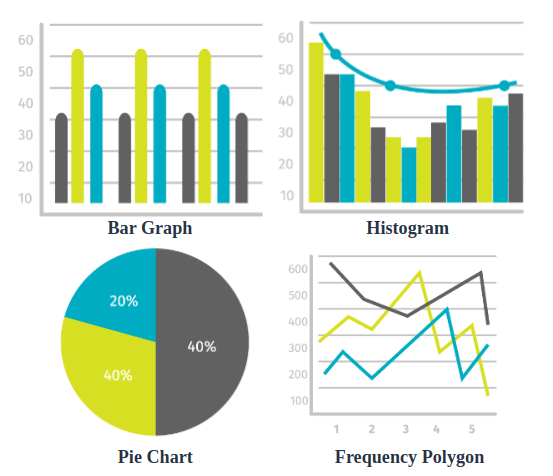
A brief description of all these graphs is as follows:
| Graph Type | Description | Use Cases |
|---|
| Histogram | Represents the frequency of each interval of continuous data using bars of equal width. | Continuous data distribution analysis. |
| Bar Graph | Represents the frequency of each interval using bars of equal width; can also represent discrete data. | Comparing discrete data categories. |
| Frequency Polygon | Connects midpoints of class frequencies using lines, similar to a histogram but without bars. | Comparing various datasets. |
| Pie Chart | Circular graph showing data as slices of a circle, indicating the proportional size of each slice relative to the whole dataset. | Showing relative sizes of data portions. |
Frequency Distribution Table
A frequency distribution table is a way to organize and present data in a tabular form which helps us summarize the large dataset into a concise table. In the frequency distribution table, there are two columns one representing the data either in the form of a range or an individual data set and the other column shows the frequency of each interval or individual.
For example, let’s say we have a dataset of students’ test scores in a class.
Test Score
| Frequency
|
|---|
0-20
| 6
|
20-40
| 12
|
40-60
| 22
|
60-80
| 15
|
80-100
| 5
|
Types of Frequency Distribution Table
Based on the analysis and categorization of the data, there are two types of Frequency Distribution Tables i.e.,
- Grouped Frequency Distribution Table
- Ungrouped Frequency Distribution Table
Let’s learn about them in detail.
Frequency Distribution Table for Grouped Data
A grouped frequency distribution table is a table that organizes any given data into intervals or groups, known as class intervals and displays the frequency or number of observations that fall within each interval.
For example, we can consider the table of the number of cattle owned by families in a town.
Number of Cattle
| Number of Families
|
|---|
10 – 20
| 5
|
20 – 30
| 12
|
30 – 40
| 8
|
40 – 50
| 15
|
50 – 60
| 20
|
In the above table, we can see there are two columns. The first column represents the number of cattle, and the second column represents the number of families who own the associate number of cattle. As the first column is grouped with a certain interval length, thus this table is an example of Grouped Frequency Distribution.
Frequency Distribution Table for Ungrouped Data
An ungrouped frequency distribution table is a statistical table that organizes individual data values along with their corresponding frequencies instead of groups or class intervals.
For example, consider the number of vowels in any given paragraph.
Vowel
| Frequency
|
|---|
a
| 7
|
e
| 10
|
i
| 7
|
o
| 6
|
u
| 3
|
In the above table, the two columns representing a list of vowels and their frequency in any given paragraph. As the first column is a list of some individual elements, thus this table is an example of Ungrouped Frequency Distribution.
Check: Difference between Frequency Array and Frequency Distribution
Types of Frequency Distribution
There are four types of frequency distributions:
- Grouped Frequency Distribution
- Ungrouped Frequency Distribution
- Relative Frequency Distribution
- Cumulative Frequency Distribution
Check: Types of Frequency Distribution
Grouped Frequency Distribution
In Grouped Frequency Distribution observations are divided between different intervals known as class intervals and then their frequencies are counted for each class interval. This Frequency Distribution is used mostly when the data set is very large.
Example: Make the Frequency Distribution Table for the ungrouped data given as follows:
23, 27, 21, 14, 43, 37, 38, 41, 55, 11, 35, 15, 21, 24, 57, 35, 29, 10, 39, 42, 27, 17, 45, 52, 31, 36, 39, 38, 43, 46, 32, 37, 25
Solution:
As there are observations in between 10 and 57, we can choose class intervals as 10-20, 20-30, 30-40, 40-50, and 50-60. In these class intervals all the observations are covered and for each interval there are different frequency which we can count for each interval. Thus, the Frequency Distribution Table for the given data is as follows:
| Class Interval | Frequency |
|---|
10 – 20
| 5
|
20 – 30
| 8
|
30 – 40
| 12
|
40 – 50
| 6
|
50 – 60
| 3
|
Ungrouped Frequency Distribution
In Ungrouped Frequency Distribution, all distinct observations are mentioned and counted individually. This Frequency Distribution is often used when the given dataset is small.
Example: Make the Frequency Distribution Table for the ungrouped data given as follows:
10, 20, 15, 25, 30, 10, 15, 10, 25, 20, 15, 10, 30, 25
Solution:
As unique observations in the given data are only 10, 15, 20, 25, and 30 with each having a different frequency. Thus the Frequency Distribution Table of the given data is as follows:
| Value | Frequency |
|---|
10
| 4
|
15
| 3
|
20
| 2
|
25
| 3
|
30
| 2
|
Relative Frequency Distribution
This distribution displays the proportion or percentage of observations in each interval or class. It is useful for comparing different data sets or for analyzing the distribution of data within a set.
Relative Frequency is given by:
Relative Frequency = Frequency of the Event/Total Number of Events
Example: Make the Relative Frequency Distribution Table for the following data:
| Score Range | 0-20 | 21-40 | 41-60 | 61-80 | 81-100 |
|---|
| Frequency | 5 | 10 | 20 | 10 | 5 |
|---|
Solution:
To Create the Relative Frequency Distribution table, we need to calculate Relative Frequency for each class interval. Thus Relative Frequency Distribution table is given as follows:
| Score Range | Frequency | Relative Frequency |
|---|
0-20
| 5
| 5/50 = 0.10
|
21-40
| 10
| 10/50 = 0.20
|
41-60
| 20
| 20/50 = 0.40
|
61-80
| 10
| 10/50 = 0.20
|
81-100
| 5
| 5/50 = 0.10
|
Total
| 50
| 1.00
|
Cumulative Frequency Distribution
Cumulative frequency is defined as the sum of all the frequencies in the previous values or intervals up to the current one. The frequency distributions which represent the frequency distributions using cumulative frequencies are called cumulative frequency distributions. There are two types of cumulative frequency distributions:
- Less than type: We sum all the frequencies before the current interval.
- More than type: We sum all the frequencies after the current interval.
Check:
Let’s see how to represent a cumulative frequency distribution through an example,
Example: The table below gives the values of runs scored by Virat Kohli in the last 25 T-20 matches. Represent the data in the form of less-than-type cumulative frequency distribution:
| 45 | 34 | 50 | 75 | 22 |
| 56 | 63 | 70 | 49 | 33 |
| 0 | 8 | 14 | 39 | 86 |
| 92 | 88 | 70 | 56 | 50 |
| 57 | 45 | 42 | 12 | 39 |
Solution:
Since there are a lot of distinct values, we’ll express this in the form of grouped distributions with intervals like 0-10, 10-20 and so. First let’s represent the data in the form of grouped frequency distribution.
| Runs | Frequency |
|---|
0-10
| 2
|
10-20
| 2
|
20-30
| 1
|
30-40
| 4
|
40-50
| 4
|
50-60
| 5
|
60-70
| 1
|
70-80
| 3
|
80-90
| 2
|
90-100
| 1
|
Now we will convert this frequency distribution into cumulative frequency distribution by summing up the values of current interval and all the previous intervals.
| Runs scored by Virat Kohli | Cumulative Frequency |
|---|
Less than 10
| 2
|
Less than 20
| 4
|
Less than 30
| 5
|
Less than 40
| 9
|
Less than 50
| 13
|
Less than 60
| 18
|
Less than 70
| 19
|
Less than 80
| 22
|
Less than 90
| 24
|
Less than 100
| 25
|
This table represents the cumulative frequency distribution of less than type.
Runs scored by Virat Kohli
| Cumulative Frequency
|
|---|
More than 0
| 25
|
More than 10
| 23
|
More than 20
| 21
|
More than 30
| 20
|
More than 40
| 16
|
More than 50
| 12
|
More than 60
| 7
|
More than 70
| 6
|
More than 80
| 3
|
More than 90
| 1
|
This table represents the cumulative frequency distribution of more than type.
We can plot both the type of cumulative frequency distribution to make the Cumulative Frequency Curve.
Frequency Distribution Curve
A frequency distribution curve, also known as a frequency curve, is a graphical representation of a data set’s frequency distribution. It is used to visualize the distribution and frequency of values or observations within a dataset. Let’s understand it’s different types based on the shape of it, as follows:
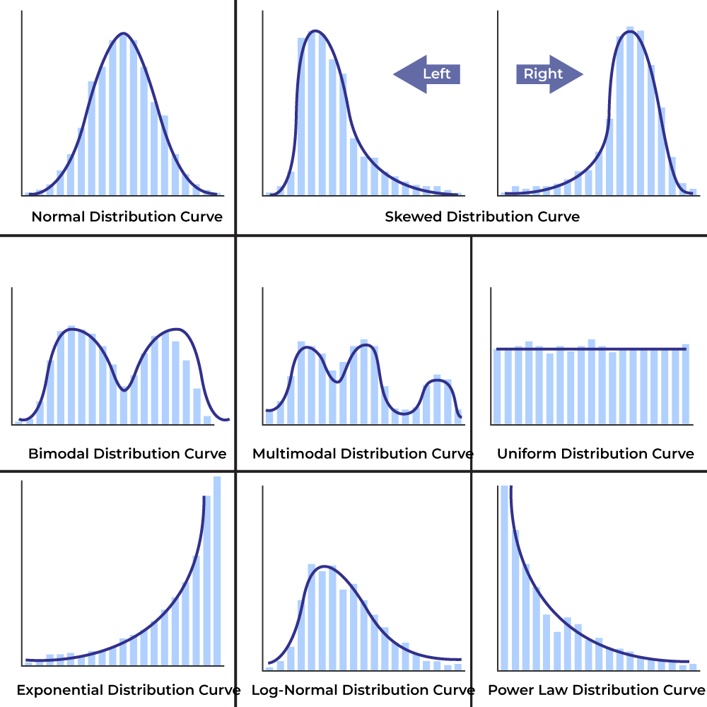
Frequency Distribution Curve Types
|
|---|
| Type of Distribution | Description |
|---|
| Normal Distribution | Symmetric and bell-shaped; data concentrated around the mean. |
| Skewed Distribution | Not symmetric; can be positively skewed (right-tailed) or negatively skewed (left-tailed). |
| Bimodal Distribution | Two distinct peaks or modes in the frequency distribution, suggesting data from different populations. |
| Multimodal Distribution | More than two distinct peaks or modes in the frequency distribution. |
| Uniform Distribution | All values or intervals have roughly the same frequency, resulting in a flat, constant distribution. |
| Exponential Distribution | Rapid drop-off in frequency as values increase, resembling an exponential function. |
| Log-Normal Distribution | Logarithm of the data follows a normal distribution, often used for multiplicative data, positively skewed. |
Check: Grouping of Data – Definition, Frequency Distribution, Histograms
There are various formulas which can be learned in the context of Frequency Distribution, one such formula is the coefficient of variation. This formula for Frequency Distribution is discussed below in detail.
Coefficient of Variation
We can use mean and standard deviation to describe the dispersion in the values. But sometimes while comparing the two series or frequency distributions becomes a little hard as sometimes both have different units.
The coefficient of Variation is defined as,
[Tex]\bold{\frac{\sigma}{\bar{x}} \times 100}
[/Tex]
Where,
- σ represents the standard deviation
- [Tex]\bold{\bar{x}}
[/Tex] represents the mean of the observations
Note: The data with greater C.V. is said to be more variable than the other. The series having lesser C.V. is said to be more consistent than the other.
Comparing Two Frequency Distributions with the Same Mean
We have two frequency distributions. Let’s say [Tex]\sigma_{1} \text{ and } \bar{x}_1
[/Tex] are the standard deviation and mean of the first series and [Tex]\sigma_{2} \text{ and } \bar{x}_2
[/Tex] are the standard deviation and mean of the second series. The Coefficeint of Variation(CV) is calculated as follows
C.V of first series = [Tex]\frac{\sigma_1}{\bar{x}_1} \times 100
[/Tex]
C.V of second series = [Tex]\frac{\sigma_2}{\bar{x}_2} \times 100
[/Tex]
We are given that both series have the same mean, i.e.,
[Tex]\bar{x}_2 = \bar{x}_1 = \bar{x}
[/Tex]
So, now C.V. for both series are,
C.V. of the first series = [Tex] \frac{\sigma_1}{\bar{x}} \times 100
[/Tex]
C.V. of the second series = [Tex]\frac{\sigma_2}{\bar{x}} \times 100
[/Tex]
Notice that now both series can be compared with the value of standard deviation only. Therefore, we can say that for two series with the same mean, the series with a larger deviation can be considered more variable than the other one.
Frequency Distribution Examples
Problem 1: Suppose we have a series, with a mean of 20 and a variance is 100. Find out the Coefficient of Variation.
Solution:
We know the formula for Coefficient of Variation,
[Tex]\frac{\sigma}{\bar{x}} \times 100
[/Tex]
Given mean [Tex]\bar{x}
[/Tex] = 20 and variance [Tex]\sigma^2
[/Tex] = 100.
Substituting the values in the formula,
[Tex]\frac{\sigma}{\bar{x}} \times 100 \\ = \frac{20}{\sqrt{100}} \times 100 \\ = \frac{20}{10} \times 100 \\ = 200
[/Tex]
Problem 2: Given two series with Coefficients of Variation 70 and 80. The means are 20 and 30. Find the values of standard deviation for both series.
Solution:
In this question we need to apply the formula for CV and substitute the given values.
Standard Deviation of first series.
[Tex]C.V = \frac{\sigma}{\bar{x}} \times 100 \\ 70 = \frac{\sigma}{20} \times 100 \\ 1400 = \sigma \times 100 \\ 14 = \sigma
[/Tex]
Thus, the standard deviation of first series = 14.
Standard Deviation of second series.
[Tex]C.V = \frac{\sigma}{\bar{x}} \times 100 \\ 80 = \frac{\sigma}{30} \times 100 \\ 2400 = \sigma \times 100 \\ 24 = \sigma
[/Tex]
Thus, the standard deviation of first series = 24.
Problem 3: Draw the frequency distribution table for the following data:
2, 3, 1, 4, 2, 2, 3, 1, 4, 4, 4, 2, 2, 2
Solution:
Since there are only very few distinct values in the series, we will plot the ungrouped frequency distribution.
| Value | Frequency |
1
| 2
|
2
| 6
|
3
| 2
|
4
| 4
|
Total
| 14
|
Problem 4: The table below gives the values of temperature recorded in Hyderabad for 25 days in summer. Represent the data in the form of less-than-type cumulative frequency distribution:
| 37 | 34 | 36 | 27 | 22 |
| 25 | 25 | 24 | 26 | 28 |
| 30 | 31 | 29 | 28 | 30 |
| 32 | 31 | 28 | 27 | 30 |
| 30 | 32 | 35 | 34 | 29 |
Solution:
Since there are so many distinct values here, we will use grouped frequency distribution. Let’s say the intervals are 20-25, 25-30, 30-35. Frequency distribution table can be made by counting the number of values lying in these intervals.
| Temperature | Number of Days |
|---|
20-25
| 2
|
25-30
| 10
|
30-35
| 13
|
This is the grouped frequency distribution table. It can be converted into cumulative frequency distribution by adding the previous values.
| Temperature | Number of Days |
|---|
Less than 25
| 2
|
Less than 30
| 12
|
Less than 35
| 25
|
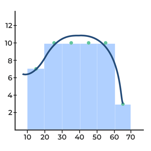
Problem 5: Make a Frequency Distribution Table as well as the curve for the data:
{45, 22, 37, 18, 56, 33, 42, 29, 51, 27, 39, 14, 61, 19, 44, 25, 58, 36, 48, 30, 53, 41, 28, 35, 47, 21, 32, 49, 16, 52, 26, 38, 57, 31, 59, 20, 43, 24, 55, 17, 50, 23, 34, 60, 46, 13, 40, 54, 15, 62}
Answer:
To create the frequency distribution table for given data, let’s arrange the data in ascending order as follows:
{13, 14, 15, 16, 17, 18, 19, 20, 21, 22, 23, 24, 25, 26, 27, 28, 29, 30, 31, 32, 33, 34, 35, 36, 37, 38, 39, 40, 41, 42, 43, 44, 45, 46, 47, 48, 49, 50, 51, 52, 53, 54, 55, 56, 57, 58, 59, 60, 61, 62}
Now, we can count the observations for intervals: 10-20, 20-30, 30-40, 40-50, 50-60 and 60-70.
| Interval | Frequency |
|---|
| 10 – 20 | 7 |
| 20 – 30 | 10 |
| 30 – 40 | 10 |
| 40 – 50 | 10 |
| 50 – 60 | 10 |
| 60 – 70 | 3 |
From this data, we can plot the Frequency Distribution Curve as follows:
Read More:
Conclusion of Frequency Distribution
The frequency distribution provides a clear summary of how often each value or category occurs within a dataset. It allows us to see the distribution of values and understand the pattern or spread of data. By organizing data into groups and displaying their frequencies, we gain insights into the central tendency, variability, and shape of the data distribution. This facilitates better understanding and interpretation of the dataset, aiding in decision-making, analysis, and communication of findings.
Frequency Distribution – FAQs
Define Frequency Distribution in Statistics?
A frequency distribution is a table or graph that displays the frequency of various outcomes or values in a sample or population. It shows the number of times each value occurs in the data set.
How Can I Construct a Frequency Distribution?
To construct a frequency distribution:
- Organize the data.
- Decide on the number of classes.
- Calculate the class width.
- Create class intervals.
- Count the frequencies for each interval.
- Create a frequency table.
- Optionally, visualize the data with graphs like histograms or bar charts.
What are the Types of Frequency Distribution?
There are four types of frequency distributions that are as follows:
- Grouped Frequency Distribution
- Ungrouped Frequency Distribution
- Relative Frequency Distribution
- Cumulative Frequency Distribution
What is Ungrouped Frequency Distribution?
An ungrouped frequency distribution is a distribution that shows the frequency of each individual value in a data set.
What is Grouped Frequency Distribution?
A grouped frequency distribution is a distribution that shows the frequency of values within specified intervals or classes.
What is frequency count distribution?
Frequency count distribution is a way of organizing and displaying data to show how often each unique value (or range of values) appears in a dataset
What is Relative Frequency Distribution?
A relative frequency distribution is a distribution that shows the proportion or percentage of values within each interval or class.
What is Cumulative Frequency Distribution?
A cumulative frequency distribution is a distribution that shows the number or proportion of values that fall below a certain value or interval.
Share your thoughts in the comments
Please Login to comment...