Data Handling: Nowadays, managing and representing data systematically has become very important especially when the data provided is large and complex, This is when Data Handling comes into the picture.
Data handling involves the proper management of research data throughout and beyond the lifespan of a research project. This process includes establishing and implementing policies and procedures for securely storing, archiving, or disposing of data. It encompasses both electronic and non-electronic means of data management to ensure the data’s safety and security at all stages.
Statistics is another term for data handling, and it is useful not only in the fields of Math and Science but also in the fields where the representation of data is required. Let’s learn about some forms of Data handling, including the graphical representation of data and how they work.
What is Data Handling?
The definition of Data handling is in the title itself, that is, Handling the data in such a way that it becomes easier for people to understand and comprehend the given information. Hence, The process of collecting, Recording, and representing data in some form of graph or chart to make it easy for people to understand is called Data handling.
Data Handling Meaning
Data handling refers to the process of gathering, recording, organizing, and analyzing data to extract useful information, draw conclusions, and support decision-making. It encompasses a broad range of activities, including the collection of raw data, ensuring its accuracy and integrity, processing it into a manageable form, analyzing it statistically, and presenting it in ways that are easy to understand (such as charts, graphs, and tables).
Graphical Representation of Data
- Pictographs or Picture Graphs
- Bar Graphs
- Line Graphs
- Pie Charts
- Scatter Plot
Pictographs
A pictograph is the pictorial representation of any data given to us in written form. It can be said that pictographs used to be the earliest form of conversation, since way back in time, people communicated mostly through pictures with each other since languages were not present.
Indeed, Pictograph plays a role in our day-to-day life too. For instance, when a friend tells us a story, we start imagining the story in our head and that makes it both easy to understand and easy to remember for a long time for us.
Drawing a Pictograph
Let’s learn to draw the pictograph with the help of an example,
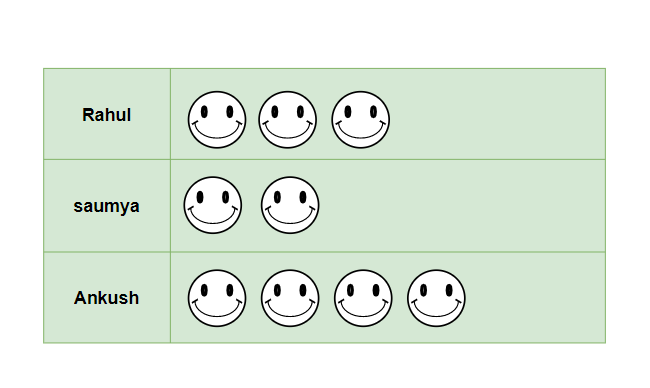
Example: In a reading competition, three students were participating- Rahul, Saumya, and Ankush. They were supposed to read as many books as they could in an hour. Rahul read 3 books, Saumya read 2 books and Ankush read 4 books. Draw the pictograph for the information.
Solution:
There are some basic steps to draw a Pictograph:
- Decide the particular picture/pictures that is required to represent data, make sure that the picture is a little related in order to memorize information easily.
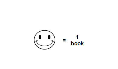
- Here, to successfully read a book, a smiley is denoted.
- Now, draw the pictures according to information presented, for example, there will be 3 smilies for Rahul as he completed 3 books in an hour.
Bar Graphs
The graphical representation of any quantity, number or data in the form of bars is called a bar graph. With the help of Bar Graph, not only the data look neat and understanding but also it is easier to compare the data given.
Types of Bar Graph
Various types of bar graph include:
- Vertical Bar Graph
- Horizontal Bar Graph
Vertical Bar Graph
These are the most common bar graph we come across, the bars of grouped data in vertical bar graphs lie vertically. Sometimes when the data categorized have long names, then Horizontal bar graphs are preferred since, in vertical bar graphs, there is not much space on the x-axis.
An example explaining the concept of Bar graph is added below:
Example: There are 800 students in a school and the table for their birthdays in all 12 months is given below, Draw the Vertical Bar graph and answer,
Months
| January
| February
| March
| April
| May
| June
| July
| August
| September
| October
| November
| December
|
|---|
No. of Students
|
50
|
80
|
65
|
50
|
40
|
90
|
45
|
110
|
80
|
70
|
100
|
20
|
|---|
- Maximum number of students have their birthdays in which month?
- Which two months have equal number of birthday?
- Minimum number of birthdays occur in which month?
Solution:
The vertical bar graph for the table given in the question will be,
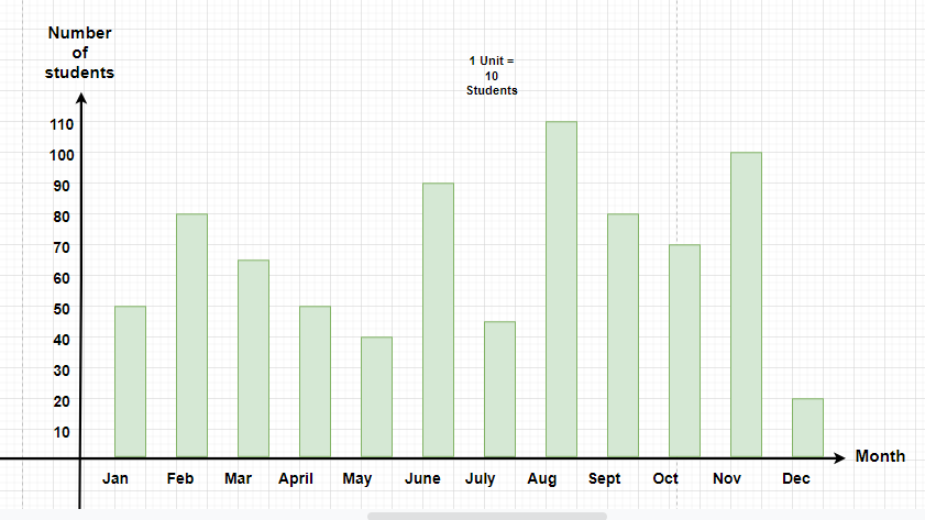
From the Bar graph we can figure out the answer of the questions
- August is that month in which maximum birthdays are happening, since the bar above august is the longest(there are 110 students whose birthday come in August)
- From the graph, we can tell that January and April have equal lengths of bars, That means they have the same number of birthdays (both have 50 birthdays)
- Minimum number of birthdays occur in December since it has the smallest bar.(20 students have their birthdays in December.
Horizontal Bar Graph
The graphs that have their rectangular bars lying horizontally, which means that the frequency of the data lie on the x-axis while the categories of the data lie on the y-axis are known as Horizontal bar graphs.
Horizontal bar graphs are preferred when the name of the categories of data are long and the minimum space on the x-axis is not sufficient.
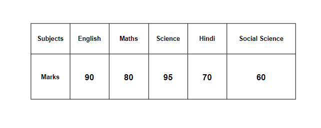
Example: In an examination, Reeta performed in 5 subjects, her performance is given in the table below. Draw a Horizontal Bar graph showing the marks she obtained in all the subjects, Also, calculate the overall Percentage obtained by her.
Solution:
The Horizontal bar graph for the table mentioned in the question,
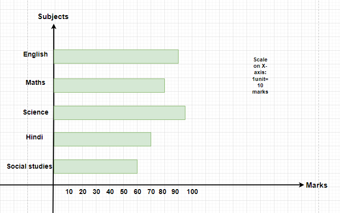
The overall Percentage obtained by Reeta = [Tex]\frac{(90+80+95+70+60)}{500}[/Tex]×100
= 79 percent.
Double- Bar Graph
Double-bar graphs are used when two groups of data are required to be represented on a single graph. In a double-bar graph, to represent two groups of data, they are represented beside each other at different heights depending upon their values.
Advantages of double-bar graph:
- A double-bar graph is helpful when multiple data are required to be represented.
- It helps in summarizing large and big data in an easy and visual form.
- It shows and covers all different frequency distribution.
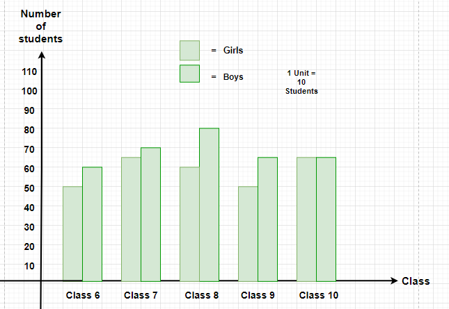
Example: The table for the number of boys and girls for classes 6, 7, 8, 9, and 10 is shown below. Represent the data on a Double-bar graph.
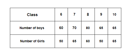
Solution:
The double-bar graph for the table given the question,
Line Graphs
Line graph or line chart visually shows how different things relate over time by connecting dots with straight lines. It helps us see patterns or trends in the data, making it easier to understand how variables change or interact with each other as time goes by.
How to Make a Line Graph?
To make a line graph we need to use the following steps:
- Determine Variables: The first and foremost step to creating a line graph is to identify the variables you want to plot on the X-axis and Y-axis.
- Choose Appropriate Scales: Based on your data, determine the appropriate scale.
- Plot Points: Plot the individual data points on the graph according to the given data.
- Connect Points: After plotting the points, you have to connect those points with a line.
- Label Axes: Add labels to the X-axis and Y-axis. You can also include the unit of measurement.
- Add Title: After completing the graph you should provide a suitable title.
Example: Kabir eats eggs each day and the data for the same is added in the table below. Draw a line graph for the given data
| Weekdays | Monday | Tuesday | Wednesday | Thursday |
|---|
| Eggs Eaten | 5 | 10 | 15 | 10 |
|---|
Solution:

Line Graph
Pie Charts
Pie chart is one of the types of charts in which data is represented in a circular shape. In pie chart circle is further divided into multiple sectors/slices; those sectors show the different parts of the data from the whole.
Pie charts, also known as circle graphs or pie diagrams, are very useful in representing and interpreting data
Example: In an office no of employees who plays various sports are added in a table below:
Sport
| Cricket
| Football
| Badminton
| Hockey
| Other
|
|---|
Number of Employees
|
34
|
50
|
24
|
10
|
82
|
|---|
Draw suitable pie chart.
Solution:
Required pie chart for the given data is,

Pie Chart
Scatter Plot
A scatter plot is a type of graphical representation that displays individual data points on a two-dimensional coordinate system. Each point on the plot represents the values of two variables, allowing us to observe any patterns, trends, or relationships between them. Typically, one variable is plotted on the horizontal axis (x-axis), and the other variable is plotted on the vertical axis (y-axis).
Scatter plots are commonly used in data analysis to visually explore the relationship between variables and to identify any correlations or outliers present in the data.
Line drawn in a scatter plot, that is near to almost all the points in the plot is called the “line of best fit” or “trend line“. The example for the same is added in the image below:

People Also View:
Examples on Data Handling
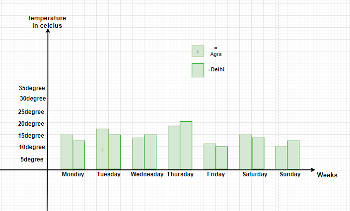
Example 1: In a survey done for a week from Monday to Sunday, for two cities Agra and Delhi, The temperatures of both the cities are measured and the temperatures obtained are as following,
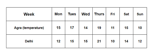
Draw the Bar Graph for the given table in the question.
Solution:
The Given table has two categories of data, one is the temperature for Agra and the other is the temperature for Delhi, Therefore, the graph can be drawn in one as a double- Bar graph, the graph shall look like,
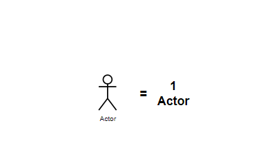
Example 2: In a Theater, there are 3 Plays with different amounts of actors participating in each play. In play 1, there are 9 actors, in play 2, there are 3 lesser actors, and the number of actors in play 3 is one lesser than play 1. Draw the Pictograph for the information given and analyze in which play, the stage will be most crowded.
Solution:
From the information given in the question, we can say that play 1 has 9 actors, play 2 has 6 actors and play 3 has 10 actors
Representing actors in the pictorial form as,
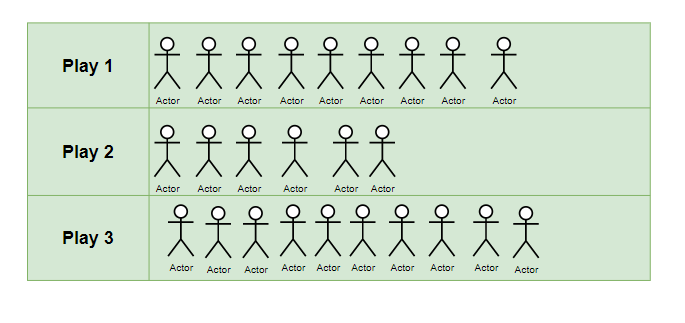
Therefore, we can conclude that Play 3 has the stage most crowded as it has 10 actors acting on stage.
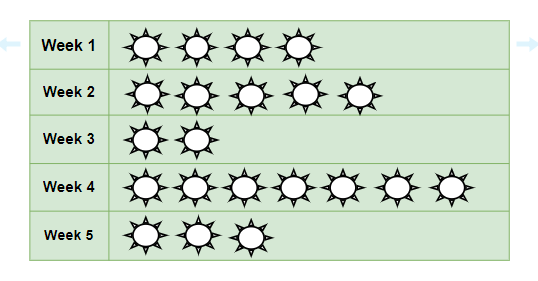
Example 3: In a Weather Report conducted for 5 weeks continuously, it was noted that not all days are sunny days in the season of spring. The observation said that week 1 had 4 sunny days, week 2 had 5 sunny days, week 3 had only 2 sunny days, week 4 had sunny days in the entire week, and week 5 had only 3 sunny days.
Draw a Pictograph for the information given above.
Solution:
Representing sunny days in pictorial form for better understanding,

Data Handling Worksheet
Question: The following are the scores of 7 students in mathematics: 10, 15, 20, 25, 10, 30, 20. Calculate the mean (average) score.
Question: Draw a bar graph for the following data showing the number of cars sold by a dealership in the first five months of the year: January (10), February (15), March (20), April (25), May (20).
Question: Find the median number of pets owned by the students in a class from the given list: 1, 3, 2, 2, 4, 3, 1, 2.
Question: Determine the mode of the following data set representing the number of books read by classmates in one month: 3, 4, 4, 2, 1, 5, 4, 3, 3.
Question: A pie chart shows the following distribution of a class’s favorite fruits: Apple (30%), Banana (25%), Cherry (20%), Date (25%). If there are 20 students in the class, how many students chose Banana as their favorite fruit?
Question: Calculate the range of the data given below, which shows the heights (in cm) of plants in a garden: 100, 150, 145, 133, 122, 139, 140, 150.
FAQs on Data Handling
What is Data Handling?
Data Handling is the process of gathering, recording, and presenting information in a way that is helpful to analyze, make predictions and choices.
What are Two Types of Data Handling?
The two types of data handling are
- Qualitative Data
- Quantitative Data
What is data handling tools?
Some common data handling tools include:
- Database Management Systems (DBMS)
- Data Warehousing Tools
- Business Intelligence (BI) Tools
- Statistical Analysis Software, etc.
What are 4 types of data management?
Four types of data management include
- Relational Database Management Systems (RDBMS)
- Object-Oriented Database Management Systems (OODMBS)
- In-Memory Databases
- Columnar Databases
Share your thoughts in the comments
Please Login to comment...