Python – Binomial Distribution
Last Updated :
16 Jul, 2020
Binomial distribution is a probability distribution that summarises the likelihood that a variable will take one of two independent values under a given set of parameters. The distribution is obtained by performing a number of
Bernoulli trials.
A Bernoulli trial is assumed to meet each of these criteria :
- There must be only 2 possible outcomes.
- Each outcome has a fixed probability of occurring. A success has the probability of p, and a failure has the probability of 1 – p.
- Each trial is completely independent of all others.
The binomial random variable represents the number of successes(
r) in
n successive independent trials of a Bernoulli experiment.
Probability of achieving
r success and
n-r failure is :

The number of ways we can achieve
r successes is :

Hence, the
probability mass function(pmf), which is the total probability of achieving
r success and
n-r failure is :

An example illustrating the distribution :
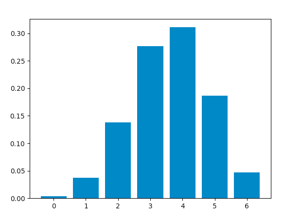
Consider a random experiment of tossing a biased coin
6 times where the probability of getting a head is
0.6. If ‘getting a head’ is considered as ‘
success’ then, the binomial distribution table will contain the probability of
r successes for each possible value of r.
| r | 0 | 1 | 2 | 3 | 4 | 5 | 6 |
| P(r) | 0.004096 | 0.036864 | 0.138240 | 0.276480 | 0.311040 | 0.186624 | 0.046656 |
This distribution has a mean equal to
np and a variance of
np(1-p).
Using Python to obtain the distribution :
Now, we will use Python to analyse the distribution(using
SciPy) and plot the graph(using
Matplotlib).
Modules required :
- SciPy:
SciPy is an Open Source Python library, used in mathematics, engineering, scientific and technical computing.
Installation :
pip install scipy
- Matplotlib:
Matplotlib is a comprehensive Python library for plotting static and interactive graphs and visualisations.
Installation :
pip install matplotlib
The
scipy.stats module contains various functions for statistical calculations and tests. The
stats() function of the
scipy.stats.binom module can be used to calculate a binomial distribution using the values of
n and
p.
Syntax : scipy.stats.binom.stats(n, p)
It returns a tuple containing the mean and variance of the distribution in that order.
scipy.stats.binom.pmf() function is used to obtain the probability mass function for a certain value of r, n and p. We can obtain the distribution by passing all possible values of r(0 to n).
Syntax : scipy.stats.binom.pmf(r, n, p)
Calculating distribution table :
Approach :
- Define n and p.
- Define a list of values of r from 0 to n.
- Get mean and variance.
- For each r, calculate the pmf and store in a list.
Code :
from scipy.stats import binom
n = 6
p = 0.6
r_values = list(range(n + 1))
mean, var = binom.stats(n, p)
dist = [binom.pmf(r, n, p) for r in r_values ]
print("r\tp(r)")
for i in range(n + 1):
print(str(r_values[i]) + "\t" + str(dist[i]))
print("mean = "+str(mean))
print("variance = "+str(var))
|
Output :
r    p(r)
0    0.004096000000000002
1    0.03686400000000005
2    0.13824000000000003
3    0.2764800000000001
4    0.31104
5    0.18662400000000007
6    0.04665599999999999
mean = 3.5999999999999996
variance = 1.44
Code: Plotting the graph using matplotlib.pyplot.bar() function to plot vertical bars.
from scipy.stats import binom
import matplotlib.pyplot as plt
n = 6
p = 0.6
r_values = list(range(n + 1))
dist = [binom.pmf(r, n, p) for r in r_values ]
plt.bar(r_values, dist)
plt.show()
|
Output :
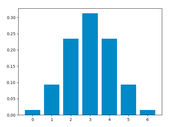
When success and failure are equally likely, the binomial distribution is a
normal distribution. Hence, changing the value of
p to
0.5, we obtain this graph, which is identical to a normal distribution plot :
Like Article
Suggest improvement
Share your thoughts in the comments
Please Login to comment...