Time series data is a sequence of data points recorded or collected at regular time intervals. It is a type of data that tracks the evolution of a variable over time, such as sales, stock prices, temperature, etc. The regular time intervals can be daily, weekly, monthly, quarterly, or annually, and the data is often represented as a line graph or time-series plot. Time series data is commonly used in fields such as economics, finance, weather forecasting, and operations management, among others, to analyze trends, and patterns, and to make predictions or forecasts.
Components of Time Series Data
The components of time series data are the underlying patterns or structures that make up the data. There are several common components in time series data. In time series data, there are several types of patterns that can occur:
- Trend: A long-term upward or downward movement in the data, indicating a general increase or decrease over time.
- Seasonality: A repeating pattern in the data that occurs at regular intervals, such as daily, weekly, monthly, or yearly.
- Cycle: A pattern in the data that repeats itself after a specific number of observations, which is not necessarily related to seasonality.
- Irregularity: Random fluctuations in the data that cannot be easily explained by trend, seasonality, or cycle.
- Autocorrelation: The correlation between an observation and a previous observation in the same time series.
- Outliers: Extreme observations that are significantly different from the other observations in the data.
- Noise: Unpredictable and random variations in the data.
By identifying these patterns in time series data, analysts can better understand the underlying structure and make more accurate forecasts.
Trend
A trend in time series data refers to a long-term upward or downward movement in the data, indicating a general increase or decrease over time. The trend represents the underlying structure of the data, capturing the direction and magnitude of change over a longer period. In time series analysis, it is common to model and remove the trend from the data to better understand the underlying patterns and make more accurate forecasts. There are several types of trends in time series data:
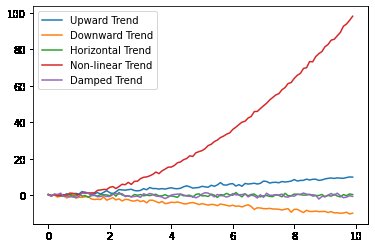
- Upward Trend: A trend that shows a general increase over time, where the values of the data tend to rise over time.
- Downward Trend: A trend that shows a general decrease over time, where the values of the data tend to decrease over time.
- Horizontal Trend: A trend that shows no significant change over time, where the values of the data remain constant over time.
- Non-linear Trend: A trend that shows a more complex pattern of change over time, including upward or downward trends that change direction or magnitude over time.
- Damped Trend: A trend that shows a gradual decline in the magnitude of change over time, where the rate of change slows down over time.
It’s important to note that time series data can have a combination of these types of trends or multiple trends present simultaneously. Accurately identifying and modeling the trend is a crucial step in time series analysis, as it can significantly impact the accuracy of forecasts and the interpretation of patterns in the data.
Here’s a code example in Python that demonstrates different types of Trends in time series data using sample data.
Python3
import numpy as np
import matplotlib.pyplot as plt
t = np.arange(0, 10, 0.1)
data = t + np.random.normal(0, 0.5, len(t))
plt.plot(t, data, label='Upward Trend')
t = np.arange(0, 10, 0.1)
data = -t + np.random.normal(0, 0.5, len(t))
plt.plot(t, data, label='Downward Trend')
t = np.arange(0, 10, 0.1)
data = np.zeros(len(t)) + np.random.normal(0, 0.5, len(t))
plt.plot(t, data, label='Horizontal Trend')
t = np.arange(0, 10, 0.1)
data = t**2 + np.random.normal(0, 0.5, len(t))
plt.plot(t, data, label='Non-linear Trend')
t = np.arange(0, 10, 0.1)
data = np.exp(-0.1*t) * np.sin(2*np.pi*t)\
+ np.random.normal(0, 0.5, len(t))
plt.plot(t, data, label='Damped Trend')
plt.legend()
plt.show()
|
Output:
Various Trends in Time Series Data
The above code generates a plot of five different types of trends in time series data: upward, downward, horizontal, non-linear, and damping. The sample data is generated using a combination of mathematical functions and random noise.
Seasonality
Seasonality in time series data refers to patterns that repeat over a regular time period, such as a day, a week, a month, or a year. These patterns arise due to regular events, such as holidays, weekends, or the changing of seasons, and can be present in various types of time series data, such as sales, weather, or stock prices.
There are several types of seasonality in time series data, including:
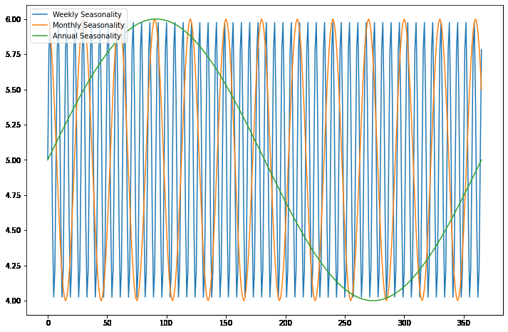
- Weekly Seasonality: A type of seasonality that repeats over a 7-day period and is commonly seen in time series data such as sales, energy usage, or transportation patterns.
- Monthly Seasonality: A type of seasonality that repeats over a 30- or 31-day period and is commonly seen in time series data such as sales or weather patterns.
- Annual Seasonality: A type of seasonality that repeats over a 365- or 366-day period and is commonly seen in time series data such as sales, agriculture, or tourism patterns.
- Holiday Seasonality: A type of seasonality that is caused by special events such as holidays, festivals, or sporting events and is commonly seen in time series data such as sales, traffic, or entertainment patterns.
It’s important to note that time series data can have multiple types of seasonality present simultaneously, and accurately identifying and modeling the seasonality is a crucial step in time series analysis.
Here’s a code example in Python that demonstrates different types of seasonality in time series data using sample data:
Python3
import numpy as np
import matplotlib.pyplot as plt
np.random.seed(1)
time = np.arange(0, 366)
weekly_seasonality = np.sin(2 * np.pi * time / 7)
weekly_data = 5 + weekly_seasonality
monthly_seasonality = np.cos(2 * np.pi * time / 30)
monthly_data = 5 + monthly_seasonality
annual_seasonality = np.sin(2 * np.pi * time / 365)
annual_data = 5 + annual_seasonality
plt.figure(figsize=(12, 8))
plt.plot(time, weekly_data,
label='Weekly Seasonality')
plt.plot(time, monthly_data,
label='Monthly Seasonality')
plt.plot(time, annual_data,
label='Annual Seasonality')
plt.legend(loc='upper left')
plt.show()
|
Output:
Seasonality in Time Series Data
The above code generates a plot that shows three graphs of the generated sample data with different types of seasonality. The data represents the different effects of weekly, monthly, and annual seasonality on a single time series. The x-axis represents time, and the y-axis represents the value of the time series after adding the corresponding seasonality component. The plot uses the matplotlib library to display the graphs, and the NumPy library for data generation and mathematical operations. The legend function adds a legend to the plot to help distinguish the different graphs. The show function displays the plot on the screen.
Cyclicity
Cyclicity in time series data refers to the repeated patterns or periodic fluctuations that occur in the data over a specific time interval. It can be due to various factors such as seasonality (daily, weekly, monthly, yearly), trends, and other underlying patterns.
Difference between Seasonality and Cyclicity
Seasonality refers to a repeating pattern in the data that occurs over a fixed time interval, such as daily, weekly, monthly, or yearly. Seasonality is a predictable and repeating pattern that can be due to various factors such as weather, holidays, and human behavior.
Cyclicity, on the other hand, refers to the repeated patterns or fluctuations that occur in the data over an unspecified time interval. These patterns can be due to various factors such as economic cycles, trends, and other underlying patterns. Cyclicity is not limited to a fixed time interval and can be of different frequencies, making it harder to identify and model.
Putting together, seasonality refers to a repeating pattern in the data that occurs over a fixed time interval, while cyclicity refers to a repeating pattern that occurs over an unspecified time interval.
Python3
import numpy as np
import matplotlib.pyplot as plt
np.random.seed(1)
time = np.array([0, 30, 60, 90, 120,
150, 180, 210, 240,
270, 300, 330])
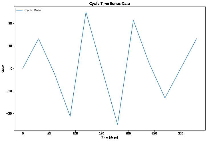
data = 10 * np.sin(2 * np.pi * time / 50)\
+ 20 * np.sin(2 * np.pi * time / 100)
plt.figure(figsize=(12, 8))
plt.plot(time, data, label='Cyclic Data')
plt.legend(loc='upper left')
plt.xlabel('Time (days)')
plt.ylabel('Value')
plt.title('Cyclic Time Series Data')
plt.show()
|
Output:
Cyclicity in Time Series Data
The above code generates time series data with a combination of two cyclic patterns. The sin function is used to generate cyclic patterns, with different frequencies for each pattern. The time variable is defined as an array of 12-time points with uneven time intervals to represent an irregular sampling of the data. The data is plotted using the Matplotlib library, which shows the cyclic patterns in the data over time with uneven time intervals.
Irregularities
Irregularities in time series data refer to unexpected or unusual fluctuations in the data that do not follow the general pattern of the data. These fluctuations can occur for various reasons, such as measurement errors, unexpected events, or other sources of noise. Irregularities can have a significant impact on the accuracy of time series models and forecasting, as they can obscure underlying trends and seasonality patterns in the data.
Python3
import numpy as np
import matplotlib.pyplot as plt
np.random.seed(1)
time = np.arange(0, 100)
data = 5 * np.sin(2 * np.pi * time / 20) + 2 * time
irregularities = np.random.normal(0, 5, len(data))
irregular_data = data + irregularities
plt.figure(figsize=(12, 8))
plt.plot(time, data, label='Original Data')
plt.plot(time, irregular_data,
label='Data with Irregularities')
plt.legend(loc='upper left')
plt.show()
|
Output:
.png)
Irregularities in Time Series Data
The above code generates a time series with a sinusoidal pattern and a linear trend, and then introduces random noise to create irregularities in the data. The resulting plot shows that the irregularities can significantly affect the appearance of the time series data, making it more difficult to identify the underlying patterns.
Autocorrelation
Autocorrelation in time series data refers to the degree of similarity between observations in a time series as a function of the time lag between them. Autocorrelation is a measure of the correlation between a time series and a lagged version of itself. In other words, it measures how closely related the values in the time series are to each other at different time lags.
Autocorrelation is a useful tool for understanding the properties of a time series, as it can provide information about the underlying patterns and dependencies in the data. For example, if a time series is positively autocorrelated at a certain time lag, this suggests that a positive value in the time series is likely to be followed by another positive value a certain amount of time later. On the other hand, if a time series is negatively autocorrelated at a certain time lag, this suggests that a positive value in the time series is likely to be followed by a negative value a certain amount of time later.
Autocorrelation can be computed using various statistical techniques, such as the Pearson correlation coefficient or the autocorrelation function (ACF). The autocorrelation function provides a graphical representation of the autocorrelation for different time lags and can be used to identify the dominant patterns and dependencies in the time series.
Python3
import numpy as np
import matplotlib.pyplot as plt
np.random.seed(1)
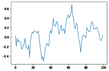
data = np.random.randn(100)
data = np.convolve(data, np.ones(10) / 10,
mode='same')
plt.plot(data)
plt.show()
|
Output:
Time Series data with Autocorrelation
This code generates random time series data using NumPy and then applies a moving average filter to the data to create autocorrelation.
Outliers
Outliers in time series data are data points that are significantly different from the rest of the data points in the series. These can be due to various reasons such as measurement errors, extreme events, or changes in underlying data-generating processes. Outliers can have a significant impact on the results of time series analysis and modeling, as they can skew the statistical properties of the data.
Noise
Noise in time series data refers to random fluctuations or variations that are not due to an underlying pattern or trend. It is typically considered as any unpredictable and random variation in the data. These fluctuations can arise from various sources such as measurement errors, random fluctuations in the underlying process, or errors in data recording or processing. The presence of noise can make it difficult to identify the underlying trend or pattern in the data, and therefore it is important to remove or reduce the noise before any further analysis.
Conclusion
In conclusion, time series data can be decomposed into several components, including trend, seasonality, cyclicity, irregularities, autocorrelation, outliers, and noise. Understanding these components is crucial for analyzing and modeling time series data effectively. By identifying and isolating these components, we can gain a better understanding of the underlying patterns and relationships in time series data, which can inform decision-making and improve forecasting accuracy.
Share your thoughts in the comments
Please Login to comment...