In this article, we will discuss exploratory data analysis which is one of the basic and essential steps of a data science project. A data scientist involves almost 70% of his work in doing the EDA of his dataset.
Exploratory Data Analysis (EDA)
Exploratory Data Analysis (EDA) refers to the method of studying and exploring record sets to apprehend their predominant traits, discover patterns, locate outliers, and identify relationships between variables. EDA is normally carried out as a preliminary step before undertaking extra formal statistical analyses or modeling.
The Foremost Goals of EDA
1. Data Cleaning: EDA involves examining the information for errors, lacking values, and inconsistencies. It includes techniques including records imputation, managing missing statistics, and figuring out and getting rid of outliers.
2. Descriptive Statistics: EDA utilizes precise records to recognize the important tendency, variability, and distribution of variables. Measures like suggest, median, mode, preferred deviation, range, and percentiles are usually used.
3. Data Visualization: EDA employs visual techniques to represent the statistics graphically. Visualizations consisting of histograms, box plots, scatter plots, line plots, heatmaps, and bar charts assist in identifying styles, trends, and relationships within the facts.
4. Feature Engineering: EDA allows for the exploration of various variables and their adjustments to create new functions or derive meaningful insights. Feature engineering can contain scaling, normalization, binning, encoding express variables, and creating interplay or derived variables.
5. Correlation and Relationships: EDA allows discover relationships and dependencies between variables. Techniques such as correlation analysis, scatter plots, and pass-tabulations offer insights into the power and direction of relationships between variables.
6. Data Segmentation: EDA can contain dividing the information into significant segments based totally on sure standards or traits. This segmentation allows advantage insights into unique subgroups inside the information and might cause extra focused analysis.
7. Hypothesis Generation: EDA aids in generating hypotheses or studies questions based totally on the preliminary exploration of the data. It facilitates form the inspiration for in addition evaluation and model building.
8. Data Quality Assessment: EDA permits for assessing the nice and reliability of the information. It involves checking for records integrity, consistency, and accuracy to make certain the information is suitable for analysis.
Types of EDA
Depending on the number of columns we are analyzing we can divide EDA into two types.
EDA, or Exploratory Data Analysis, refers back to the method of analyzing and analyzing information units to uncover styles, pick out relationships, and gain insights. There are various sorts of EDA strategies that can be hired relying on the nature of the records and the desires of the evaluation. Here are some not unusual kinds of EDA:
1. Univariate Analysis: This sort of evaluation makes a speciality of analyzing character variables inside the records set. It involves summarizing and visualizing a unmarried variable at a time to understand its distribution, relevant tendency, unfold, and different applicable records. Techniques like histograms, field plots, bar charts, and precis information are generally used in univariate analysis.
2. Bivariate Analysis: Bivariate evaluation involves exploring the connection between variables. It enables find associations, correlations, and dependencies between pairs of variables. Scatter plots, line plots, correlation matrices, and move-tabulation are generally used strategies in bivariate analysis.
3. Multivariate Analysis: Multivariate analysis extends bivariate evaluation to encompass greater than variables. It ambitions to apprehend the complex interactions and dependencies among more than one variables in a records set. Techniques inclusive of heatmaps, parallel coordinates, aspect analysis, and primary component analysis (PCA) are used for multivariate analysis.
4. Time Series Analysis: This type of analysis is mainly applied to statistics sets that have a temporal component. Time collection evaluation entails inspecting and modeling styles, traits, and seasonality inside the statistics through the years. Techniques like line plots, autocorrelation analysis, transferring averages, and ARIMA (AutoRegressive Integrated Moving Average) fashions are generally utilized in time series analysis.
5. Missing Data Analysis: Missing information is a not unusual issue in datasets, and it may impact the reliability and validity of the evaluation. Missing statistics analysis includes figuring out missing values, know-how the patterns of missingness, and using suitable techniques to deal with missing data. Techniques along with lacking facts styles, imputation strategies, and sensitivity evaluation are employed in lacking facts evaluation.
6. Outlier Analysis: Outliers are statistics factors that drastically deviate from the general sample of the facts. Outlier analysis includes identifying and knowledge the presence of outliers, their capability reasons, and their impact at the analysis. Techniques along with box plots, scatter plots, z-rankings, and clustering algorithms are used for outlier evaluation.
7. Data Visualization: Data visualization is a critical factor of EDA that entails creating visible representations of the statistics to facilitate understanding and exploration. Various visualization techniques, inclusive of bar charts, histograms, scatter plots, line plots, heatmaps, and interactive dashboards, are used to represent exclusive kinds of statistics.
These are just a few examples of the types of EDA techniques that can be employed at some stage in information evaluation. The choice of strategies relies upon on the information traits, research questions, and the insights sought from the analysis.
Exploratory Data Analysis (EDA) Using Python Libraries
For the simplicity of the article, we will use a single dataset. We will use the employee data for this. It contains 8 columns namely – First Name, Gender, Start Date, Last Login, Salary, Bonus%, Senior Management, and Team. We can get the dataset here Employees.csv
Let’s read the dataset using the Pandas read_csv() function and print the 1st five rows. To print the first five rows we will use the head() function.
Python3
import pandas as pd
import numpy as np
df = pd.read_csv('employees.csv')
df.head()
|
Output:
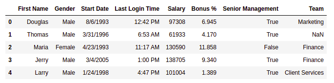
First five rows of the dataframe
Getting Insights About The Dataset
Let’s see the shape of the data using the shape.
Output:
(1000, 8)
This means that this dataset has 1000 rows and 8 columns.
Let’s get a quick summary of the dataset using the pandas describe() method. The describe() function applies basic statistical computations on the dataset like extreme values, count of data points standard deviation, etc. Any missing value or NaN value is automatically skipped. describe() function gives a good picture of the distribution of data.
Example:
Output:
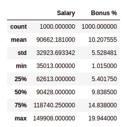
description of the dataframe
Note we can also get the description of categorical columns of the dataset if we specify include =’all’ in the describe function.
Now, let’s also see the columns and their data types. For this, we will use the info() method.
Output:
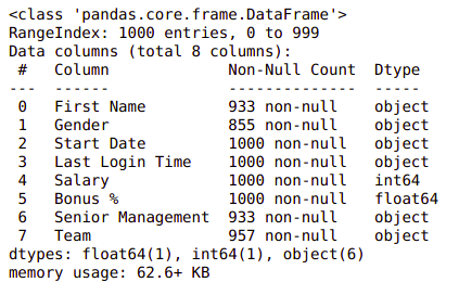
Information about the dataset
Changing Dtype from Object to Datetime
Start Date is an important column for employees. However, it is not of much use if we can not handle it properly to handle this type of data pandas provide a special function datetime() from which we can change object type to DateTime format.
Python3
df['Start Date'] = pd.to_datetime(df['Start Date'])
|
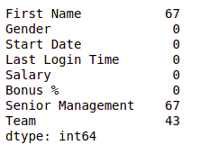
We can see the number of unique elements in our dataset. This will help us in deciding which type of encoding to choose for converting categorical columns into numerical columns.
Output:
        First Name           200
        Gender                 2
        Start Date           972
        Last Login Time      720
        Salary               995
        Bonus %              971
        Senior Management      2
        Team                  10
        dtype: int64
Till now we have got an idea about the dataset used. Now Let’s see if our dataset contains any missing values or not.
Handling Missing Values
You all must be wondering why a dataset will contain any missing values. It can occur when no information is provided for one or more items or for a whole unit. For Example, Suppose different users being surveyed may choose not to share their income, and some users may choose not to share their address in this way many datasets went missing. Missing Data is a very big problem in real-life scenarios. Missing Data can also refer to as NA(Not Available) values in pandas. There are several useful functions for detecting, removing, and replacing null values in Pandas DataFrame :
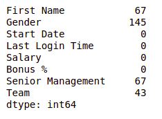
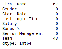
Now let’s check if there are any missing values in our dataset or not.
Example:
Output:
Null values in dataframe
We can see that every column has a different amount of missing values. Like Gender has 145 missing values and salary has 0. Now for handling these missing values there can be several cases like dropping the rows containing NaN or replacing NaN with either mean, median, mode, or some other value.
Now, let’s try to fill in the missing values of gender with the string “No Gender”.
Example:
Python3
df["Gender"].fillna("No Gender", inplace = True)
df.isnull().sum()
|
Output:
Null values in dataframe after filling Gender column
We can see that now there is no null value for the gender column. Now, Let’s fill the senior management with the mode value.
Example:
Python3
mode = df['Senior Management'].mode().values[0]
df['Senior Management']= df['Senior Management'].replace(np.nan, mode)
df.isnull().sum()
|
Output:
Null values in dataframe after filling S senior management column
Now for the first name and team, we cannot fill the missing values with arbitrary data, so, let’s drop all the rows containing these missing values.
Example:
Python3
df = df.dropna(axis = 0, how ='any')
print(df.isnull().sum())
df.shape
|
Output:
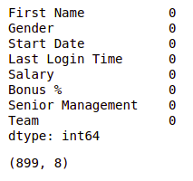
Null values in dataframe after dropping all null values
We can see that our dataset is now free of all the missing values and after dropping the data the number of rows also reduced from 1000 to 899.
Note: For more information, refer to Working with Missing Data in Pandas.
After removing the missing data let’s visualize our data.
Data Encoding
There are some models like Linear Regression which does not work with categorical dataset in that case we should try to encode categorical dataset into the numerical column. we can use different methods for encoding like Label encoding or One-hot encoding. pandas and sklearn provide different functions for encoding in our case we will use the LabelEncoding function from sklearn to encode the Gender column.
Python3
from sklearn.preprocessing import LabelEncoder
le = LabelEncoder()
df['Gender'] = le.fit_transform\
(df['Gender'])
|
Noe
Data visualization
Data Visualization is the process of analyzing data in the form of graphs or maps, making it a lot easier to understand the trends or patterns in the data.
Let’s see some commonly used graphs –
Note: We will use Matplotlib and Seaborn library for the data visualization. If you want to know about these modules refer to the articles –
Histogram
It can be used for both uni and bivariate analysis.
Example:
Python3
import seaborn as sns
import matplotlib.pyplot as plt
sns.histplot(x='Salary', data=df, )
plt.show()
|
Output:
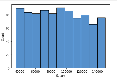
Histogram plot of salary column
Boxplot
It can also be used for univariate and bivariate analyses.
Example:
Python3
import seaborn as sns
import matplotlib.pyplot as plt
sns.boxplot( x="Salary", y='Team', data=df, )
plt.show()
|
Output:
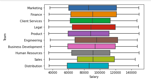
Boxplot of Salary and team column
Scatter Boxplot For Data Visualization
It can be used for bivariate analyses.
Example:
Python3
import seaborn as sns
import matplotlib.pyplot as plt
sns.scatterplot( x="Salary", y='Team', data=df,
hue='Gender', size='Bonus %')
plt.legend(bbox_to_anchor=(1, 1), loc=2)
plt.show()
|
Output:
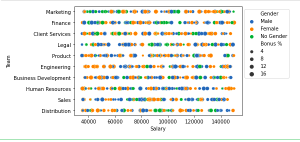
Scatter plot of salary and Team column
For multivariate analysis, we can use pairplot()method of the seaborn module. We can also use it for the multiple pairwise bivariate distributions in a dataset.
Example:
Python3
import seaborn as sns
import matplotlib.pyplot as plt
sns.pairplot(df, hue='Gender', height=2)
|
Output:
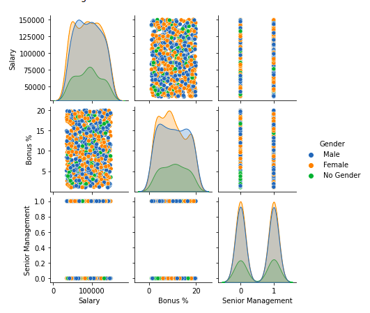
Pairplot of columns of dataframe
Handling Outliers
An Outlier is a data item/object that deviates significantly from the rest of the (so-called normal)objects. They can be caused by measurement or execution errors. The analysis for outlier detection is referred to as outlier mining. There are many ways to detect outliers, and the removal process of these outliers from the dataframe is the same as removing a data item from the panda’s dataframe.
Let’s consider the iris dataset and let’s plot the boxplot for the SepalWidthCm column.
Example:
Python3
import seaborn as sns
import matplotlib.pyplot as plt
df = pd.read_csv('Iris.csv')
sns.boxplot(x='SepalWidthCm', data=df)
|
Output:

Boxplot of sample width column before outliers removal
In the above graph, the values above 4 and below 2 are acting as outliers.
Removing Outliers
For removing the outlier, one must follow the same process of removing an entry from the dataset using its exact position in the dataset because in all the above methods of detecting the outliers end result is the list of all those data items that satisfy the outlier definition according to the method used.
Example: We will detect the outliers using IQR and then we will remove them. We will also draw the boxplot to see if the outliers are removed or not.
Python3
import sklearn
from sklearn.datasets import load_boston
import pandas as pd
import seaborn as sns
df = pd.read_csv('Iris.csv')
Q1 = np.percentile(df['SepalWidthCm'], 25,
interpolation = 'midpoint')
Q3 = np.percentile(df['SepalWidthCm'], 75,
interpolation = 'midpoint')
IQR = Q3 - Q1
print("Old Shape: ", df.shape)
upper = np.where(df['SepalWidthCm'] >= (Q3+1.5*IQR))
lower = np.where(df['SepalWidthCm'] <= (Q1-1.5*IQR))
df.drop(upper[0], inplace = True)
df.drop(lower[0], inplace = True)
print("New Shape: ", df.shape)
sns.boxplot(x='SepalWidthCm', data=df)
|
Output:
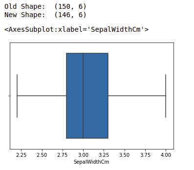
Boxplot of sample width after outlier removal
Note: for more information, refer Detect and Remove the Outliers using Python
These are some of the EDA we do during our data science project however it depends upon your requirement and how much data analysis we do.
Like Article
Suggest improvement
Share your thoughts in the comments
Please Login to comment...