React-Bootstrap Popover Overlay
Last Updated :
20 Nov, 2023
The React bootstrap provides us with the bootstrap components out of the box compared to normal React. It comes with the pre-applied CSS and the themes and properties of the bootstrap component can be modified by changing the properties. The Dropdown component is used for showing dropdowns in React Bootstrap. The overlay component in React-Bootstrap adds extra beauty to the Tool Tips by controlling the position and visibility. It supports transitions to create better UX and visibility toggling.
In this article, we will see React-Bootstrap Popover Overlay. The popover overlay is like a tooltip that pops up over the parent component to give some information regarding it. We can specify the overlay property in the OverlayTrigger component as popover and then popover appears as an Overlay.
Syntax:
<OverlayTrigger trigger="triggerType" placement="value" overlay={popover}>
      <Button >....</Button>
</OverlayTrigger>
Steps to create a React App and Installing required modules:
Step 1: Create a react application by running the below command:
npx create-react-app AppName
Step 2: Once it is done change your directory to the newly created application using the following command:
cd AppName
Step 3: Install React Bootstrap dependency:
npm install react-bootstrap bootstrap
Step 4: Or Add these cdn links in the index.html
<script src="https://cdn.jsdelivr.net/npm/react/umd/react.production.min.js" crossorigin></script>
<script src="https://cdn.jsdelivr.net/npm/react-dom/umd/react-dom.production.min.js"
             crossorigin>
</script>
<script src="https://cdn.jsdelivr.net/npm/react-bootstrap@next/dist/react-bootstrap.min.js"
              crossorigin>
</script>
Step 5: Start the application
npm start
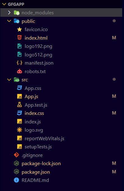
Project structure:
Example 1: In this example, we are creating a basic popover display in App.js file
Javascript
import OverlayTrigger from "react-bootstrap/OverlayTrigger";
import Popover from "react-bootstrap/Popover";
import Button from "react-bootstrap/Button";
const App = () => {
const popover = (
<Popover>
<Popover.Header as="h3"> About GeeksforGeeks</Popover.Header>
<Popover.Body>
GeeksforGeeks is a leading platform that provides computer
science resources and coding challenges for programmers and
technology enthusiasts, along with interview and exam
preparations for upcoming aspirants.
</Popover.Body>
</Popover>
);
return (
<div className="App">
<h1 style={{ color: "green", textAlign: "center" }}>
{" "}
GeeksforGeeks
</h1>
<h5 style={{ textAlign: "center" }}>
{" "}
React-Bootstrap Popover Overlay
</h5>
<br></br>
<br></br>
<div style={{ textAlign: "center" }}>
<OverlayTrigger
trigger="click"
placement="right"
overlay={popover}
>
<Button variant="success">GeeksforGeeks</Button>
</OverlayTrigger>
</div>
</div>
);
};
export default App;
|
Output:

Example 2: In this example, we are using hover triggerType and position of popover using placement property in the App.js file
Javascript
import OverlayTrigger from "react-bootstrap/OverlayTrigger";
import Popover from "react-bootstrap/Popover";
import Button from "react-bootstrap/Button";
const App = () => {
const popover = (
<Popover>
<Popover.Body>GeeksforGeeks</Popover.Body>
</Popover>
);
return (
<div className="App">
<h1 style={{ color: "green", textAlign: "center" }}>
{" "}
GeeksforGeeks
</h1>
<h5 style={{ textAlign: "center" }}>
{" "}
React-Bootstrap Popover Overlay
</h5>
<br></br>
<br></br>
<div style={{ textAlign: "center" }}>
<OverlayTrigger
trigger="hover"
placement="right"
overlay={popover}
>
<Button variant="success" className="mx-2">
GeeksforGeeks(right)
</Button>
</OverlayTrigger>
<OverlayTrigger
trigger="hover"
placement="left"
overlay={popover}
>
<Button variant="success" className="mx-2">
GeeksforGeeks(left)
</Button>
</OverlayTrigger>
<OverlayTrigger
trigger="hover"
placement="top"
overlay={popover}
>
<Button variant="success" className="mx-2">
GeeksforGeeks(top){" "}
</Button>
</OverlayTrigger>
<OverlayTrigger
trigger="hover"
placement="bottom"
overlay={popover}
>
<Button variant="success" className="mx-2">
GeeksforGeeks(bottom)
</Button>
</OverlayTrigger>
</div>
</div>
);
};
export default App;
|
Output:

Share your thoughts in the comments
Please Login to comment...