How to Create a Responsive Layout with React Bootstrap ?
Last Updated :
31 Oct, 2023
Creating a responsive layout with React Bootstrap means designing a web page that adapts and looks good on various screen sizes and devices. React Bootstrap provides responsive components and grid system classes that help in organizing and scaling content effectively, ensuring a seamless user experience across desktops, tablets, and mobile devices.
Prerequisites:
Steps to Create React Application And Installing Module:
Step 1: Create a React application using the following command:
npx create-react-app foldername
Step 2: After creating your project folder i.e. folder name, move to it using the following command:
cd foldername
Step 3: After creating the ReactJS application, Install the required module using the following command:
npm install react-bootstrap
npm install bootstrap
Project structure:
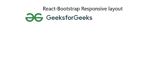
Approach 1: Using React functional component
In this approach, we are using React functional component that demonstrates the use of React-Bootstrap to create a responsive layout. It includes a heading, a container, a centered row with a column, and an embedded SVG image within a responsive container, maintaining a 16:9 aspect ratio. The layout utilizes Bootstrap classes for styling and responsiveness.
Example: This example shows the use of the above-explained approach.
Javascript
import React from 'react';
import 'bootstrap/dist/css/bootstrap.css';
import { Container, Row, Col, ResponsiveEmbed }
from 'react-bootstrap';
export default function App() {
return (
<Container className="mt-5">
<Row className="justify-content-center">
<Col xs={12} md={8}>
<h4 className="text-center">
React-Bootstrap Responsive layout
</h4>
<div className="embed-responsive
embed-responsive-16by9">
<ResponsiveEmbed aspectRatio="16by9">
<embed type="image/svg+xml"
src=
className="embed-responsive-item" />
</ResponsiveEmbed>
</div>
</Col>
</Row>
</Container>
);
}
|
Output:
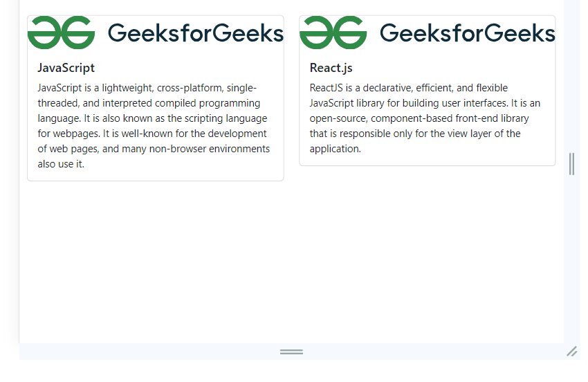
Approach 2: Using React Bootstrap cards
In this approach, we are using React Bootstrap to create a responsive layout. It utilizes Container, Row, and Col components to structure cards containing GeeksforGeeks logo images, each representing a technology ( JavaScript, React.js). The layout adjusts dynamically based on screen size, ensuring a consistent and visually appealing display on various devices.
Example: This example shows the use of the above-explained approach.
Javascript
import React from "react";
import { Container, Row, Col, Card } from "react-bootstrap";
import "bootstrap/dist/css/bootstrap.min.css";
const App = () => (
<Container fluid className="mt-5">
<Row className="justify-content-center">
<Col xs={12} md={6} lg={4}>
<Card>
<Card.Img
variant="top"
src=
alt="GeeksforGeeks Logo"
/>
<Card.Body>
<Card.Title>JavaScript</Card.Title>
<Card.Text>
JavaScript is a lightweight, cross-platform,
single-threaded, and interpreted compiled
programming language. It is also known as
the scripting language for webpages. It
is well-known for the development of web
pages, and many non-browser environments also
use it.
</Card.Text>
</Card.Body>
</Card>
</Col>
<Col xs={12} md={6} lg={4}>
<Card>
<Card.Img
variant="top"
src=
alt="GeeksforGeeks Logo"
/>
<Card.Body>
<Card.Title>React.js</Card.Title>
<Card.Text>
ReactJS is a declarative, efficient,
and flexible JavaScript library for
building user interfaces. It is an
open-source, component-based front-end
library that is responsible only for the
view layer of the application.
</Card.Text>
</Card.Body>
</Card>
</Col>
</Row>
</Container>
);
export default App;
|
Output:
Share your thoughts in the comments
Please Login to comment...