React Bootstrap Form Layout
Last Updated :
18 Jan, 2024
React-Bootstrap is a front-end framework mainly customized for React. It simplifies the process of designing forms by providing a set of pre-designed components. These components can integrate with React application to create elegant and responsive forms with ease.
Syntax:
<Form>
            <Form.Label> ... </Form.Label>
            <Form.Control type="email" />
        ....
</Form>
Creating React Application and installing dependencies.
Step 1: Create a React application using the following command.
npx create-react-app bootstraplayout
cd bootstraplayout
Step 2: Install the required dependencies.
npm install react-bootstrap bootstrap
Step 3: Add the below line in index.js file.
import 'bootstrap/dist/css/bootstrap.css';
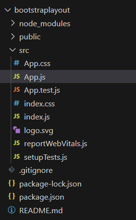
Folder Structure:
The updated dependencies in package.json file will look like:
"dependencies": {
    "@testing-library/jest-dom": "^5.17.0",
    "@testing-library/react": "^13.4.0",
    "@testing-library/user-event": "^13.5.0",
    "bootstrap": "^5.3.2",
    "react": "^18.2.0",
    "react-bootstrap": "^2.9.2",
    "react-dom": "^18.2.0",
    "react-scripts": "5.0.1",
    "web-vitals": "^2.1.4"
}
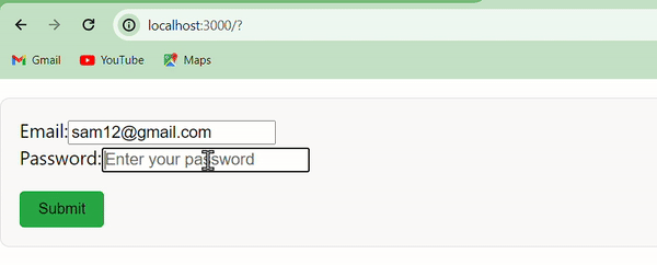
Example 1: Using Grid System
The grid system in React Bootstrap allows developers to create flexible and responsive layouts by dividing the container into rows and columns.
Javascript
import React from "react";
import { Container, Row, Col, Form, Button } from "react-bootstrap";
const GridForm = () => {
const containerStyle = {
margin: "20px 0",
padding: "20px",
border: "1px solid #ddd",
borderRadius: "10px",
backgroundColor: "#f9f9f9",
};
const submitButtonStyle = {
marginTop: "20px",
backgroundColor: "#28a745",
border: "none",
borderRadius: "5px",
padding: "10px 20px",
fontSize: "16px",
cursor: "pointer",
};
return (
<Container style={containerStyle}>
<Form>
<Row>
<Col>
<Form.Label>Email:</Form.Label>
<Form.Control
type="email"
placeholder="Enter your email"
/>
</Col>
<Col>
<Form.Label>Password:</Form.Label>
<Form.Control
type="password"
placeholder="Enter your password"
/>
</Col>
</Row>
<Button
variant="primary"
type="submit"
style={submitButtonStyle}
>
Submit
</Button>
</Form>
</Container>
);
};
export default GridForm;
|
Output:
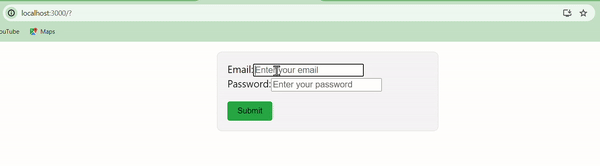
Example 2: Form Control Components
React Bootstrap provides dedicated form control components like FormControl, FormGroup, and ControlLabel. These components offer more control over individual form elements.
Javascript
import React from "react";
import { Container, Row, Col, Form, Button } from "react-bootstrap";
const FormControlForm = () => {
const formStyle = {
maxWidth: "400px",
margin: "20px auto",
padding: "20px",
border: "1px solid #ddd",
borderRadius: "10px",
backgroundColor: "#f5f5f5",
};
const submitButtonStyle = {
marginTop: "20px",
backgroundColor: "#28a745",
border: "none",
borderRadius: "5px",
padding: "10px 20px",
fontSize: "16px",
cursor: "pointer",
};
return (
<Form style={formStyle}>
<Form.Group>
<Form.Label>Email:</Form.Label>
<Form.Control type="email" placeholder="Enter your email" />
</Form.Group>
<Form.Group>
<Form.Label>Password:</Form.Label>
<Form.Control
type="password"
placeholder="Enter your password"
/>
</Form.Group>
<Button variant="success"
type="submit"
style={submitButtonStyle}>
Submit
</Button>
</Form>
);
};
export default FormControlForm;
|
Output:
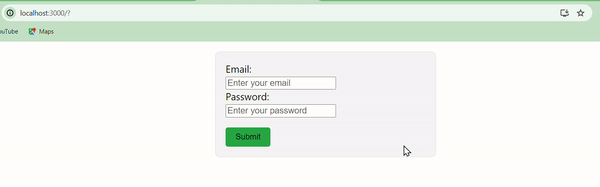
Example 3: Horizontal Form Layout
In a horizontal form layout, form labels and controls are aligned in the same row.
Javascript
import React from "react";
import { Container, Row, Col, Form, Button } from "react-bootstrap";
const HorizontalForm = () => {
const submitButtonStyle = {
marginTop: "20px",
backgroundColor: "#28a745",
border: "none",
borderRadius: "5px",
padding: "10px 20px",
fontSize: "16px",
cursor: "pointer",
};
const formStyle = {
maxWidth: "400px",
margin: "20px auto",
padding: "20px",
border: "1px solid #ddd",
borderRadius: "10px",
backgroundColor: "#f5f5f5",
};
return (
<Form style={formStyle}>
<Form.Group as={Row}>
<Form.Label column sm={2}>
Email:
</Form.Label>
<Col sm={10}>
<Form.Control type="email"
placeholder="Enter your email" />
</Col>
</Form.Group>
<Form.Group as={Row}>
<Form.Label column sm={2}>
Password:
</Form.Label>
<Col sm={10}>
<Form.Control
type="password"
placeholder="Enter your password"
/>
</Col>
</Form.Group>
<Button variant="success"
type="submit"
style={submitButtonStyle}>
Submit
</Button>
</Form>
);
};
export default HorizontalForm;
|
Output:
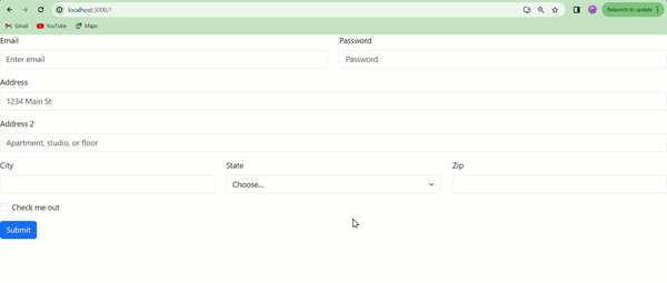
Example 4: let’s create an advance Layout form using Horizontal form approach.
Javascript
import Button from 'react-bootstrap/Button';
import Col from 'react-bootstrap/Col';
import Form from 'react-bootstrap/Form';
import Row from 'react-bootstrap/Row';
function GridComplexExample() {
return (
<Form>
<Row className="mb-3">
<Form.Group as={Col} controlId="formGridEmail">
<Form.Label>Email</Form.Label>
<Form.Control type="email" placeholder="Enter email" />
</Form.Group>
<Form.Group as={Col} controlId="formGridPassword">
<Form.Label>Password</Form.Label>
<Form.Control type="password" placeholder="Password" />
</Form.Group>
</Row>
<Form.Group className="mb-3" controlId="formGridAddress1">
<Form.Label>Address</Form.Label>
<Form.Control placeholder="1234 Main St" />
</Form.Group>
<Form.Group className="mb-3" controlId="formGridAddress2">
<Form.Label>Address 2</Form.Label>
<Form.Control placeholder="Apartment, studio, or floor" />
</Form.Group>
<Row className="mb-3">
<Form.Group as={Col} controlId="formGridCity">
<Form.Label>City</Form.Label>
<Form.Control />
</Form.Group>
<Form.Group as={Col} controlId="formGridState">
<Form.Label>State</Form.Label>
<Form.Select defaultValue="Choose...">
<option>Choose...</option>
<option>...</option>
</Form.Select>
</Form.Group>
<Form.Group as={Col} controlId="formGridZip">
<Form.Label>Zip</Form.Label>
<Form.Control />
</Form.Group>
</Row>
<Form.Group className="mb-3" id="formGridCheckbox">
<Form.Check type="checkbox" label="Check me out" />
</Form.Group>
<Button variant="primary" type="submit">
Submit
</Button>
</Form>
);
}
export default GridComplexExample;
|
Step 4: Run the above code using :
npm start
Output:
Share your thoughts in the comments
Please Login to comment...