Bootstrap 5 Grid system Grid tiers
Last Updated :
09 Aug, 2023
Bootstrap Grid system is one of the most versatile layouts which we can use and it has different responsive variants which can be used to add custom responsiveness. Across the six default breakpoints, the grid works smoothly, and all these breakpoints can also be called Grid Tiers which can be changed using the SASS version. For this, we can use the $grid-breakpoints and $container-max-widths for changing the maximum width occupied by the container at the various breakpoints.
Grid system Grid tiers Variables:
- $grid-breakpoints: This variable states the grid tier values(screen sizes of the viewport) where the grid will break into the custom responsive number of columns if specified. Under this variable, the default values are 0 for xs, 576px for sm, 768px for md, 992px for lg, 1200px for xl, and 1400px for xxl.
- $container-max-widths: This variable states the maximum width of the container at any specific given breakpoint or viewport size. Under this variable, the default values are 0 for xs, 540px for sm, 720px for md, 960px for lg, 1140px for xl, and 1320px for xxl.
Syntax:
$variable_to_override: (
    /* Grid Tiers and their values */
)!default;
Steps to override SCSS of Bootstrap
Step 1: Install Bootstrap using the following command inside the project folder/directory
npm i bootstrap sass
Step 2: Create your custom SCSS file and write the variable you want to override. Then include the bootstrap SCSS file using import.
$variable_to_override: value
@import "../node_modules/bootstrap/scss/bootstrap.scss";
Step 3: Convert the SCSS file to CSS using a live server extension. Or use this command.
scss style.scss style.css
Step 4: Include the CSS file in your HTML file.
<link rel="stylesheet" href="style.css">
Project Structure:
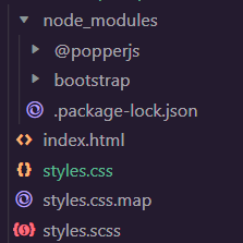
Local project structure while adding the code examples
Example 1: The code below demonstrates how we can change the $grid-breakpoints variable and the different breakpoints values inside it. The values of the sm, md, and lg breakpoints are changed, and the columns change with the new breakpoints. In the output GIF, you can see on the top right corner of the browser window the current size of the screen which it is resized to:
CSS
$grid-breakpoints: (
xs: 0,
sm: 476px,
md: 650px,
lg: 1000px,
xl: 1200px,
xxl: 1400px
) !default;
@import "./node_modules/bootstrap/scss/bootstrap.scss";
|
- styles.css: The above SCSS file is compiled into this CSS file(only the changes shown).
CSS
@media (min-width: 476px) {
.container-sm,
.container {
max-width: 540px;
}
}
@media (min-width: 650px) {
.container-md,
.container-sm,
.container {
max-width: 720px;
}
}
@media (min-width: 1000px) {
.container-lg,
.container-md,
.container-sm,
.container {
max-width: 960px;
}
}
@media (min-width: 1200px) {
.container-xl,
.container-lg,
.container-md,
.container-sm,
.container {
max-width: 1140px;
}
}
@media (min-width: 1400px) {
.container-xxl,
.container-xl,
.container-lg,
.container-md,
.container-sm,
.container {
max-width: 1320px;
}
}
|
HTML
<!doctype html>
<html lang="en">
<head>
<link rel="stylesheet" href="styles.css">
<script src=
</script>
</head>
<body>
<div class="text-center mt-4">
<h1 class="text-success">
GeeksforGeeks
</h1>
<h3>
Bootstrap 5 Grid system Customizing the Grid
</h3>
<div class="mt-4 p-4">
<div class="row">
<div class="col-sm-12 col-md-6 col-lg-3">
<div class="card mb-3 bg-light">
<div class="card-body">
<p class="card-text">
A data structure is a storage that
is used to store and organize data.
</p>
</div>
</div>
</div>
<div class="col-sm-12 col-md-6 col-lg-3">
<div class="card mb-3 bg-light">
<div class="card-body">
<p class="card-text">
Therefore Algorithm refers to a
sequence of finite steps to solve
a particular problem.
</p>
</div>
</div>
</div>
<div class="col-sm-12 col-md-6 col-lg-3">
<div class="card mb-3 bg-light">
<div class="card-body">
<p class="card-text">
C++ is a general-purpose programming
language and is widely used nowadays
for competitive programming.
</p>
</div>
</div>
</div>
<div class="col-sm-12 col-md-6 col-lg-3">
<div class="card mb-3 bg-light">
<div class="card-body">
<p class="card-text">
Java is one of the most popular and
widely used programming languages.
</p>
</div>
</div>
</div>
</div>
</div>
</div>
</body>
</html>
|
Output:
.gif)
Example 2: The code below demonstrates how we can manipulate the $grid-breakpoints and $container-max-widths variables and the different breakpoints values inside it. Here, the values of the grid’s breakpoints and the container’s max widths have been changed for the md and lg, and the classes like col-md-* and col-lg-* will act a little differently. The change can be seen in the output GIF:
CSS
$grid-breakpoints: (
xs: 0,
sm: 576px,
md: 950px,
lg: 1100px,
xl: 1200px,
xxl: 1400px) !default;
$container-max-widths: (
sm: 540px,
md: 850px,
lg: 900px,
xl: 1140px,
xxl: 1320px) !default;
@import "./node_modules/bootstrap/scss/bootstrap.scss";
|
- styles.css: The above SCSS file is compiled into this CSS file(only the changes shown).
CSS
@media (min-width: 576px) {
.container-sm,
.container {
max-width: 540px;
}
}
@media (min-width: 950px) {
.container-md,
.container-sm,
.container {
max-width: 850px;
}
}
@media (min-width: 1100px) {
.container-lg,
.container-md,
.container-sm,
.container {
max-width: 900px;
}
}
@media (min-width: 1200px) {
.container-xl,
.container-lg,
.container-md,
.container-sm,
.container {
max-width: 1140px;
}
}
@media (min-width: 1400px) {
.container-xxl,
.container-xl,
.container-lg,
.container-md,
.container-sm,
.container {
max-width: 1320px;
}
}
|
HTML
<!doctype html>
<html lang="en">
<head>
<link rel="stylesheet" href="styles.css">
<script src=
</script>
</head>
<body>
<div class="text-center mt-4">
<h1 class="text-success">
GeeksforGeeks
</h1>
<h3>Bootstrap 5 Grid system Grid tiers</h3>
<div class="container mt-5">
<div class="row">
<div class="col-4 col-md-2
col-lg-6 bg-light
border border-warning">
Outer: col-md-2
</div>
<div class="col-8 col-md-10
col-lg-6 bg-light
text-light
border border-warning">
<div class="row">
<div class="col-6 col-md-4
col-lg-8 bg-success
border border-warning">
Nested: .col-6 .col-md-4 .col-lg-8
</div>
<div class="col-6 col-md-8
col-lg-4 bg-success
border border-warning">
Nested: .col-6 .col-md-8 .col-lg-4
</div>
</div>
</div>
</div>
</div>
<p class="text-danger fs-3 m-4"
id="view"></p>
</div>
<script>
document.getElementById("view").innerHTML = "Screen Width: "
+ window.innerWidth;
</script>
</body>
</html>
|
Output:
.gif)
Reference: https://getbootstrap.com/docs/5.0/layout/grid/#grid-tiers
Share your thoughts in the comments
Please Login to comment...