R – Line Graphs
Last Updated :
09 Dec, 2021
A line graph is a chart that is used to display information in the form of a series of data points. It utilizes points and lines to represent change over time. Line graphs are drawn by plotting different points on their X coordinates and Y coordinates, then by joining them together through a line from beginning to end. The graph represents different values as it can move up and down based on the suitable variable.
R – Line Graphs
The plot() function in R is used to create the line graph.
Syntax: plot(v, type, col, xlab, ylab)
Parameters:
- v: This parameter is a contains only the numeric values
- type: This parameter has the following value:
- “p” : This value is used to draw only the points.
- “l” : This value is used to draw only the lines.
- “o”: This value is used to draw both points and lines
- xlab: This parameter is the label for x axis in the chart.
- ylab: This parameter is the label for y axis in the chart.
- main: This parameter main is the title of the chart.
- col: This parameter is used to give colors to both the points and lines.
Creating a Simple Line Graph
Approach: In order to create a line graph:
- It is created using the type parameter as “o” and input vector.
- Below code to describe the line graph.
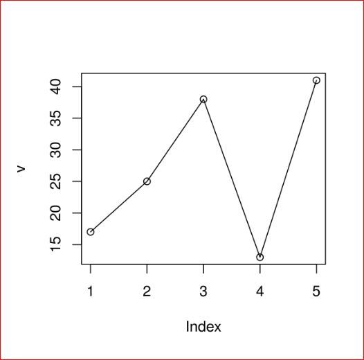
Example:
R
v <- c(17, 25, 38, 13, 41)
plot(v, type = "o")
|
Output:
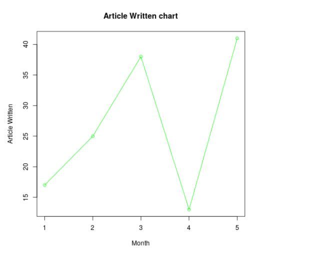
Adding Title, Color and Labels in Line Graphs in R
Approach: To create a colored and labeled line chart.
- Take all parameters which are required to make line chart by giving a title to the chart and add labels to the axes.
- We can add more features by adding more parameters with more colors to the points and lines.
Example:
R
v <- c(17, 25, 38, 13, 41)
plot(v, type = "o", col = "green",
xlab = "Month", ylab = "Article Written",
main = "Article Written chart")
|
Output:
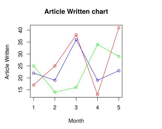
Multiple Lines in a Line Graph in R Programming Language
Approach: To create multiple line graphs.
- In above example, we created line graphs by only one line in each graph.
- Now creating multiple lines to describe it more clearly.
Example:
R
v <- c(17, 25, 38, 13, 41)
t <- c(22, 19, 36, 19, 23)
m <- c(25, 14, 16, 34, 29)
plot(v, type = "o", col = "red",
xlab = "Month", ylab = "Article Written ",
main = "Article Written chart")
lines(t, type = "o", col = "blue")
lines(m, type = "o", col = "green")
|
Output: When we execute the above code, it shows the following result-
Share your thoughts in the comments
Please Login to comment...