“A Picture is worth a thousand words,” and that picture would be even more expressive if the user could interact with it. Hence the concept of “interactive graphs or charts. Interactive charts allow both the presenter and the audience more freedom since they allow users to zoom in and out, hover and read information related to the marker, get tooltip information, etc. R provides a lot of packages to make interactive graphs. In this article, we will focus on plotly and ggplot.
Ggplot is a package in R by tidyverse. It is based on Leland Wilkinson’s Grammar of Graphics. ggplot creates complex and intricate plots using the principles listed in the grammar of graphics. Users can use all types of data, such as univariate, multivariate, or categorical, to create data. It was meant as an alternative to the base graphics package in R and is now one of the most popular packages for data visualization in R.
However, ggplot cannot make interactive plots. To help ggplot create interactive plots, we can use a package called plotly.
Plotly is an open-source package in R and is based on JavaScript by the same name, plotly.js. The Plotly package helps create interactive and intuitive plots and graphs. It also provides the ability to embed these graphs in web pages and save them on your computers. It is used extensively along with the ggplot package to make complex, intricate, and attractive data visualizations.
Plotly provides a package called ggplotly, which helps convert ggplot charts and plots into interactive plots and graphs.
Once R and RStudio are set up, we require the following packages installed in Rstudio.
- Plotly
- Ggplot
- Dplyr
- Car
- Babynames
- Gapminder
To install these packages, we use the following commands:
R
install.packages("plotly")
install.packages("ggplot2")
install.packages("dplyr")
install.packages("car")
install.packages("babynames")
install.packages("gapminder")
|
We also need to load them in the RStudio session as follows:
R
library(plotly)
library(dplyr)
library(carData)
library(gapminder)
library(babynames)
|
Now that we have all the required packages installed and loaded in RStudio, we will look at some examples using different plots.
Scatterplot
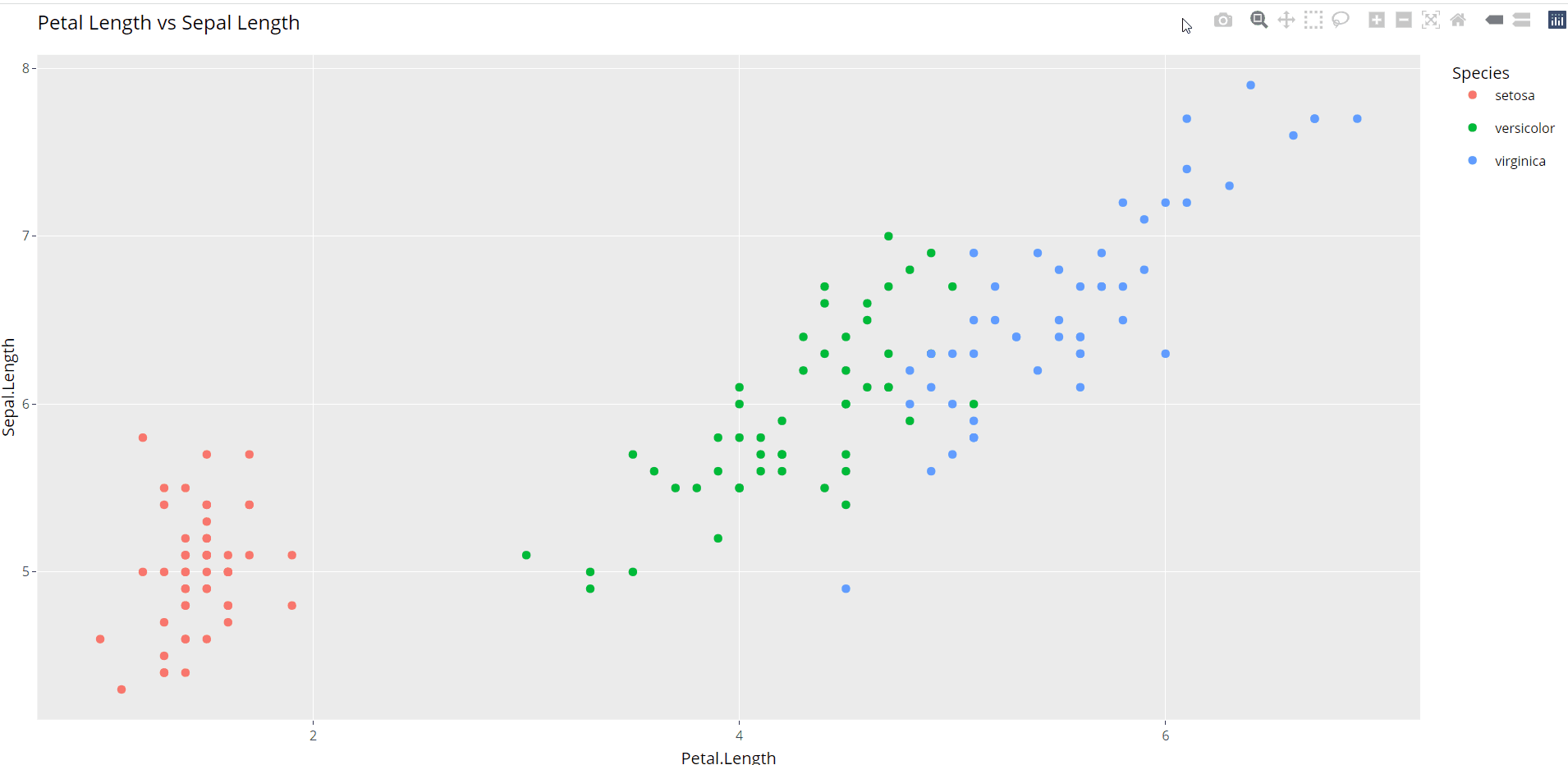
A scatterplot usually shows the relationship between two numerical variables. Each dot represents a value on the horizontal and vertical axis. To generate a scatterplot, we will use the iris dataset in R. To generate a scatterplot using ggplot, and we use the geom_point function.
R
p <- ggplot(data=iris, aes(Petal.Length,Sepal.Length)) +
geom_point(aes(color=Species)) +
ggtitle("Petal Length vs Sepal Length")
|

However, the plot is not interactive. We use the ggplotly function to make it interactive and pass the plot to the function as an argument. Ggplotly provides options like zoom-in, zoom-out, lasso-select, etc.
Another example is the Distance versus speed scatter plot from the car dataset.
R
p1 <- ggplot(data=cars, aes(dist,speed)) + geom_point() +
ggtitle("Stopping Distance vs Speed") +
xlab("Stopping Distance in feet") +
ylab("Speed (mph)")
|

To make it interactive, we use the following code

Bar graph
A bar chart also called a bar diagram, plots categorical data vertically or horizontally. To create a non-interactive bar graph using the “mpg” dataset, we use the geom_bar function.
R
p2 <- ggplot(mpg, aes(manufacturer)) + geom_bar(aes(fill = drv))+
ggtitle("Distribution for Cars based on Drive Type and Manufacturers")
|

To make the same graph interactive using the ggplotly, we do:

Area Plots
Area Plots or area graphs are an extension of line graphs. Area graphs are line graphs with the area under them filled in. For plotting an area graph, we will use the babynames dataset.
We have filtered only a minimal number of names from the dataset for our visualization. We create the area graph using the geom_area function.
R
babyData<-babynames %>% filter(name %in% c(
'Florence','Harriette','Emma','Bertha','Chloe','Sarah'))%>% filter(sex=='F')
p2<- ggplot(babyData, aes(x=year, y=n, fill=name,
text=name))+ geom_area()+
ggtitle('Yearwise popularity of american baby names')
|

To make the above chart interactive, we use the ggplotly function as follows:

Bubble Graph
A bubble chart is an extension of the scatterplot. The bubble graph is a three-dimensional visual representation of your data where the two axes define the point, whereas the third dimension represents the size of the bubble.
We will create a bubble graph using the airquality dataset in R. We create a bubble plot using the geom_point(), adding the size as the third dimension.
R
airQuality_plot <- ggplot(airquality, aes(x = Day, y = Ozone,
color= as.factor(Month),
text = paste("Month:", Month))) +
geom_point(size = airquality$Wind) +
ggtitle("Air Quality in New York by Day") +
labs(x = "Day of the month", y = "Ozone (ppb)", color="Month") +
scale_x_continuous(breaks = seq(1, 31, 5))+
scale_size(range = c(1, 10))
|

However, bubble graphs are even more insightful when they are interactive. The tooltip is to specify the specific information we want to display on the plot.
R
ggplotly(airQuality_plot, tooltip=c("text","x","y"))
|

Animated Graphs
Sometimes even with interactive graphs, the picture is not complete. Adding movements to a complex graph can help make the relationship between the variables more transparent and add more meaning to the graphs. To achieve this, we use animations.
Using the ggplotly package, we can add animations like range sliders, animation frames, buttons, etc., which show the relationship between the variables in motion. Animations usually work well for data that shows a trend over time. For demonstrating an animation example, we will use the txhousing dataset. In the first example using the txhousing dataset, we will draw a simple graph showing every city’s monthly median housing prices for many years. The median value of the year is marked as a red line. The non-interactive version of this graph using just ggplot is as follows;
R
p <- ggplot(txhousing, aes(month, median)) +
geom_line(aes(group = year), alpha = 0.3) +
geom_smooth() +
geom_line(aes(frame = year, ids = month), color = "red") +
facet_wrap(~ city)
|

Using the animation_opts function, we can show the median line movement year by year. We can also enlarge and see a part of the data as follows:
R
ggplotly(p, width = 1500, height = 900) %>%
animation_opts(1000)
|

We can also show the year-wise growth of the median housing values for every city. To do so, we first need to mutate the dataset to get the median housing value for each city for a year.
R
accumulate_by <- function(dat, var) {
var <- lazyeval::f_eval(var, dat)
lvls <- plotly:::getLevels(var)
dats <- lapply(seq_along(lvls), function(x) {
cbind(dat[var %in% lvls[seq(1, x)], ], frame = lvls[[x]])
})
dplyr::bind_rows(dats)
}
df <- txhousing
plot_data <- df %>%
filter(year > 2010)
plot <- plot_data %>% accumulate_by(~date)
|
This data we can then plot using ggplot as follows:
R
ggplot(fig, aes(date,median)) + geom_line(aes(group=city,color=city))
|

The above code outputs a non-interactive version of the graph. To animate this, we can use the following code:
R
plot <- plot %>%
ggplotly(x = ~date, y = ~median,
split = ~city,
frame = ~frame,
type = 'scatter',
mode = 'lines',
line = list(simplify = F)
)
plot <- plot %>% layout(
xaxis = list(
title = "Date",
zeroline = F
),
yaxis = list(
title = "Median",
zeroline = F
)
)
plot <- plot %>% animation_opts(
frame = 100,
transition = 0,
redraw = FALSE
)
plot <- plot %>% animation_slider(
hide = T
)
plot <- plot %>% animation_button(
x = 1, xanchor = "right", y = 0, yanchor = "bottom"
)
|
Output:

Like Article
Suggest improvement
Share your thoughts in the comments
Please Login to comment...