How to Perform Quantile Regression in Python
Last Updated :
22 Feb, 2022
In this article, we are going to see how to perform quantile regression in Python.
Linear regression is defined as the statistical method that constructs a relationship between a dependent variable and an independent variable as per the given set of variables. While performing linear regression we are curious about computing the mean value of the response variable. Instead, we can use a mechanism known as quantile regression in order to compute or estimate the quantile (percentile) value of the response value. For example, 30th percentile, 50th percentile, etc.
Quantile regression
Quantile regression is simply an extended version of linear regression. Quantile regression constructs a relationship between a group of variables (also known as independent variables) and quantiles (also known as percentiles) dependent variables.
Perform quantile regression in Python
Calculation quantile regression is a step-by-step process. All the steps are discussed in detail below:
Creating a dataset for demonstration
Let us create a dataset now. As an example, we are creating a dataset that contains the information of the total distance traveled and total emission generated by 20 cars of different brands.
Python3
import numpy as np
import pandas as pd
import statsmodels.api as sm
import statsmodels.formula.api as smf
import matplotlib.pyplot as plt
np.random.seed(0)
rows = 20
Distance = np.random.uniform(1, 10, rows)
Emission = 20 + np.random.normal(loc=0, scale=.25*Distance, size=20)
df = pd.DataFrame({'Distance': Distance, 'Emission': Emission})
df.head()
|
Output:
    Distance    Emission
0    5.939322    22.218454
1    7.436704    19.618575
2    6.424870    20.502855
3    5.903949    18.739366
4    4.812893    16.928183
Estimating Quantile Regression
Now we will construct a quantile regression model with the help of,
- Distance traveled: As a predictor variable
- Mileage achieved: As a response variable
Now, We will make use of this model to estimate the 70th percentile of emission generated based on the total distance traveled by cars.
Python3
import numpy as np
import pandas as pd
import statsmodels.api as sm
import statsmodels.formula.api as smf
import matplotlib.pyplot as plt
np.random.seed(0)
rows = 20
Distance = np.random.uniform(1, 10, rows)
Emission = 40 + Distance + np.random.normal(loc=0,
scale=.25*Distance,
size=20)
df = pd.DataFrame({'Distance': Distance,
'Emission': Emission})
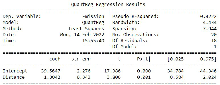
model = smf.quantreg('Emission ~ Distance',
df).fit(q=0.7)
print(model.summary())
|
From the output of this program, the estimated regression equation can be deduced as,
val = 39.5647 + 1.3042 * X (distance in km)
It implies that the 70th percentile of emission for all the cars that travel X km is expected to be val.
Output:
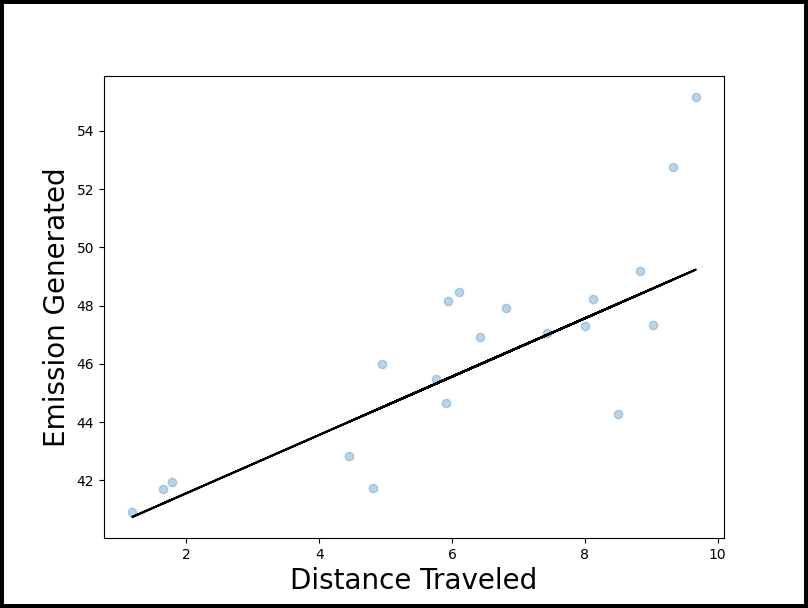
Visualization quantile regression
In order to visualize and understand the quantile regression, we can use a scatterplot along with the fitted quantile regression.
Python3
import numpy as np
import pandas as pd
import statsmodels.api as sm
import statsmodels.formula.api as smf
import matplotlib.pyplot as plt
np.random.seed(0)
rows = 20
Distance = np.random.uniform(1, 10, rows)
Emission = 40 + Distance + np.random.normal(loc=0,
scale=.25*Distance,
size=20)
df = pd.DataFrame({'Distance': Distance,
'Emission': Emission})
model = smf.quantreg('Emission ~ Distance',
df).fit(q=0.7)
fig, ax = plt.subplots(figsize=(10, 8))
y_line = lambda a, b: a + Distance
y = y_line(model.params['Intercept'],
model.params['Distance'])
ax.plot(Distance, y, color='black')
ax.scatter(Distance, Emission, alpha=.3)
ax.set_xlabel('Distance Traveled', fontsize=20)
ax.set_ylabel('Emission Generated', fontsize=20)
fig.savefig('quantile_regression.png')
|
Output:
Share your thoughts in the comments
Please Login to comment...