qqplot (Quantile-Quantile Plot) in Python
Last Updated :
10 Jan, 2023
When the quantiles of two variables are plotted against each other, then the plot obtained is known as quantile – quantile plot or qqplot. This plot provides a summary of whether the distributions of two variables are similar or not with respect to the locations.
Interpretations
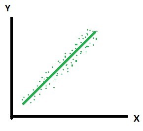
- All point of quantiles lie on or close to straight line at an angle of 45 degree from x – axis. It indicates that two samples have similar distributions.
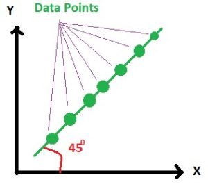
And in practice it is always not possible to get such a 100 percent clear straight line but the plot looks like below. Here the points are lying nearly on the straight line.
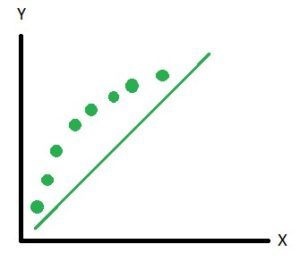
- The y – quantiles are lower than the x – quantiles. It indicates y values have a tendency to be lower than x values.
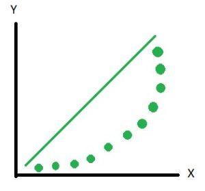
And in practice it is not always possible to get 100 percent as shown above but the plot looks as shown below. Here you can see that most of the points are lying below the line and few points are above the line. Hence we can say that the distributions are not the same.
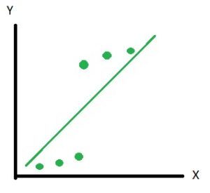
- The x – quantiles are lower than the y – quantiles. It indicates x values have a tendency to be lower than the y values.
- Indicates that there is a breakpoint up to which the y – quantiles are lower than the x – quantiles and after that point the y – quantiles are higher than the x – quantiles.
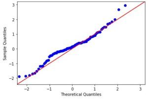
Quantile – Quantile plot using statsmodel in Python –
import numpy as np
import statsmodels.api as sm
import pylab as py
data_points = np.random.normal(0, 1, 100)
sm.qqplot(data_points, line ='45')
py.show()
|
Output:
Like Article
Suggest improvement
Share your thoughts in the comments
Please Login to comment...