How to Make the Navbar Collapse on Smaller Screens in React Bootstrap ?
Last Updated :
19 Oct, 2023
Earlier, websites were mainly designed for desktop computers because that’s what most people used. But now, with so many devices that can access the internet, websites need to be responsive on all sorts of screen sizes and types. So, In this article, we will see how to make Navbar collapse on a smaller screen using libraries like React-Bootstrap.
Prerequisites:
Steps to create the project:
Step1: Create a React application using the following command
npx create-react-app folderName
Step2: Create a React application using the following command
cd folderName
Step 3: Now install React-bootstrap and bootstrap
Step 3: Now install React-bootstrap and bootstrap
Step 4: Add Bootstrap CSS to index.js
import 'bootstrap/dist/css/bootstrap.min.css';
Step 5: Create a folder “Components” and create a file named “NavBarComponent” inside this folder.
Project Structure:
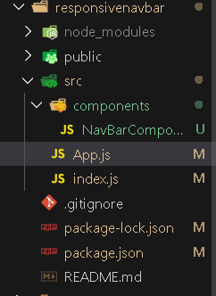
Project Structure
The updated dependencies in package.json will look like this :
{
  "name": "responsivenavbar",
  "version": "0.1.0",
  "private": true,
  "dependencies": {
    "@testing-library/jest-dom": "^5.17.0",
    "@testing-library/react": "^13.4.0",
    "@testing-library/user-event": "^13.5.0",
    "bootstrap": "^5.3.2",
    "react": "^18.2.0",
    "react-bootstrap": "^2.9.0",
    "react-dom": "^18.2.0",
    "react-scripts": "5.0.1",
    "web-vitals": "^2.1.4"
  }
}
Approach:
- Navbar component is used to create the main navigation bar. and props like collapseOnSelect is used to ensure the navbar collapses on selecting an item. and another prop expand is used to expand the navbar on larger screens.
- Container Component is used to wrap the navbar content within a responsive container.
- Navbar Brand Component is used to add a brand logo to the navbar.
- Navbar Toggle Button is used to Include a responsive navbar toggle button.
- Collapsible Navbar Content is used to Define the collapsible content of the navbar within Navbar.Collapse.
- Nav component is used at two places one for placing items to left and another to place item to right and inside this Nav.Linkis used to add navigation.
- NavDropdown Component is used to include a dropdown menu.
Example: App.js file imports NavBarComponent and exports App component. NavBarComponent.js file imports Container, Nav, Navbar and NavDropdown component from react-bootstrap library and after making UI exports NavBarComponent.
Javascript
import NavbarComponent from
"./components/NavBarComponent";
function App() {
return <NavbarComponent>
</NavbarComponent>;
}
export default App;
|
Javascript
import Container from 'react-bootstrap/Container';
import Nav from 'react-bootstrap/Nav';
import Navbar from 'react-bootstrap/Navbar';
import NavDropdown from 'react-bootstrap/NavDropdown';
function NavbarComponent() {
return (
<Navbar collapseOnSelect expand="lg"
className="bg-secondary">
<Container>
<Navbar.Brand href="#home">
GeeksForGeeks
</Navbar.Brand>
<Navbar.Toggle
aria-controls="responsive-navbar-nav" />
<Navbar.Collapse id="responsive-navbar-nav">
<Nav className="me-auto">
<Nav.Link href="#DataStructures">
Data Structures
</Nav.Link>
<Nav.Link href="#CompetitiveProgramming">
Competitive Programming
</Nav.Link>
<NavDropdown title="Courses"
id="collapsible-nav-dropdown">
<NavDropdown.Item href="#action/3.1">
backend
</NavDropdown.Item>
<NavDropdown.Item href="#action/3.2">
frontend
</NavDropdown.Item>
<NavDropdown.Item href="#action/3.3">
DSA
</NavDropdown.Item>
<NavDropdown.Divider />
<NavDropdown.Item href="#action/3.4">
cp
</NavDropdown.Item>
</NavDropdown>
</Nav>
<Nav>
<Nav.Link href="#contactus">
Contact Us
</Nav.Link>
<Nav.Link eventKey={2} href="#community">
Community
</Nav.Link>
</Nav>
</Navbar.Collapse>
</Container>
</Navbar>
);
}
export default NavbarComponent;
|
Steps to run the application:
Step 1: Run the Application using following command from the root directory of the project :
npm start
Step 2: Open web-browser and type the following URL
http://localhost:3000/
Output:
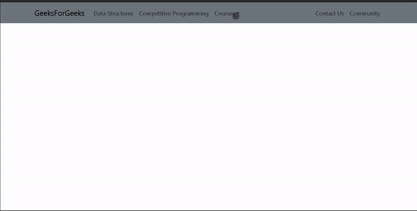
Navbar collapse On Smaller Screen
Share your thoughts in the comments
Please Login to comment...