How to make an Element Visible only on Larger Screens in Tailwind CSS ?
Last Updated :
19 Feb, 2024
In Tailwind CSS, you can use the responsive utility classes to control the visibility of an element based on screen size. To make an element visible only on larger screens, you can use the hidden and block classes with responsive breakpoints. We can achieve the effect of visibility of an element only on larger screens in Tailwind CSS in many ways i.e., using Display Utility Classes and using Visibility Classes.
Syntax:
<element class="hidden lg:block">
    Content
</element>
Using Display Utility Classes
Tailwind CSS provides display utility classes that allow you to control the display property of elements based on screen size. The hidden class hides the element by default, and the lg:block class makes it visible as a block element starting from the large (lg) breakpoint with a minimum width of 1024px.
Example: Illustration of making an element visible only on larger screens in Tailwind CSS using display utility class.
HTML
<!Doctype HTML>
<html>
<head>
<title>GFG Tailwind</title>
<meta charset="UTF-8">
<meta name="viewport" content="width=device-width,
initial-scale=1.0">
</head>
<body>
<div class="bg-green-200 py-4">
This is visible on every screen
</div>
<div class="bg-red-200 hidden lg:block py-4">
This element is visible only on large screens.
</div>
</body>
</html>
|
Output:

Output
Using Visibility Classes
Use visibility classes to control the visibility of elements based on screen size. The invisible class hides the element by making it invisible but still occupies space in the layout. The lg:visible class overrides the visibility property and makes the element visible starting from the large (lg) breakpoint and larger screens.
Example: Illustration of making an element visible only on larger screens in Tailwind CSS using visibility utility class.
HTML
<!doctype HTML>
<html>
<head>
<title>GFG Tailwind</title>
<meta charset="UTF-8">
<meta name="viewport" content="width=device-width,
initial-scale=1.0">
</head>
<body>
<div class="bg-green-200 py-4">
This is visible on every screen
</div>
<div class="bg-green-600 invisible lg:visible py-4">
This element is visible only on large (lg) and larger screens.
</div>
</body>
</html>
|
Output:
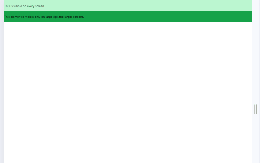
Output
Share your thoughts in the comments
Please Login to comment...