Auto Layout is a magical feature in Figma, offering dynamic creation of frames and components. This feature enables automatic adjustment of the height, width, and positions of elements in a seamless manner.
It empowers designers to craft layouts that adapt to changes in content, expanding or contracting to fit the designated container. For instance, when designing a button, you can use Auto Layout to ensure that the button resizes itself as you input text. Additionally, the feature allows the automatic alignment and maintenance of padding on all four sides as you modify the button’s dimensions. The Auto Layout feature in Figma truly works like magic, providing a versatile and efficient design experience.
Furthermore, the ability to alter an element’s size with this feature aids in the creation of responsive interfaces. It is not necessary to design the same part in two different dimensions to adapt it to different devices. Alternatively, you might utilize the Auto Layout tool and create a single element.
<bi>
How to Start?
You can apply auto layout to anything. There exist three methods for utilizing auto layout:
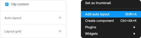
- To enable auto layout, simply pick the items and then press Shift + A.
- When groups, frames, or any contents are selected, an option to add Auto Layout appears in the “Design” section of the Properties Panel (right bar).
- Applying auto layout directly from the options that surfaced upon doing a right-click is another alternative.
Applying Auto Layout
Auto Layout & Properties
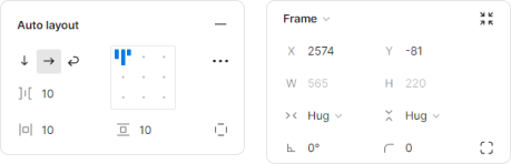
Auto Layout & Properties
Once you apply Auto Layout, the panel shown above appears using which you can adjust the properties of that particular frame. After this whatever elements are inserted in the frame, they get organised automatically as per the set properties.
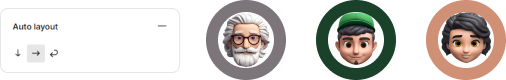
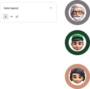
.png)
Applying Auto Lyout helps Organizing multiple elements
1. Direction Adjustments
The auto layout features allow for quick alignment and organization, as well as easy direction changes for the contents, from vertical to horizontal and vice versa. Click on the arrows representing the horizontal and vertical orientation to change the direction of the elements on a frame.
2. Distribution of elements
Distribution mode controls how the objects inside the frame are distributed when auto layout is performed. There are two distribution methods:
- In packed mode, items within a frame will be arranged in groups. Use this setting to maintain the closest distance and alignment between items in a frame.
- Space between: The distance between items in a frame is uniformly distributed along the frame’s chosen direction and alignment. To extend things across a frame, use this option.
- Click the […] option in the auto layout properties to view the advanced layout settings and adjust the distribution mode. Use the dropdown menu next to Spacing mode to select the direction mode.
- Shortcut: Toggling between packed and space between requires clicking the alignment box and pressing X.
3. Alignment adjustments
When auto layout is used, elements are automatically aligned; however, what’s more intriguing is that alignment is not limited to a particular location in space. You may choose to align items grouped using Auto Layout so that they are positioned left, right, or center.
When auto layout is used, a little grid with nine points appears. There will be a blue icon with three bars on one of these spots in the properties panel on the right side of the design section. Every point represents a distinct alignment type.
The manner in which the elements are distributed essentially determines alignment. Setting the alignment between distribution modes in space, three options are available to you for each direction if your distribution is set to Space between:
- Automatic vertical arrangement: Left, Center, Right
- Horizontal auto arrangement: Upper, Middle, Lower
- Setting alignment in the gap between packed mode: The same nine options are available to you in each direction if your distribution is set to packed:
- Upper left
- Uppermost center
- Upper right
- To the left
- To the center
- Alright
- Lower left
- Lower center
- Lower right
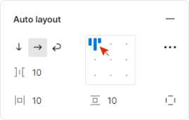
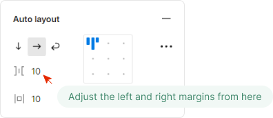
4. Padding adjustments
An element’s inner margin is called padding. The white space, or padding, that appears between an auto layout frame’s edge and its child objects on a range of elements—including the button itself—is managed. Paddings can have distinct values for the top, right, bottom, and left padding, or they can be arranged uniformly, vertically, and horizontally. In order to create the best vents, we employ this.
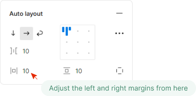
Left & Right Margins
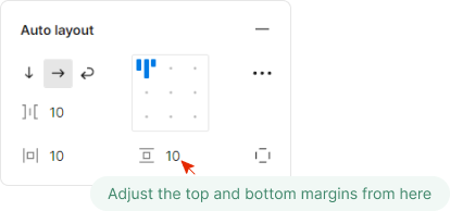
Top & Bottom Margins
5. Spacing
- After learning how to work with paddings, the next step is to understand the distance between each item inside an element with auto layout, be it a standard layer, a group, or a component.
- Applying auto layout comes in two flavors. To complete the task, choose the set of cards on the side and enter values in the space provided between the objects.
- You may also edit it by dragging freely, clicking on the line, or clicking on one of the pink lines that will emerge when you click on the card—just like we did with the padding.
Spacing between elements
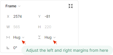
6. Resizing Elements
- The auto layout is a great tool for working with responsive design because it automates the process of changing a group or component, as you may have previously seen.
- Furthermore, beneath the width and height fields are three resizing options that enhance what we’ve seen thus far. Let’s discuss these in more detail.
a. Fixed height and width
As the name implies, the first option, Fixed width/height, fixes the element’s current value forever. When the width or height of an auto layout frame is set to Fixed, the frame’s dimensions stay the same regardless of the content. The size of the frame remains fixed regardless of changes to the things inside it, much like an arbitrary length of text.
b. Hug Content
Hug content is the second choice; it keeps the appropriate paddings and gaps in place and lets you use Auto Layout to change the height or width of any internal elements inside the group. Create an auto layout frame with the setting Hug content so that it will automatically resize to fit its child objects. The frame will keep its minimal size to enclose the objects inside it while adhering to the padding value.
If any child items inside an auto layout frame are set to Fill container, take note that the parent frame will become Fixed for the axis and will no longer hug the contents.
c. Fill Container
The third and last option is the Fill container. When the Fill container setting is applied to an auto layout frame, objects will expand to fill the width and/or height of the parent frame while keeping the desired padding and spacing.
Resizing elements
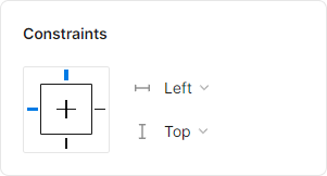
7. Resizing by Constraints
In an auto layout frame, you cannot apply restrictions to an object’s child objects if its absolute position is disabled. However, by utilizing the resizing function, you can define how things respond to resizing of the frame or of the objects included within it.
You can still apply limits to the auto layout frame itself even if it is included by another frame. You will then be able to set the Auto layout frame’s constraints and the resizing choices for any items that are within of it.
Adjust the restrictions menu’s settings to specify the location in which items should stay fixed when the frame is resized.
Resizing by Constraints
8. Absolute Position
No matter how many pixels tall or wide your device is, you may specify exactly where you want an element to be when its position is set to absolute.
You’ve seen that using Auto Layout makes it easier for you to arrange different pieces that are grouped together, but it also prevents you from being able to move the elements around freely. That is, if Position absolute isn’t enabled.
To make it active, pick any layer, group, or component inside a group that has Auto Layout enabled, then click the button to the right of the “Y” box in the right-hand Design Panel.
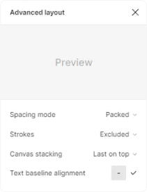
9. Text Baseline Alignment
The Text baseline perfectly aligns layers with varying heights that are vertically centered and positioned in a horizontal auto layout when text is coupled with an object, like a button and an icon.
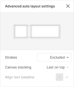
Click the […] menu in the auto layout properties to enter the advanced layout settings, then select the text baseline alignment option to enable it.
Shortcut: Once text baseline alignment is enabled, press B to turn it on or off.
10. Strokes in Auto layout
By default, strokes are not taken into account when determining an object’s size. It is a setting that can be included or excluded in the advanced auto layout.
Strokes in Auto Layout
11. Stacking Order
The final object (the rightmost) in a stack always stays at the top when there are numerous layers with negative spacing. It is modifiable to First on top.
Relation between Auto Layout & Flex Component
Developing responsive and adaptable layouts is crucial in the fast-paced field of web design and development to ensure a flawless user experience on a range of devices. The Figma auto layout feature and the CSS flexbox feature are two strong tools that help with this procedure. We’ll look at the similarities between these tools and talk about how they help developers and designers in this piece.
1. Flexibility in Layout Design
With Figma’s Auto Layout feature, designers may define limits on component layouts to create designs that are both flexible and adaptable. It enables items inside of frames to automatically reposition and resize themselves in accordance with the material within.
CSS Flexbox: Similar to this, CSS’s Flexbox (Flexible Box Layout) offers a one-dimensional layout approach that makes it possible to create responsive and flexible designs. It makes it simpler to create intricate layouts with less code by streamlining the alignment and spacing of elements within a container.
2. Responsive Design
The Auto Layout feature in Figma is excellent at producing designs that fluidly adjust to various screen sizes. To guarantee that components resize and reflow gracefully, designers might apply restrictions, padding, and spacing guidelines.
Flexbox in CSS: Flexbox’s intrinsic responsiveness enables programmers to create layouts that adapt to different screen sizes. Its clever management of space distribution and alignment makes it easier to create adaptable designs and fluid grids.
3. Alignment and Distribution
With Figma’s Auto Layout feature, designers can effortlessly manage the arrangement and spacing of items inside a frame, guaranteeing a unified and aesthetically attractive design.
CSS Flexbox: In a similar vein, Flexbox offers a collection of features that provide fine-grained control over the arrangement and alignment of objects inside a container. This makes it possible for developers to precisely generate layouts that adhere to design criteria.
Collaboration Between Designers and Developers
1. Seamless Handoff
Figma’s Auto Layout: Auto Layout gives designers and developers a clear picture of how a design should respond to screen changes, which makes collaboration between them easier.
Flexbox is a CSS feature that makes it simple for developers to convert design specifications into code and make sure the layout reflects the designer’s purpose.
2. Reduced Margin of Error
Figma’s Auto Layout: Auto Layout lowers the possibility of errors and misinterpretations during the development stage by reducing the necessity for human modifications.
Flexbox in CSS: This reduces differences between the final result and the design by enabling developers to precisely execute layouts based on the design parameters.
Conclusion
In conclusion, Flexbox in CSS and Auto Layout in Figma work together to enable designers and developers to create layouts that are responsive, adaptable, and consistent. Teams may improve collaboration, expedite work processes, and create web experiences that fluidly adjust to a wide range of devices and screen sizes by utilizing these tools.
Auto Layout in Figma – FAQs
What is the use of auto layout in Figma?
Auto Layout in Figma helps designers create responsive, scalable designs by allowing elements to adjust their size and position based on their parent container’s dimensions and other elements within the same container. This feature automates spacing, alignment, and resizing, simplifying the design process for various screen sizes and orientations.
What is the difference between auto layout and constraints?
- Auto Layout controls the spacing and sizing of elements within a container automatically, responding to changes in content or screen size.
- Constraints, on the other hand, define how individual elements behave relative to their parent frame when the frame’s size changes, such as sticking to a side or scaling with the frame.
How to create responsive auto layout in Figma?
To create a responsive Auto Layout in Figma:
- Select your elements.
- Click the “+” icon next to Auto Layout in the right sidebar to apply Auto Layout.
- Adjust properties like spacing, alignment, and direction.
- Set resizing properties for elements within the frame to determine how they resize or reposition when the frame changes.
to
Share your thoughts in the comments
Please Login to comment...