The study of using colors to convey an emotion, create a visual effect, or change human perception is known as Color Theory. Color theory is all about using colors to convey the right message. But how can we use color theory to our advantage? And how does color theory correlate with Psychology?
In this article, we will discuss what color theory is, and how it correlates with Psychology, and we will discuss some advanced insights around color theory and psychology that will help you create better designs.

Mastering Color Theory
What is Color Theory?
The study of using colors in order to convey an emotion, create a visual effect, or change human perception is known as Color Theory. But why is it important? Color theory is super important because using colors irresponsibly may lead to miscommunicating our message or communicating the wrong message. Color theory helps us to start our color palettes. It’s an important foundation to understand but creating beautiful color palettes and foundational for a professional-looking design.
How does Color Theory impact psychology?
According to studies, 90% of consumers evaluate a brand or design based on color alone.
In 1974 K.W. Jacobs demonstrated red to be more stimulating than green and green more stimulating than blue. According to this study, a person left in a red room is constantly stimulated with heightened awareness and elevated heart rate. And in 1981 Richard Kuller showed in his studies that color had a great effect on heart rates as well as emotional perceptions of objects. So color does have a direct physical response on our bodies and can actually play on our emotions hence, impacting the overall human Psychology. Colors are indeed a double edged sword – right use of colors has a positive impact on the user’s psyche and helps in the communication of your message but if a few things go here and there, it might cause stress on the user’s eyes or can reduce the effectiveness of your message you wish to convey.
Some insights on using Color Theory
Here are some advanced insights around color theory and psychology that will hep you create better designs:
Hue:
Now Color theory is more than just choosing a color or create your own pallet, color theory is about what changes to make to a particular color depending on your target audience, their gender, culture, age, demographics etc. and come up with a color that impacts their psychology for good. Color theory is all about learning how to balance contrast, tint, tone, shade and temperature.
The primary three distinct properties of color are hue, contrast and saturation. A Hue is the attribute of color that decides the dominant color family of the specific color. The traditional color name of a specific wavelength of light is called hue.
Note :- White, Black and Gray are not usually referred to as a Hue.

Hue
Insight :- increase hue to convey variety and interest through your colors.
Saturation:
Saturation deals with the intensity of color or how bright and dull a color is. A saturated color is high in intensity, that is bright and an unsaturated color is dull or low in intensity. Another term for saturation is chroma. A color without any brightness, no hue is achromatic (black or white or gray). Also weaker contrast and weaker saturation conveys calmness as opposed to a stronger contrast and saturation which convey activity. Pastel colors are considered calming because they lack saturation.
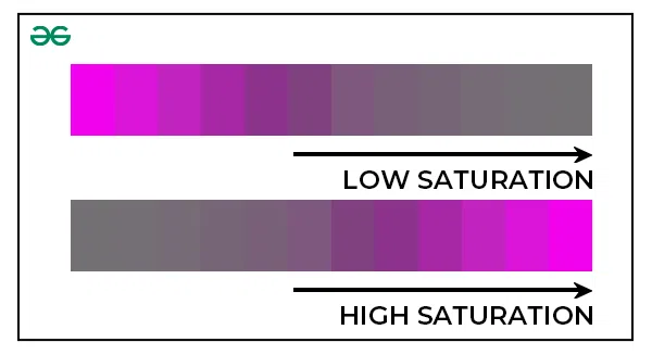
Saturation
Insight :- increase Saturation to highlight focal points in your design and in the Visual Arts part of design.
Tint:
Tint is the attribute of color associated with the whites in the color. Tint of a color is basically any base color taken from the color wheel and adding white to it.
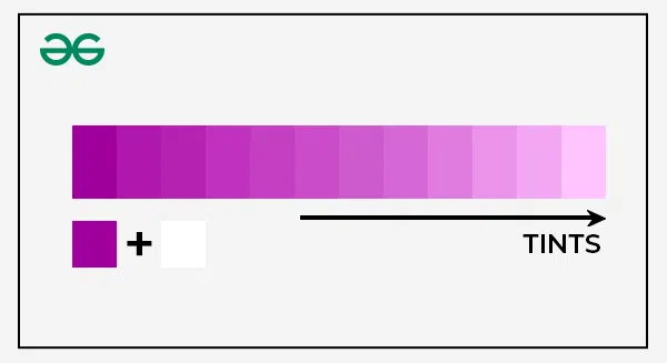
Tint
Insight :- increase Tint to convey lightness, airiness and positivity through your colors.
Tone:
A tone of the color is the base color or hue from the color wheel and gray added to it. Tone helps us make the base color less intense and more pleasing to the viewer.

Tone
Insight :- increase/darken the tone if you want to invoke seriousness, intensity or richness from your color.
Shade:
A shade of the color is basically any base color taken from the color wheel and adding black to it to darken the color to some degree. For example, if we take red add a touch of black, this beautiful deep red color would be a shade of red. To increase the shade of any color, you just have to add black to it, remember, shade does not contain any shite or gray, it must only be black that is added to the color.

Shades
Insight :- increase/darken the Shade if you want to invoke emphasis, seriousness or intrigue from your color.
Contrast:
Contrast is a visual design principle where we try and differentiate one or more elements/visuals from others by differentiating them by help of colors, fonts, typography, repetition, alignment, or anything else. The idea is to make a particular element or visual to stand out to the users. In design terms – The visual design principle of contrast refers to the juxtaposition of two visually different elements.

Contrast
Insight :- Here is a three step process to create color contrast:
Step 1: Choose a dominant color
The first step is to choose the dominant color that highlights the most important text/visual in the design. It might be possible that the company you work in or client you are working for might already have a color/brand color in mind. At that case step 1 is already done, but if you yourself have to choose the dominant color, research about what is the meaning of different colors.
For example, blue means trust, security, safety, peace and calmness. Purple means royalty, wealth and rich experience.
Step 2: Creating a palette of three colors
We already got our first color, we need 2 more colors that goes good with the dominant color. For this you can use tools like “mycolor.spaces” or you can even do it manually.
Step 3: Apply the 60/30/10 rule
Now that we have our 3 color palette ready, we can apply those colors to the user interface by the 60 – 30 – 10 rule. This rules basically means that 60% of a particular element in the background, 30% is the main element, and the 10% is the center of the element that we want to highlight or user’s attention.
Conclusion
Like we mentioned in the article, Colors are indeed a double edged sword – right use of colors has a positive impact on the user’s psyche and helps in the communication of your message but if a few things go here and there, it might cause stress on the user’s eyes or can reduce the effectiveness of your message you wish to convey.
This makes it super important to understand color theory and use colors wisely to improve your overall design. Make sure that you use the insights we offered you in this article in order to use color theory for your advantage and improve your overall design.
Share your thoughts in the comments
Please Login to comment...