Color Meaning | The Concept of Using Color Symbolism
Last Updated :
08 Dec, 2023
Colors are one of the most important parts of a design. They enhance the user’s understanding and impression of the design. Different colors have different psychological effects on the human mind. Different colors are used to make users feel different emotions. Different color combinations also impact users in different ways. Color theory suggests how different colors go hand in hand and their impact is determined by color meaning. In this article, we will discuss about colors and their meanings.

Color Meaning
Color Spectrum
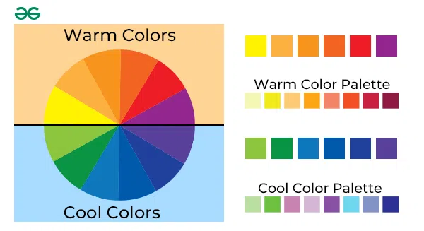
Colors in the red area of the spectrum known as warm colors, evoke either feelings of warmth or feelings of anger and hostility. On the other hand, colors on the blue side of the spectrum, cool colors can call to mind feelings of either sadness or calmness.
Warm Colors:
These colors create an emotional and energetic effect on the viewer. They give a strong vibe to the viewer and are highly overwhelming. They are mixed with different neutral colors to calm the effect. Some of these warm colors are:
- Red: Promotes: Power, Importance, and Youth.
Red is a very bold and impactful color for the viewers which is very eye catchy. It can easily capture anyone’s attention. The red color is also used as a symbol of danger. That is why most of the alert and warning signals are red so they can be noticed easily. It helps evoke energetic emotions.
- Yellow: Promotes: Youthful, Lively, Energy, Freshness, Optimistic
Yellow is one of the more versatile colors. Yellow gives mixed emotions like negative feelings: caution, criticism, laziness, and jealousy and Darker shades of yellow signifies impression of antiquity, timelessness, wisdom, and curiosity. Yellow color is very cheerful and lively and gives an optimistic cheerful and happy vibe.
- Orange: Promotes: Friendliness, Energy, Uniqueness
Orange is a mixture of its two side colors on the color wheel, red and yellow. Orange is the most muted warm color, and is uniquely versatile. Orange doesn’t have that bold energetic vibe that red has. It is used in many safety gears because it gives a safe feel to the viewers. Orange is a mixture of yellow which promotes cheerful youthfullness and red which promotes energy energy and heat. Which is why it is a good color for brands that focuses on children.
Warm and Cool Colors
Cool Colors:
These have a cool and calming effect on the viewer, and this is the reason why cool colors are the most common colors used on websites.
- Green: Promotes: Growth, Stability, Financial Themes, Environmental Themes, Freshness
Green comes between warm and cool colors. It gives a very balanced and stable aesthetic. On the other hand, green is a symbol of money, showing wealth and stability. Green color associates with nature and plants and gives a healthy feel which is very important for brands that are related to health services and products. Green color also indicates accessability which is why it is used in traffic lights and succcessfull event happening like access granted.
- Blue: Promotes: Calm, Trust, Competence, Peace, Logic, Reliability
Blue is a soothing, peaceful and calming color. Social media sites like Twitter and Facebook use light and medium shades, while corporate websites prefer dark shades tones of strength and reliability. Blue color has that cool and calm feeling to it which gives a trustful feeling which is why lot of big brands use blue color. Whenever brands wants to show that they are trustworthy, calm and cool their first choice is blue.
- Purple: Promotes: Luxury, Romance (lighter shades), Mystery (darker shades)
Purple is the color of luxury, royalty and sophistication and wealth. Purples suggest lavishness and because of that most luxury goods and fashion brands opt for this color, even cadbury also uses purple for its packaging. On the other hand Lighter shades like lavender (with pink hues) are considered romantic. Purple is a symbol of royality and wealth and is used to showcase that. Brands use purple along with gold which gives a luxurious and royal look for their brand.
Neutral Colors:
These are great to mix with warm or cool colors and they are often used to tone down primary colors and create balance in web design.
- Black: Promotes: Power, Edginess, Sophistication
The strongest of the neutral colors. This is not part of the color wheel, but almost all websites show it. It also depicts grief, mourning, and sorrow so it must be used wisely. Using Black as the main color of the brand show that the brand is edgy and powerful in their field. Black color is used to Shade other colors make them appear a bit darker.
- White: Promotes: Cleanliness, Virtue, Simplicity
Whites are also not a part of the color wheel, which in turn is primarily associated with virtue, purity and innocence. In a website which prefers simplistic and easy approaches, the white color is often used as background colour. White color is also use to change the tint of a color which lightens a color.
- Gray: Promotes: Neutrality, Formality, Balance
Gray, which is a widely used neutral colour to convey professionalism, is also highly popular for traditional and formal choices. It’s often used to illustrate texts, borders and a variety of subtle elements. Gray is formed after adding black and white. When we add gray to any hue it changes tone of that color.

Neutral Colors
Conclusion
Using Different colors will affect users with different emotions which can be used to promote something. Choosing colors wisely will help user to perfectly capture the attention of the viewer and deliver their message. Mixing hues with different neutral colors will help in changing the impact of the color. Mixing colors that don’t go well together or have opposite feel to them can give a negative impression to the viewer that is why it is suggested to wisely pick the colors and their shades.
Share your thoughts in the comments
Please Login to comment...