Significance of Icons in User Interface Design
Last Updated :
01 Nov, 2023
Icons are an important part of user interfaces, which are used in expressing objects, actions, and ideas. They are used to communicate the core idea and intent of a product or action. So, they bring a lot of benefits to user interfaces.
What are the Icons Used for?
Icons are used to present information visually. For example, Instead of writing a text message of instruction over a small button, you just design an icon representing that message. That reduces the space that could have been taken by text message and it provides a cleaner and concise user experience.
So, primarily icon is used to communicate the message very rapidly and effectively.
Types of Icons
- Glyph icons: These are symbols and are frequently solid. They can be scaled to whichever size you want and can be customized with different colors and shadow effects. Because they are generally a solid color, icons can work really well at small sizes, but may not behave as required at larger sizes.
- Colored icons: These icons have color. They can either have a solid color or a gradient color scheme. The drawback of colored icons is that they can be more challenging to integrate into UI and can even distract users from the main content.
- Universal icons: These icons are noticed instantly, and usually represent repetitive actions. Universal actions in any product should be depicted with universal icons to avoid any chaos.
- Unique icons: They represent unique features. The drawback of using them is that they are very hard for first-time users to understand. So, make sure that you include text labels when you use them.
- Outlined icons: These are created by strokes and are empty from the inside. They are clean and simple but they take users more time to process and recognize.
- Conflicting icons: If Multiple icons present the same concept that is conflicting icons.
Key Principles of Icon Design
- Keep icons simple and uncluttered.
- Ensure icons clearly convey their intended meaning.
- Maintain a consistent style within your icon set.
- Make icons relevant to their context.
- Design icons to work at various sizes.
- Keep elements well-aligned and balanced.
- Test icons at smaller sizes for readability.
- Choose colors carefully for accessibility.
- Utilize negative space effectively.
- Establish hierarchy within icon sets.
- Maintain uniform stroke width.
- Gather user feedback and iterate designs.
- Follow platform-specific design guidelines.
Creating a Simple Icon in Figma
You can create an icon on any UI design tools like figma, adobeXD etc. I am using Figma to create a simple circular icon. Here, we will understand this with an example.
Note: To generate code out of the created icon in figma use a plugin like anima.
.gif)
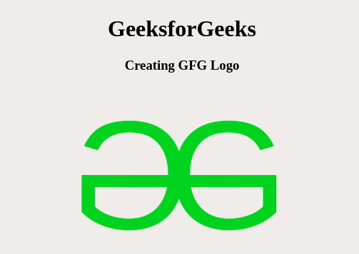
Example: Let us create an icon representing GFG logo.
Converting to code using the figma plugin (anima) going to dev mode results into,
HTML
<!DOCTYPE html>
<html>
<head>
<link rel="stylesheet" href="style.css" />
</head>
<body>
<div class="box">
<div>GeeksforGeeks</div>
<div class="group">
<div class="overlap-group">
<div class="text-wrapper">G</div>
<div class="div">G</div>
<div class="rectangle"></div>
</div>
</div>
</div>
</body>
</html>
|
CSS
.box {
width: 265px;
height: 246px;
margin:auto;
text-align: center;
}
.box > div:first-child{
color:green;
font-size: larger;
}
.box .group {
width: 269px;
height: 246px;
}
.box .overlap-group {
position: relative;
width: 265px;
height: 246px;
}
.box .text-wrapper {
width: 213px;
left: 90px;
position: absolute;
top: 0;
font-family: "Inter-Regular", Helvetica;
font-weight: 400;
color: #0abd1c;
font-size: 217px;
letter-spacing: 0;
line-height: normal;
white-space: nowrap;
}
.box .div {
width: 64px;
left: 80px;
transform: rotateY(180deg);
position: absolute;
top: 0;
font-family: "Inter-Regular", Helvetica;
font-weight: 400;
color: #0abd1c;
font-size: 217px;
letter-spacing: 0;
line-height: normal;
white-space: nowrap;
}
.box .rectangle {
position: absolute;
width: 154px;
height: 17px;
top: 124px;
left: 50px;
background-color: #0abd1c;
}
|
Output: Click here to see the live output
Benefits of Using Icons
- Icons are universal symbols that can communicate complex ideas or actions quickly and more effectively.
- Icons simplify information by reducing text which makes content more approachable and less overwhelming.
- Icons are language-agnostic, making them perfect for applications and websites targeting a global audience.
- Enhanced Usability: Icons can improve the usability of interfaces by making navigation and interaction more easier.
- Icons can help in recognizing brands
- Icons can enhance accessibility by providing an alternative means of conveying information to those with visual or cognitive impairments.
- Icons can be used for quick navigation, allowing users to jump directly to specific sections or actions without the need for extensive text-based menus.
- Icons contribute to consistency within a design system or user interface.
- Icons are good for small devices with limited screen real estate and they provide a touch-friendly target for interactions, making them suitable for responsive design.
- Icons make it easier for users to scan content and quickly identify relevant information or actions.
- Icons can aid in memory retention where users are more likely to remember visual symbols than lengthy text descriptions.
Conclusion
Icons are significant. They should serve a purpose. They should help the user do what they need without requiring additional efforts from them. They take up less space on a site than text. It makes the website interface look cleaner and more convenient for eyes.
Share your thoughts in the comments
Please Login to comment...