Importance of Color Code Concepts in UI/UX Design
Last Updated :
16 Oct, 2023
In this article, we will learn to efficiently use color codes in UI/UX to improve user experience.
What is a Color Code?
A color code is a system used to represent and specify colors in various formats, typically in digital or graphic design.
Example: #FF0000 represents the color red.

Color Code Concepts in UI/UX Design
Importance of Colors in UI/UX Design
Colors help establish a visual hierarchy by drawing attention to specific elements. They guide users to the most important information or actions on the interface. Colors play a significant role in improving user experience, impacting user decisions, and increasing user time of the UI. A good color palette can make a UI appear more attractive and a bad one can make it repulsive irrespective of its content. Colors can be used to convey messages like red color can talk about passion or even danger. Well-defined colors can improve the readability of UI design. Colors can make a profound impact on user emotions and behaviors. Colors can have different cultural connotations. Understanding these associations is crucial for designing for a global audience. Colors can be used to distinguish different sections or categories within an interface, making navigation more intuitive. Color codes are used to ensure consistency and accuracy when working with colors across different devices and media.
Types of Color Codes
1. Hex color codes
Hex color codes consists of the three-byte hexadecimal numbers with each byte representing pair of characters. This color code is prefixed with ‘#’ followed by 6 hex characters which is either a number from (0-9) or a letter from (A-F).
Syntax:
#RRGGBB
Each key of the above syntax represent a color:
- RR – Intensity of Red.
- GG – Intensity of Green.
- BB – Intensity of Blue.
2. Color name
Instead of recalling the number we can add a specific name to the color.
Example: Aqua which a light sky blue color.
3. RGB color
You can add the color in the form of RGB(Red,Green,Blue) where each parameter has a value between 0 and 255.
Example: RGB(255,0,0) – represents red color.
4. HSL color
HSL stands for Hue, Saturation , lightness. The hue is the degree with value between 0 and 360. Saturation and lightness are in percentage.
Example : hsl(100,75%,40%) – Green color.
How to Use Colors in UI?
Using colors appropriately is very necessary in UI/UX design. Here you will get to know some tips to use color codes but you need a practice to improve the choice of coloring.
1. Choose the right color for conveying message:
Colors can talk or message to communicate message to users. If you fail to use the right color you have the chance to lose your clients.

2. Colors should blend correctly with text:
If your color hides text on the UI then your product will start facing issues and it will eventually reduce the accessibility of the application.

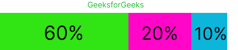
3. Use limited number of colors:
Most of the application prefer a maximum of three colors. Moreover, the colors should be limited and properly combined with each other. Most systems use 60:20:10 rule where 60% of the interface should contain your primary color, 30% your secondary color, and 10% the remaining color.
4. Element color should vary from background:
Make sure that the colors chosen by you highlight the foreground from its background.
5. Add proper contract, brightness to the product:
Contrast and brightness should be added in right amount. If you give more or les of it then the users will not be able to navigate of the UI conveniently.
Low Contrast , Low Brightness ——> Good Contract , Brightness

Best Practices to Use Color Code Concepts in UI/UX Design
- Maintaining a consistent color scheme throughout your design.
- Ensuring color choices meet accessibility standards for all users.
- Using color to emphasize important elements and establish visual hierarchy.
- Creating contrast between text and background to enhance readability.
- Limit the number of colors used to maintain a clean and cohesive design.
- Aligning color choices with the brand’s identity and values.
- Testing color variations with users to optimize for engagement and usability.
- Considering the emotional impact of colors and how they align with the user experience.
- Accounting for color adjustments in different devices and modes (e.g., dark mode).
- Using color changes to provide feedback on user interactions (e.g., button state changes).
Color Related Practices to Avoid in UI/UX Design
- Inconsistency in color choices can confuse users and disrupt visual flow.
- Using colors that don’t meet accessibility standards can exclude users with disabilities.
- Overusing bright or vibrant colors can be visually overwhelming.
- Using too many colors can lead to a cluttered and chaotic design.
- Neglecting brand colors and identity can create a disjointed user experience.
- Using colors that evoke inappropriate emotions for the context can negatively impact the user experience.
- Failing to consider how color choices adapt in various device modes or settings, such as dark mode, can lead to usability issues.
- Inconsistently using color changes to provide feedback on user interactions can lead to confusion.
Conclusion
So, in this article we learnt about the color codes and also got some tips to improve your UI looks. There is something called design thinking that elaborates the use of colors in UI/UX designing. Ultimately, if you understand the purpose of your UI product , you will be able to understand the correct use of colors.
Share your thoughts in the comments
Please Login to comment...