Chakra UI Disclosure Tabs
Last Updated :
29 Jan, 2024
Chakra UI Disclosure Tabs is a user interface component that enables organized content presentation through tabbed navigation. Users can easily switch between different sections of content, enhancing navigation and organization within React applications.
Prerequisites:
Syntax:
import { Tabs, TabList, TabPanels, Tab, TabPanel } from "@chakra-ui/react";
<Tabs>
  <TabList>
    <Tab>Tab 1</Tab>
  </TabList>
  <TabPanels>
    <TabPanel>
      Content for Tab 1
    </TabPanel>
  </TabPanels>
</Tabs>
Steps to Create React Application And Installing Module:
Step 1: Create a React application using the following command:
npx create-react-app my-app
Step 2: After creating your project folder(i.e. chakra), move to it by using the following command:
cd my-app
Step 3: After creating the React application, Install the required package using the following command:
npm i @chakra-ui/react @emotion/react@^11 @emotion/styled@^11 framer-motion@^6
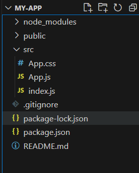
Project Structure:
The updated dependencies in the package.json file.
"dependencies": {
    "@chakra-ui/react": "^2.8.2",
    "@emotion/react": "^11.11.3",
    "@emotion/styled": "^11.11.0",
    "@testing-library/jest-dom": "^5.17.0",
    "@testing-library/react": "^13.4.0",
    "@testing-library/user-event": "^13.5.0",
    "framer-motion": "^11.0.3",
    "react": "^18.2.0",
    "react-dom": "^18.2.0",
    "react-scripts": "5.0.1",
    "web-vitals": "^2.1.4"
},
Approach to create Disclosure Tabs:
- Install Chakra UI in your React project: npm install @chakra-ui/react.
- Import the required Chakra UI components for Tabs.
- Utilize Tabs, TabList, TabPanels, Tab, and TabPanel to structure the tabs.
- Apply Chakra UI styling, including unique variants, to create an appealing and distinctive UI. Adjust colors, spacing, and typography as needed.
Example: Below is the implementation for Chakra UI Disclosure Tabs.
Javascript
import {
Tabs, TabList, TabPanels, Tab,
TabPanel, Box, Center,
} from "@chakra-ui/react";
const App =
() => {
return (
<Tabs variant="soft-rounded"
colorScheme="teal" size="lg">
<TabList justifyContent="center"
mb={4} p={2}>
<Tab _selected={{
color: "white", bg: "teal.500"
}} mx={2}>
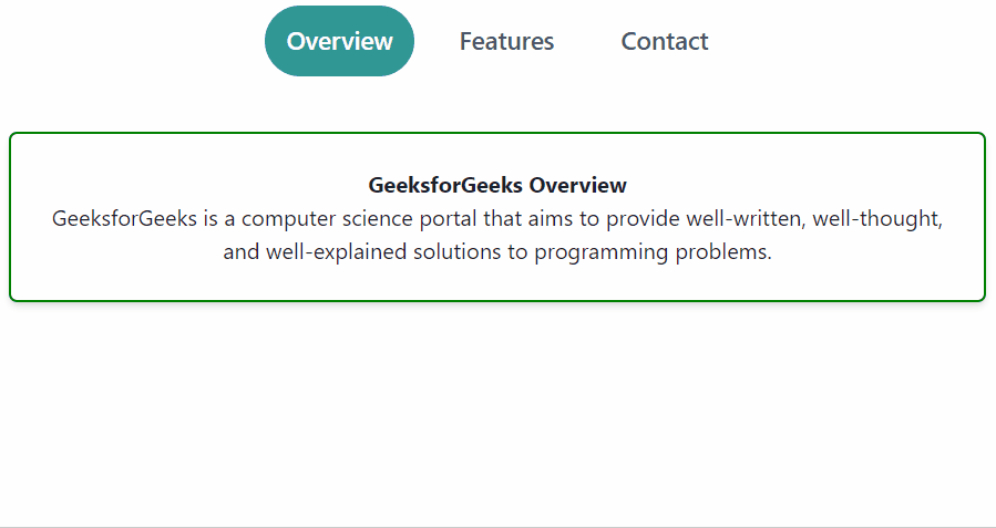
Overview
</Tab>
<Tab _selected={{
color: "white", bg: "teal.500"
}} mx={2}>
Features
</Tab>
<Tab _selected={{
color: "white", bg: "teal.500"
}} mx={2}>
Contact
</Tab>
</TabList>
<TabPanels>
<TabPanel>
<Center>
<Box
p={6}
borderRadius="md"
textAlign="center"
boxShadow="md"
border="2px solid green">
<strong>
GeeksforGeeks Overview
</strong>
<p>
GeeksforGeeks is a computer science
portal that aims to provide
well-written, well-thought, and
well-explained solutions to
programming problems.
</p>
</Box>
</Center>
</TabPanel>
<TabPanel>
<Center>
<Box
p={6}
borderRadius="md"
textAlign="center"
boxShadow="md"
border="2px solid green">
<strong>Key Features</strong>
<ul>
<li>Feature-Rich Coding Articles</li>
<li>Data Structures and Algorithms</li>
<li>Interview Preparation</li>
</ul>
</Box>
</Center>
</TabPanel>
<TabPanel>
<Center>
<Box
p={6}
borderRadius="md"
textAlign="center"
boxShadow="md"
border="2px solid green">
<strong>
Contact GeeksforGeeks
</strong>
<p>
Have a question or suggestion?
Reach out to GeeksforGeeks
through their official contact channels.
</p>
</Box>
</Center>
</TabPanel>
</TabPanels>
</Tabs>
);
};
export default App;
|
Step to run the application: Run the application using the following command:
npm start
Output:
Share your thoughts in the comments
Please Login to comment...