Chakra UI Display
Last Updated :
12 Feb, 2024
Chakra UI simplifies React UI development with customizable components. Its <Box> component offers easy visibility control across screen sizes. With Chakra UI, creating modern, accessible designs is effortless.
Syntax:
Hiding the Element on All Viewports:
<Box display='none' />
Hiding by Default and Showing from ‘md’ Up:
<Box display={{ base: "none", md: "block" }} />
//Shorthand
<Box hideBelow='md' />
Prerequisites:
Approach:
Chakra UI’s Box component for responsive element visibility control. Approaches include direct ‘none’ display, default hiding with ‘block’ from ‘md’, and shorthands for concise usage. These methods offer flexible solutions for managing element visibility across viewport sizes.
Steps to Create React Application And Installing Module:
Step 1: Create a React application using the following command:
npx create-react-app my-app
Step 2: After creating your project folder(i.e. my-app), move to it by using the following command:
cd chakra
Step 3: After creating the React application, Install the required package using the following command:
npm i @chakra-ui/react @emotion/react@^11 @emotion/styled@^11 framer-motion@^6
Project Structure:
The updated dependencies in the package.json file will look like:
"dependencies": {
    "@chakra-ui/react": "^2.8.2",
    "@emotion/react": "^11.11.3",
    "@emotion/styled": "^11.11.0",
    "@testing-library/jest-dom": "^5.17.0",
    "@testing-library/react": "^13.4.0",
    "@testing-library/user-event": "^13.5.0",
    "framer-motion": "^6.5.1",
    "react": "^18.2.0",
    "react-dom": "^18.2.0",
    "react-scripts": "5.0.1",
    "web-vitals": "^2.1.4"
}
Example: Below is the code example for Chakra UI Display:
Javascript
import {
ChakraProvider, Box,
Button, Container,
Heading, extendTheme
} from '@chakra-ui/react';
import { useState } from 'react';
const theme = extendTheme({
components: {
Box: {
baseStyle: {
padding: '20px',
backgroundColor: '#f8f9fa',
margin: '10px',
textAlign: 'center',
borderRadius: '8px',
boxShadow: '0 2px 4px rgba(0, 0, 0, 0.1)',
},
},
Button: {
baseStyle: {
borderRadius: '8px',
fontWeight: 'bold',
},
sizes: {
md: {
fontSize: 'md',
h: '40px',
px: '24px',
},
},
},
Heading: {
baseStyle: {
color: '#343a40',
marginBottom: '20px',
},
},
},
});
function App() {
const [isVisible, setIsVisible] = useState(true);
return (
<ChakraProvider theme={theme}>
<Container maxW="md" centerContent>
<Heading as="h1" size="xl" mt="10">
Chakra UI Display-Toggle Visibility
</Heading>
<Box display={
isVisible ?
'block' : 'none'
} mt="4">
This box is visible by default.
</Box>
<Button
colorScheme="teal"
onClick={
() => setIsVisible((prev) => !prev)
}
mt="4">
Toggle Visibility
</Button>
</Container>
</ChakraProvider>
);
}
export default App;
|
Steps to start the react App:
npm start
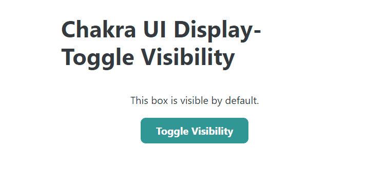
Output:
Share your thoughts in the comments
Please Login to comment...