React MUI Grid Layout
Last Updated :
15 Mar, 2024
React MUI Grid layout is a responsive layout grid that adapts to screen size and orientation, ensuring consistency across layouts.
React MUI Grid Layout
Material UI Grid Component gives a responsive layout to all the screens and orientations
Syntax:
<Grid> ... </Grid>
MUI Grid Layout Variants:
- Fluid grids: This grid type uses columns that scale and resize content and can use breakpoints to determine if the layout needs to change dramatically.
- Spacing: The spacing value can be any positive number, including decimals and any string.
- Responsive values: The grid layout supports all the responsive values like columns, columnSpacing, direction, rowSpacing, and spacing.
- Interactive: To make a grid layout interactive, use directions, justifyContent, and alignItems props.
- Auto-layout: The Auto-layout makes the items equitably share the available space and can set the width of one item and the others will automatically resize around it.
- Complex Grid: With the help of a grid layout, a complex layout can be made.
- Nested Grid: The container and item props are two independent booleans and can be combined to allow a Grid component to be both a flex container and child acting as a nested grid.
- Columns: We change the default number of columns (12) with the help of columns prop.
- Limitations: There are several limitations of grid layout like Negative margin, white-space: nowrap, direction: column | column-reverse.
- CSS Grid Layout: The grid layout is using CSS flexbox internally but we can use the system and CSS Grid to layout your pages.
- System props: The grid layout supports all system properties and can be used as props directly on the component.
- API: The API used in container layout is: <Grid />
Steps to Create React App and Installing Modules
Step 1: Initialize a React project. Check this post for setting up React app.
Step 2: After creating the ReactJS application, Install the required module using the following command:
npm install @mui/material @emotion/react @emotion/styled
Step 3: Implement MUI Grid a given in below examples.
Step 4: Run the react app using the below command.
npm start
React MUI Grid Layout Examples
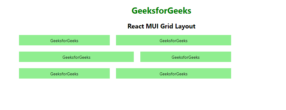
Example 1: React MUI Fluid Grid
Below example demonstrates the React MUI fluid grid layout.
Javascript
import {
    Grid,
} from "@mui/material";
import { Box } from "@mui/system";
import * as React from "react";

function App() {
    return (
        <center>
            <div>
                <h1 style={{ color: "green" }}>GeeksforGeeks</h1>
                <h2>React MUI Grid Layout</h2>
            </div>
            <div style={{ width: "50%" }}>
                <Grid container spacing={3}>
                    <Grid item xs={4}>
                        <Box sx={{ backgroundColor: 'lightgreen',
                            padding: 1, textAlign: 'center', }}>
                            GeeksforGeeks
                        </Box>
                    </Grid>
                    <Grid item xs={5}>
                        <Box sx={{ backgroundColor: 'lightgreen',
                            padding: 1, textAlign: 'center', }}>
                            GeeksforGeeks
                        </Box>
                    </Grid>
                    <Grid item xs={5}>
                        <Box sx={{ backgroundColor: 'lightgreen',
                            padding: 1, textAlign: 'center', }}>
                            GeeksforGeeks
                        </Box>
                    </Grid>
                    <Grid item xs={4}>
                        <Box sx={{ backgroundColor: 'lightgreen',
                            padding: 1, textAlign: 'center', }}>
                            GeeksforGeeks
                        </Box>
                    </Grid>
                    <Grid item xs={4}>
                        <Box sx={{ backgroundColor: 'lightgreen',
                            padding: 1, textAlign: 'center', }}>
                            GeeksforGeeks
                        </Box>
                    </Grid>
                    <Grid item xs={5}>
                        <Box sx={{ backgroundColor: 'lightgreen',
                            padding: 1, textAlign: 'center', }}>
                            GeeksforGeeks
                        </Box>
                    </Grid>
                </Grid>
            </div>
        </center>
    );
}

export default App;
Output:
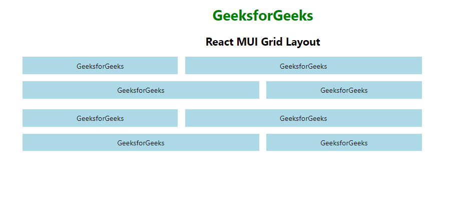
Example 2: React MUI Nested Grid
Below example demonstrates the React MUI nested grid layout.
Javascript
import {
    Grid,
} from "@mui/material";
import { Box } from "@mui/system";
import * as React from "react";

function GridComponent() {
    return (
        <React.Fragment>
            <Grid item xs={4}>
                <Box sx={{ backgroundColor: 'lightblue',
                    padding: 1, textAlign: 'center', }}>
                    GeeksforGeeks
                </Box>
            </Grid>
            <Grid item xs={6}>
                <Box sx={{ backgroundColor: 'lightblue',
                    padding: 1, textAlign: 'center', }}>
                    GeeksforGeeks
                </Box>
            </Grid>
            <Grid item xs={6}>
                <Box sx={{ backgroundColor: 'lightblue',
                    padding: 1, textAlign: 'center', }}>
                    GeeksforGeeks
                </Box>
            </Grid>
            <Grid item xs={4}>
                <Box sx={{ backgroundColor: 'lightblue',
                    padding: 1, textAlign: 'center', }}>
                    GeeksforGeeks
                </Box>
            </Grid>
        </React.Fragment>
    )
}

function App() {
    return (
        <center>
            <div>
                <h1 style={{ color: "green" }}>
                    GeeksforGeeks
                </h1>
                <h2>React MUI Grid Layout</h2>
            </div>
            <div style={{ width: "50%" }}>
                <Grid container spacing={3}>
                    <Grid container item spacing={2}>
                        <GridComponent />
                    </Grid>
                    <Grid container item spacing={2}>
                        <GridComponent />
                    </Grid>
                </Grid>
            </div>
        </center>
    );
}

export default App;
Output:
Reference: https://mui.com/material-ui/react-grid
Share your thoughts in the comments
Please Login to comment...