React Bootstrap Form Input Group
Last Updated :
06 Feb, 2024
React-Bootstrap is a front-end framework that was designed keeping React in mind. Bootstrap underwent a reconstruction and revitalization specifically for React, leading to its rebranded version known as React-Bootstrap. Input Groups are used to perform actions by adding text, buttons, or button groups on either side of textual inputs, custom dropdowns, and custom file inputs on the website and they play a crucial role in the front-end part.
Prerequisites:
Steps To Create React Application And Installing Module:
Step 1: Create a React application using the following command.
npx create-react-app my-react-app
Step 2: After creating your project folder i.e. react-bs-input-group, move to it using the following command.
cd my-react-app
Step 3: After creating the ReactJS application, Install the required modules using the following command.
npm install react-bootstrap bootstrap
npm i @chakra-ui/react @emotion/react@^11 @emotion/styled@^11 framer-motion@^6
Step 4: Add the below line in index.js file.
import 'bootstrap/dist/css/bootstrap.css';
Project Structure:
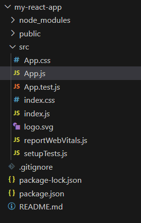
Project Structure
The updated dependencies in package.json file will look like:
 "dependencies": {
    "@chakra-ui/icons": "^2.1.1",
    "@chakra-ui/react": "^2.8.2",
    "@emotion/react": "^11.11.3",
    "@emotion/styled": "^11.11.0",
    "@testing-library/jest-dom": "^5.17.0",
    "@testing-library/react": "^13.4.0",
    "@testing-library/user-event": "^13.5.0",
    "bootstrap": "^5.3.2",
    "react": "^18.2.0",
    "react-bootstrap": "^2.10.0",
    "react-dom": "^18.2.0",
    "react-icons": "^5.0.1",
    "react-redux": "^9.1.0",
    "react-scripts": "5.0.1",
    "redux": "^5.0.1",
    "web-vitals": "^2.1.4"
}
Example: Now use the below code snippet in that file and export that component so that we can import in index.js for rendering.
Javascript
import React from "react";
import Form from "react-bootstrap/Form";
import InputGroup from "react-bootstrap/InputGroup";
import {
Box, Text
} from "@chakra-ui/react";
export default function InputGrouping() {
return (
<Box bg="lightgrey" w="100%" ml={25} p={8}>
<h3>Bootstrap Input Group</h3>
<InputGroup size="sm" className="mb-3">
<InputGroup.Text id="inputID1">
@
</InputGroup.Text>
<Form.Control
placeholder="Username"
aria-label="Username"
aria-describedby="inputID1"
/>
</InputGroup>
<InputGroup className="mb-3">
<Form.Control
placeholder="Email"
aria-label="Email"
aria-describedby="inputID2"
/>
<InputGroup.Text id="inputID2">
@example.com
</InputGroup.Text>
</InputGroup>
<Form.Label htmlFor="basic-url">
Your URL
</Form.Label>
<InputGroup className="mb-3">
<InputGroup.Text id="inputID3">
https:
</InputGroup.Text>
<Form.Control id="basic-url"
placeholder="url"
aria-label="url"
aria-describedby="inputID3"
/>
<InputGroup.Text id="inputID3">
.com
</InputGroup.Text>
</InputGroup>
<Form.Label>Select Technology</Form.Label>
<InputGroup className="mb-3">
<InputGroup.Checkbox aria-label="HTML" />
<Form.Control placeholder="HTML"
aria-label="HTML" />
<InputGroup.Checkbox aria-label="CSS" />
<Form.Control placeholder="CSS"
aria-label="CSS" />
<InputGroup.Checkbox aria-label="JavaScript" />
<Form.Control placeholder="JavaScript"
aria-label="JavaScript" />
</InputGroup>
<Form.Label>Select Gender</Form.Label>
<InputGroup size="sm">
<InputGroup.Radio aria-label="male" />
<Form.Control placeholder="male"
aria-label="male" />
<InputGroup.Radio aria-label="female" />
<Form.Control placeholder="female"
aria-label="female" />
</InputGroup>
<Form.Label>Multiple inputs</Form.Label>
<InputGroup className="mb-3">
<InputGroup.Text>
First and last name
</InputGroup.Text>
<Form.Control aria-label="First name" />
<Form.Control aria-label="Last name" />
</InputGroup>
<br />
</Box>
);
}
|
Output: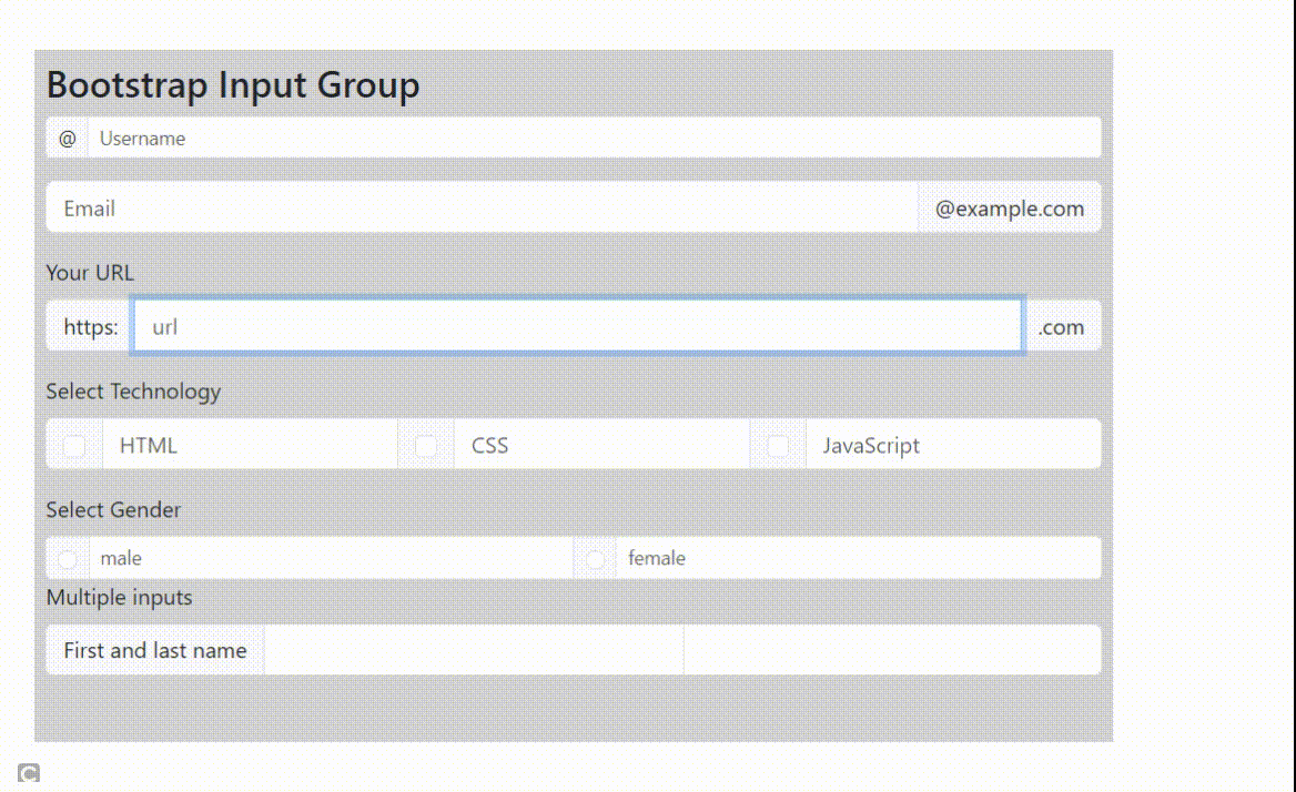
Example 2: The following code demonstrates multiple button addons along with InputGroup. Import all required files as shown below in the code.
Javascript
import React from "react";
import Form from "react-bootstrap/Form";
import Button from 'react-bootstrap/Button';
import InputGroup from "react-bootstrap/InputGroup";
import {
Box, Text
} from "@chakra-ui/react";
export default function MultipleAddons() {
return (
<Box bg="lightgrey" w="100%" ml={25} p={8}>
<h3>Bootstrap Input Group with Multiple Add ons</h3>
<Form.Label>Input group prepend</Form.Label>
<InputGroup className="mb-3">
<InputGroup.Text>$</InputGroup.Text>
<InputGroup.Text>0.00</InputGroup.Text>
<Form.Control
aria-label="Dollar amount"
/>
</InputGroup>
<Form.Label>Input group append</Form.Label>
<InputGroup className="mb-3">
<Form.Control
aria-label="Dollar amount"
/>
<InputGroup.Text>$</InputGroup.Text>
<InputGroup.Text>0.00</InputGroup.Text>
</InputGroup>
<Form.Label>Multiple button add ons</Form.Label>
<InputGroup className="mb-3">
<Button variant="outline-secondary">Button</Button>
<Button variant="outline-secondary">Button</Button>
<Form.Control
aria-label="Example text with two button addons" />
</InputGroup>
<InputGroup>
<Form.Control
placeholder="username"
aria-label="username with two button addons"
/>
<Button variant="outline-secondary">Button</Button>
<Button variant="outline-secondary">Button</Button>
</InputGroup>
<br />
</Box>
);
}
|
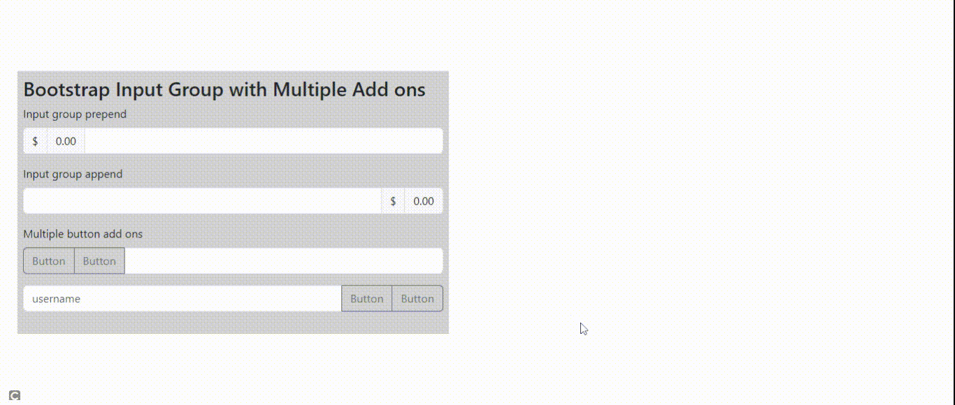
Output:
Example 3: The following code demonstrates dropdown buttons with split segemented buttons. Import all required files as shown below in the code.
Javascript
import React from "react";
import Form
from "react-bootstrap/Form";
import InputGroup
from "react-bootstrap/InputGroup";
import Dropdown
from 'react-bootstrap/Dropdown';
import DropdownButton
from 'react-bootstrap/DropdownButton';
import SplitButton
from 'react-bootstrap/SplitButton';
import {
Box, Text
} from "@chakra-ui/react";
export default function DropdownsSelect() {
return (
<Box bg="lightgrey" w="100%" ml={25} p={8}>
<h3>Bootstrap Input Group with dropdowns</h3>
<Form.Label>Input group prepend</Form.Label>
<InputGroup className="mb-3">
<DropdownButton
variant="outline-secondary"
title="Select CS subjects..."
id="dropdownID1"
>
<Dropdown.Item
href=
DataStructure
</Dropdown.Item>
<Dropdown.Item
href=
Algorithm
</Dropdown.Item>
<Dropdown.Item
href="#">Operating system</Dropdown.Item>
<Dropdown.Divider />
<Dropdown.Item
href="#">NetWorks</Dropdown.Item>
</DropdownButton>
<Form.Control
aria-label="Text input with dropdown button" />
</InputGroup>
<Form.Label>
Segmented dropdown select button
</Form.Label>
<InputGroup className="mb-3">
<SplitButton
variant="outline-secondary"
title="Choose.."
id="dropdownSegmentedID1"
>
<Dropdown.Item
href="#">Option</Dropdown.Item>
<Dropdown.Item
href="#">Another option</Dropdown.Item>
<Dropdown.Item href="#">
Something related to option
</Dropdown.Item>
<Dropdown.Divider />
<Dropdown.Item
href="#">Separated link</Dropdown.Item>
</SplitButton>
<Form.Control
aria-label="Text input with dropdown button" />
</InputGroup>
<br />
</Box>
);
}
|
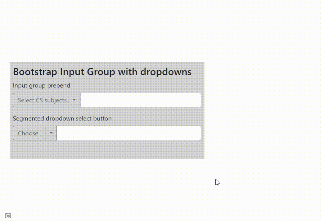
Output:
Share your thoughts in the comments
Please Login to comment...