CSS animation-timing-function Property
Last Updated :
02 Aug, 2023
The animation-timing-function property in CSS is used to specify how the animation makes transitions through keyframes. That is, it is used to specify the motion of animation during transitions.
Syntax:
animation-timing-function: linear | ease | ease-in | ease-out | ease-in-out |step-start | step-end|
steps(int, start | end) | cubic-bezier(n, n, n, n) | initial | inherit;
Property Value:
- ease: With this property value, the animation starts slowly, then fast, and then finally ends slowly (this is default).
- linear: If this value is specified for the property then the animation plays with the same speed from start to end.
- ease-in: If this value is specified then the animation begins with a slow start.
- ease-out: If this value is specified for the property then the animation plays normally but ends slow. This is similar to ease-in.
- ease-in-out: With this property value, the animation both starts and ends slow.
Example: HTML Program to illustrate the above property values for the animation-timing-function property.
HTML
<!DOCTYPE html>
<html>
<head>
<title>
CSS | animation-timing-function Property
</title>
<style>
.geeks {
font-size: 40px;
text-align: center;
font-weight: bold;
color: #090;
padding-bottom: 5px;
font-family: Times New Roman;
}
.geeks1 {
font-size: 17px;
font-weight: bold;
text-align: center;
font-family: Times New Roman;
}
h2 {
width: 350px;
animation-name: text;
animation-duration: 4s;
animation-iteration-count: infinite;
background-color: rgb(255, 210, 85);
}
#one {
animation-timing-function: ease;
}
#two {
animation-timing-function: linear;
}
#three {
animation-timing-function: ease-in;
}
#four {
animation-timing-function: ease-out;
}
#five {
animation-timing-function: ease-in-out;
}
@keyframes text {
from {
margin-left: 60%;
}
to {
margin-left: 0%;
}
}
</style>
</head>
<body>
<div class="geeks">
GeeksforGeeks
</div>
<div class="geeks1">
A computer science portal for geeks
</div>
<h2 id="one">
This text is ease.
</h2>
<h2 id="two">
This text is linear.
</h2>
<h2 id="three">
This text is ease-in.
</h2>
<h2 id="four">
This text is ease-out.
</h2>
<h2 id="five">
This text is ease-in-out.
</h2>
</body>
</html>
|
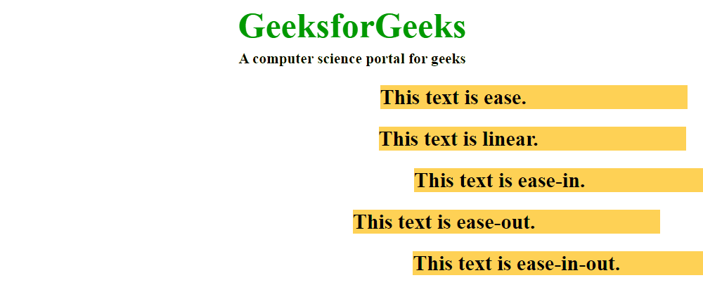
Output:
Supported Browser: The browser supported by animation-timing-function property are listed below:
- Google Chrome 43.0 and above
- Edge 12.0 and above
- Firefox 16.0 and above
- Opera 30.0 and above
- Safari 9.0 and above
Share your thoughts in the comments
Please Login to comment...