React-Bootstrap Placeholder
Last Updated :
02 Nov, 2023
React-Bootstrap Placeholder is used to make the content loading experience better for users. These placeholders not only enhance the user experience but also help us maintain the page looks and structure, even if the content hasn’t loaded yet.
React-Bootstrap Placeholder classes used:
- Width: The “width” property in the Placeholder component lets you define the horizontal size of the placeholder, enabling fixed widths like “100px” to influence the placeholder’s display width in your UI.
- Color: The “color” property in the Placeholder component defines the background color of the placeholder.
- Sizing: The “sizing” property in the Placeholder component manages the height of the placeholder with options like “xs,” “sm,” etc.
- Animation: The “animation” property in the Placeholder component lets you control placeholder animations for a more engaging loading experience. Two animation properties glow and wave.
Syntax:
<Placeholder as={Card.Title} animation="glow/wave">
            <Placeholder xs={6} />
</Placeholder>
Example: This example uses wave animation using React Bootstrap Placeholder
Javascript
import React from "react";
import Card from "react-bootstrap/Card";
import Placeholder from "react-bootstrap/Placeholder";
const img =
function App() {
return (
<div
className="d-flex justify-content-around
align-items-center bg-warning"
style={{ height: "100vh" }}>
<Card style={{ width: "20rem" }}>
<Card.Img variant="top"
src={img} className="p-4" />
<Card.Body>
{
}
<Placeholder as={Card.Title}
animation="wave">
{
}
<Placeholder xs={6} />
</Placeholder>
{
}
<Placeholder as={Card.Text}
animation="wave">
{
}
<Placeholder xs={7} />
<Placeholder xs={4} />
<Placeholder xs={4} />
<Placeholder xs={6} />
<Placeholder xs={8} />
</Placeholder>
{
}
<Placeholder.Button
variant="primary" xs={6} />
</Card.Body>
</Card>
</div>
);
}
export default App;
|
Output:

Output
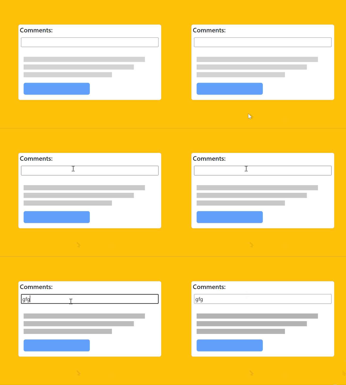
Example 2: This example uses glow animation using React Bootstrap Placeholder
Javascript
import React from "react";
import Card from "react-bootstrap/Card";
import Placeholder from "react-bootstrap/Placeholder";
function App() {
return (
<div
className="bg-warning d-flex justify-content-around
align-items-center"
style={{ height: "100vh" }}>
<Card style={{ width: "28rem" }}>
<p className="m-1 h5">Comments:</p>
<input className="m-2" type="text" placeholder="" />
<Card.Body>
{
}
<Placeholder as={Card.Text}
animation="wave">
{
}
<Placeholder xs={7} />
<Placeholder xs={4} />
<Placeholder xs={4} />
<Placeholder xs={6} />
<Placeholder xs={8} />
</Placeholder>
{
}
<Placeholder.Button
variant="primary" xs={6} />
</Card.Body>
</Card>
</div>
);
}
export default App;
|
Output:

Output
Share your thoughts in the comments
Please Login to comment...